After owning this house for a year, we are way past time for a living room renovation reveal. However, I underestimated how long it would take to actually complete this room to my liking, and we are still about 80% of the way through. Mr. R is probably having a heart attack at the number, because how can we possibly still have more to do….??
Anyway, even though there is more left, let’s take a look back at where we started.
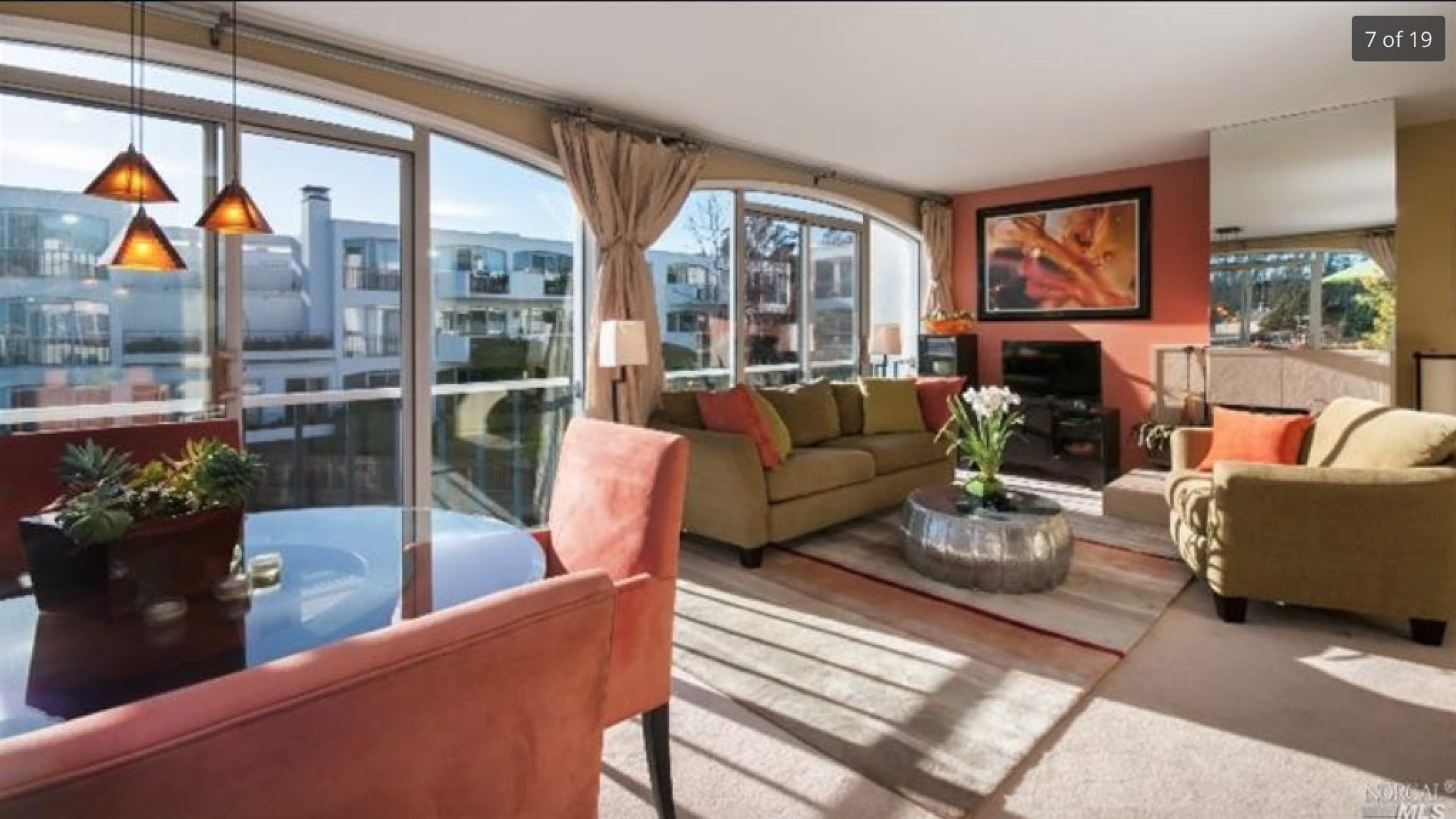
The picture above is from the Zillow listing. Not bad but any accounts in this image, but not to my liking, and once you take away the furniture, you realize what you are left with… see images below:
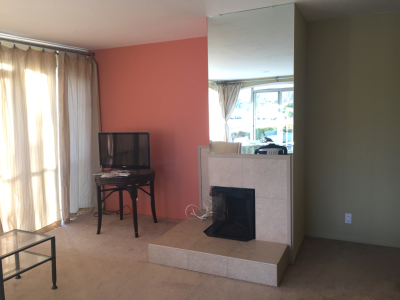
It’s hard to remember that this is what the condo looked like when we first moved in. I was still living in New York at the time with all our furniture, and Mr. R was living here with some borrowed furniture from my parents and an air mattress. While it was painful for him it’s nice to remember how far we have come in this process. That’s the beauty of ‘before’ photos- they are so important to remind you of not what you have left to do, but what you have achieved so far!
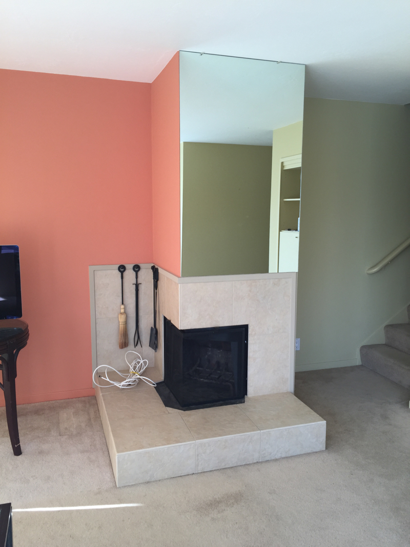
The first things that we renovated are in the images above and below. Number 1 priority was taking out the carpet and tile and replacing the floor with engineered hardwood panels in a light grey wash. It made a HUGE difference to the space, taking out the Boca Raton vibe and making it Northern California. Not that there is a problem with Boca… but …. you get it.
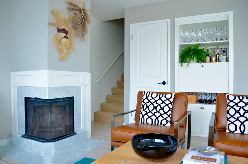
Then there was the fireplace. Seriously the most awkwardly shaped fireplace I had ever seen; and it came complete with that 15″ step around it that drastically took space from what was already a small living room. A complete overhaul was needed. I drew up a marble and wooden shaker style mantle design, inspired by the cabinetry in the kitchen, and removed the step completely, using 12″ marble tile to border the fireplace to still be on code. 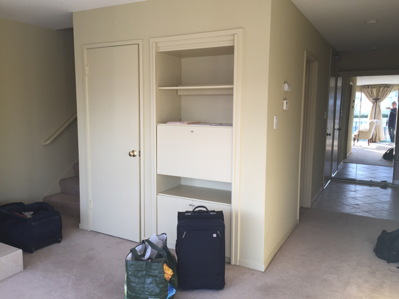
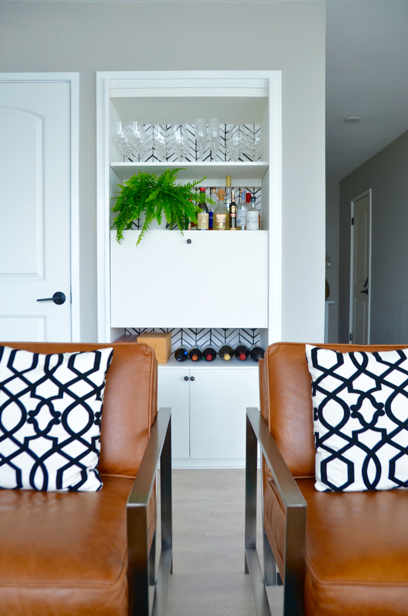
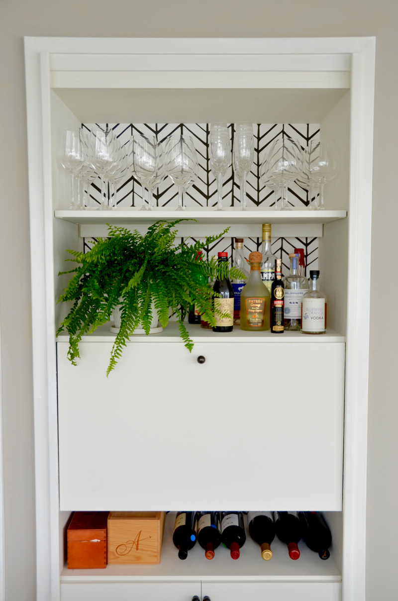
The last (more minor) project was this little secretary desk/bar area. We wanted to install plumbing and make it a full wet bar, but decided for $$ reasons just to spruce it up with some paint and wallpaper, to make it a nice storage and display area for all of our barware.
So let’s not wait any further…. let’s see the (sort of) final result!
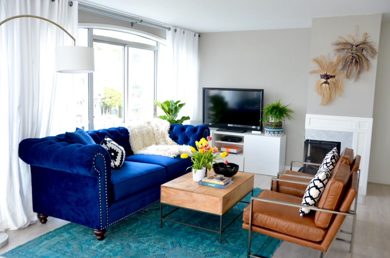
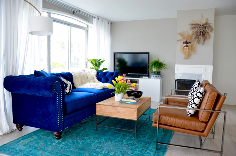
What a difference right? It still feels cozy and warm like the previous space, but now brighter and more modern. When we first painted the wall color Perbeck Stone by Farrow & Ball, I was concerned because it seemed to change color throughout the day. It seemed light blue, lavender, grey depending on the light. But now that it has settled and the furniture is in, I absolutely love the color. It is a nice light warm grey that is extremely versatile, and fades into the background nicely.
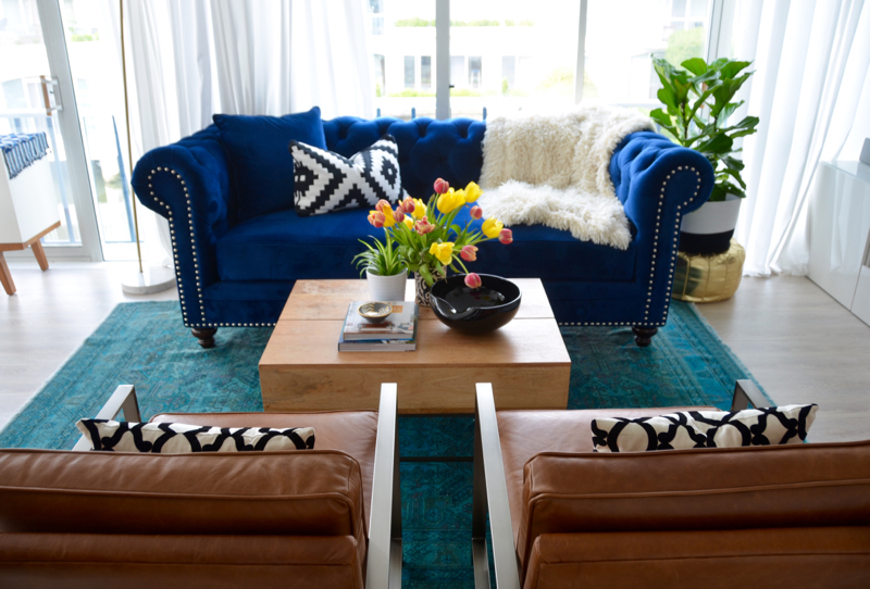
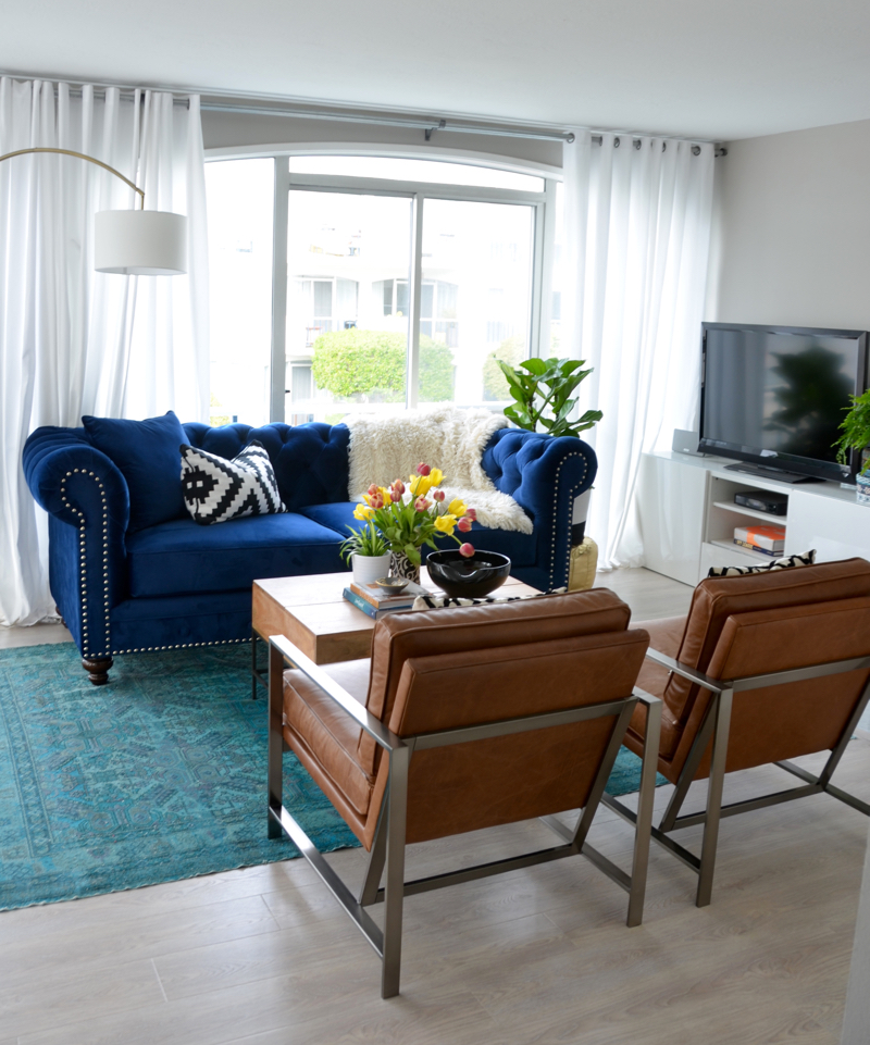
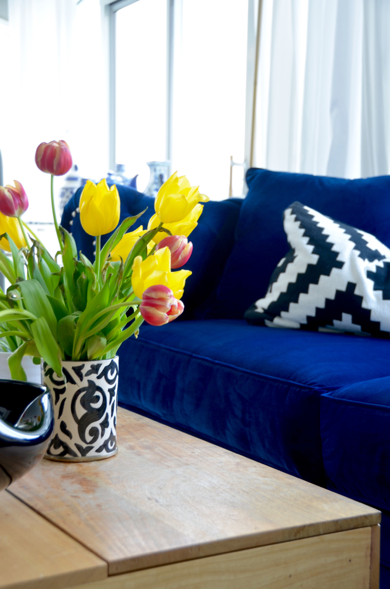
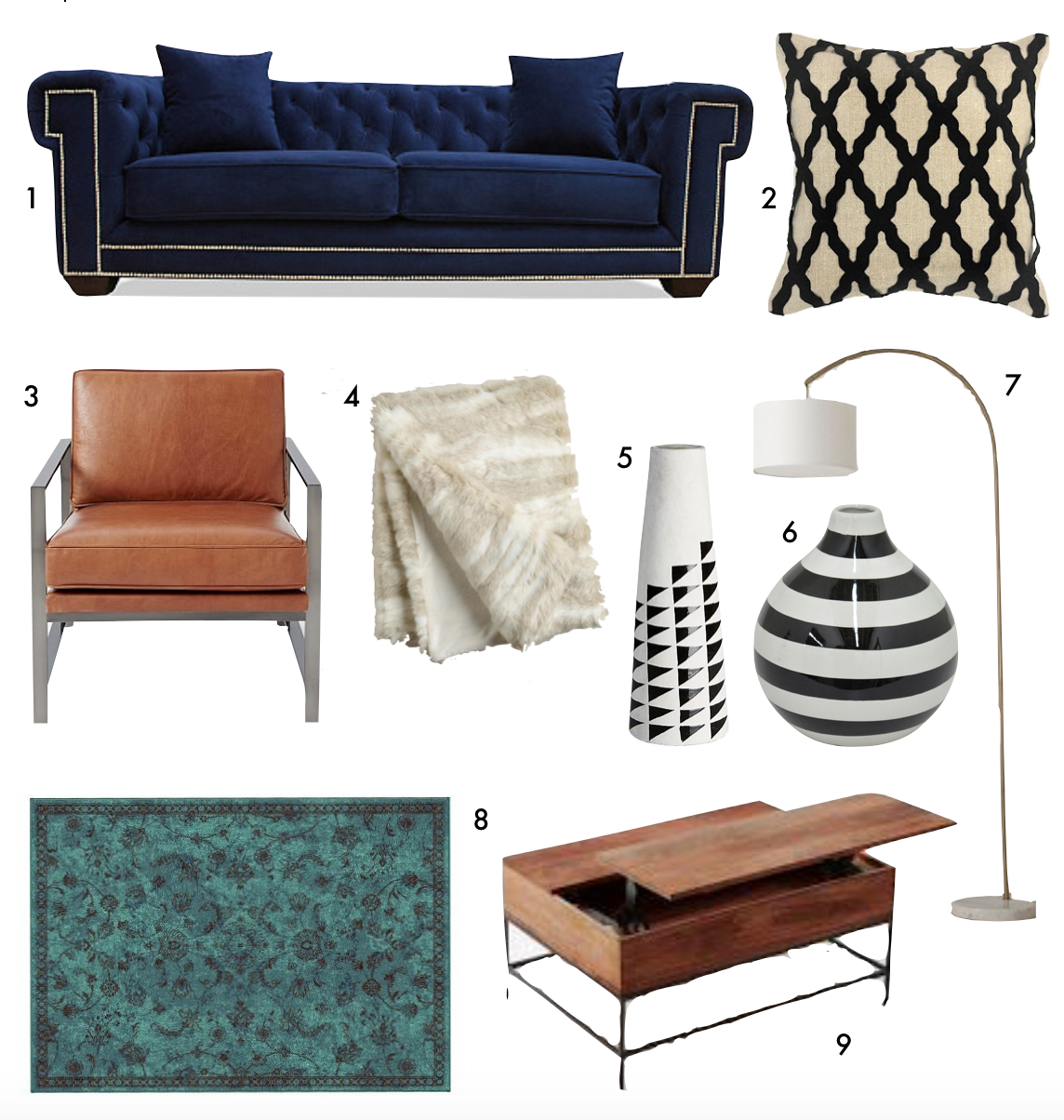
The couch was a big debate. There have only been 2 sofas in the world I have been over the top in love with. One of them is/will be an off white linen huge sectional (picture something from Restoration Hardware) and the second is a navy blue studded chesterfield. Both so different, both so divine. Knowing that the sectional wasn’t going to fit in this room, we decided to go for the chesterfield, thinking that in a future home we would somehow have space to own both. If you live in the Bay Area, I strongly recommend working with Zebra Furniture on any custom sofa requests you have. We bought our previous sofa from them 10 years ago and besides the giant red wine spill that occurred right before we moved, the sofa was in great condition and received compliments on comfort from guests all the time. We decided to work with them again in order to pick out a chesterfield with the right length, color, fabric and stud color that we wanted…. and you will never guess how quickly it came. 2 weeks! 2 WEEKS! For those of you who have ever ordered furniture online, never mind custom, you are lucky to receive your order in a month. Anyway, this is in no way sponsored by Zebra Furniture (I wish it was!) but we love their product and could not be more happy with this sofa.
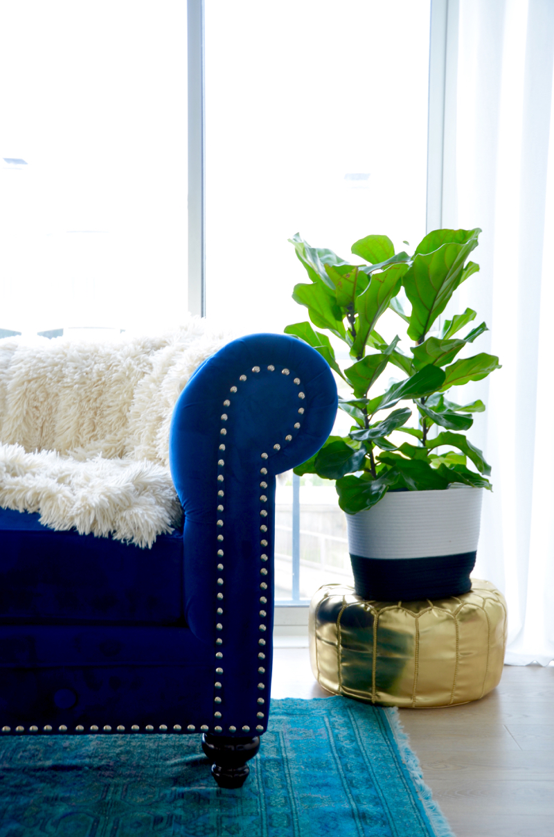
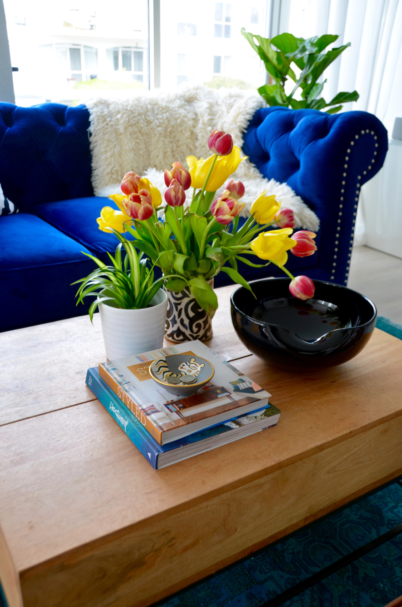
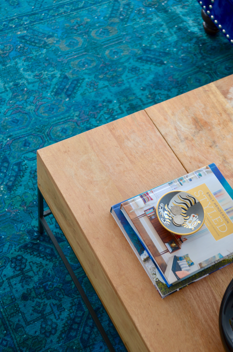
The coffee table we have owned for a while, and while we love it, I would love to have something a bit smaller and maybe glass since this takes up quite a lot of space visually. However, nothing beats the storage and the fact that half of it raises to eat off it… for movie nights!
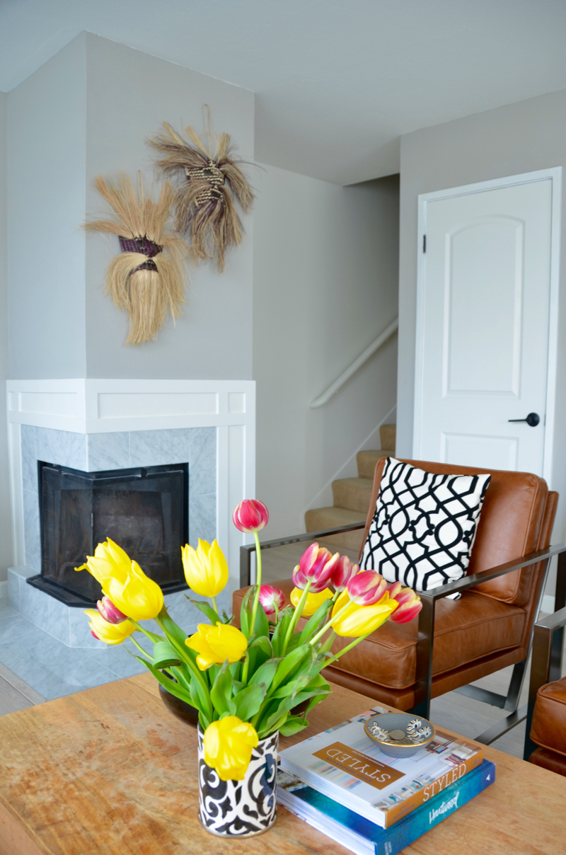
The West Elm chairs were the final decor puzzle piece, and we couldn’t be happier about how they turned out. Read more about that search here. As for the black and white pillow covers- I made those years ago but felt that with my moroccan vases and the chevron wallpaper in the bar, they seemed relevant again.
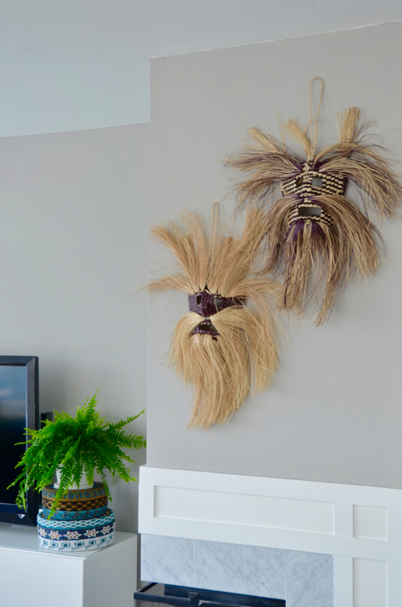
May favorite part of the room? Those awesome traditional straw masks I picked up in San Miguel de Allende. They were $4 each and the best last minute purchase I have ever bargained for. I wish I could go back and bring you all one home!
What do you think of the bar? I would love to switch out the wood shelf for a glass one to make the space appear less clunky, but I think that with a fresh coat of paint and removable wallpaper, its a vast improvement over the ‘before’.
I am so happy with where we are with this living room, but this is what I still want to change:
1. Change out coffee table for smaller glass table (possibly oval)
2. New pillows and pillow covers
3. Crown moulding. I saw this in another unit in our development and am obsessed and can’t get it out of my head. Looking at these walls without them seems like they’re naked
4. I should probably hem those curtains…. eventually
5. Maaaayyyybee one more side table in-between the 2 chairs. Not sure it’s necessary but if I find one i’m in love with I won’t say no!
Get the Look:
