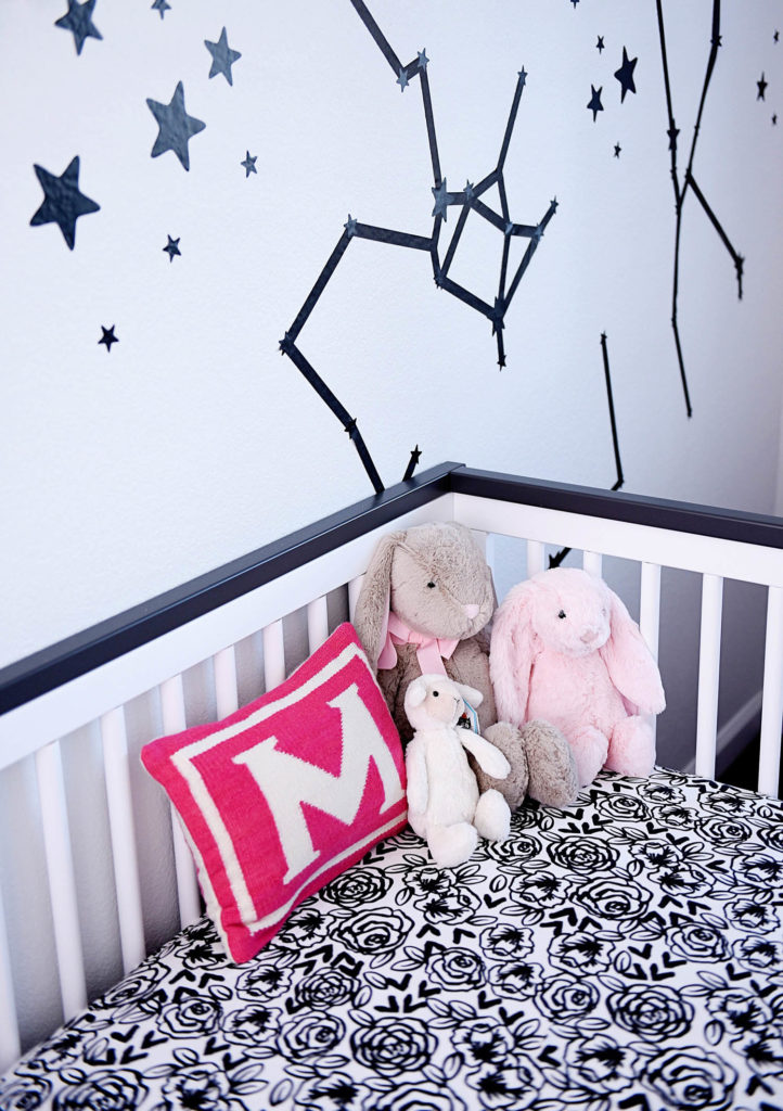
Although many of you have seen parts of my pink constellation nursery reveal through my partnerships with Spoonflower (Canopy DIY, Name Garland DIY and Side Table DIY here), today is finally the day to reveal the full nursery! If you aren’t up to date on the nursery redecoration, you can see the mockup I created here, which shows which items I am reusing from our old home, and my general design plan.
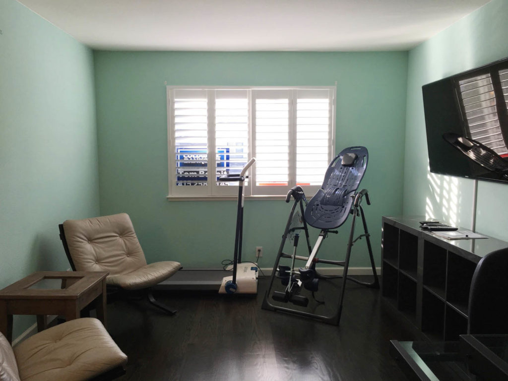
First, lets check out the BEFORE:
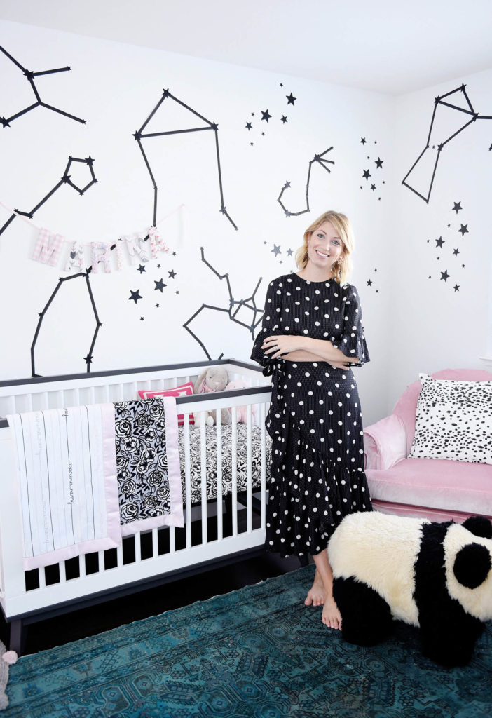
Now, the AFTER!
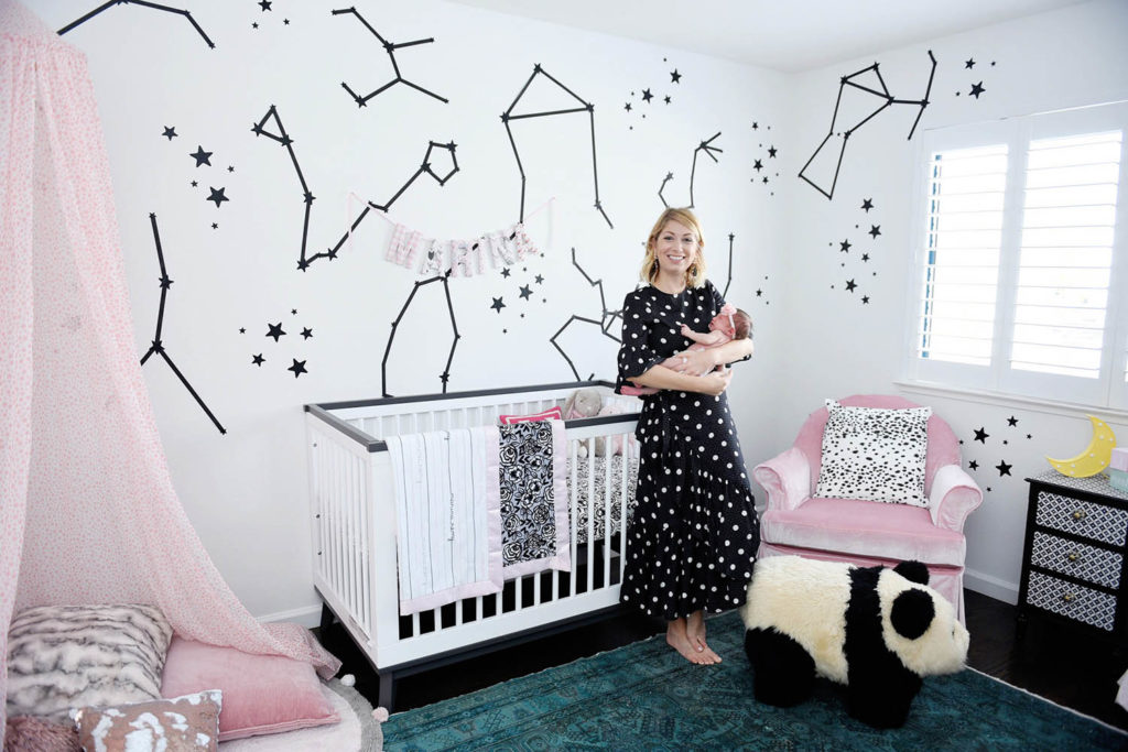
Marina may only be 5 weeks old, but this nursery project is closer to 5 months. If you’ve followed along, you know that I have gone back and forth on wallpaper and paint for this room, but couldn’t make up my mind. Since we were just moving into this house a few months before Marina was born, I had so many other renovation projects to work throughout the house. I couldn’t come up with a wallpaper or paint color idea that I knew I would want to stick with for a long time, so we ended up painting the room white, knowing that down the line I could change the space freely without any guilt.
The Walls and Theme
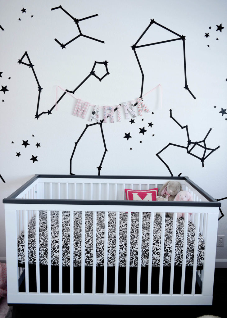
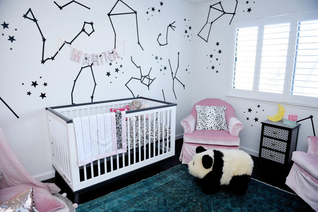
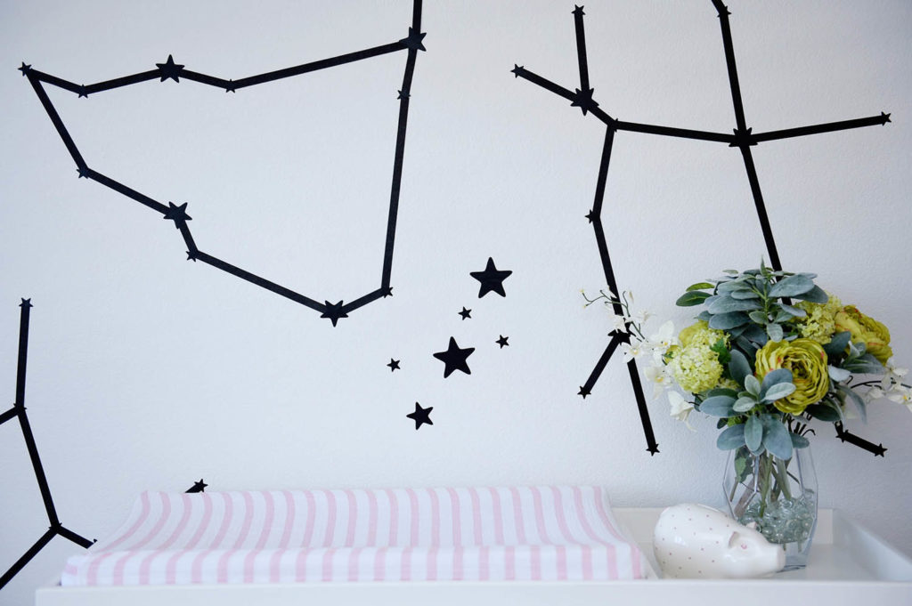
Since my washi tape wall in my old office was such a hit, I wanted to try another washi tape project, this time creating constellations and zodiac signs with washi tape and star wall decals. I have always been very into the zodiac, and was very fixated on Marina being a Pisces (although she was thisclose to being an Aries!) and how her relationship with me (a Libra) would be. Since babies can really only see high contrast items when they are young, I thought creating constellations in black would be a fun feast for her developing eyes, and simple for me to pull off and change out down the line should I change my mind. Creating the constellations was such a breeze! I googled the zodiac constellations and a few other famous ones, and tried my best to recreate them out of washi. I started off trying to be very exact, but by the end I was just making up different shapes to fill the space.
My advice if you use washi is to make sure you run your hands over each piece of tape a few times before you leave the room for the day. The tape needs to be pushed down constantly the first few hours in order to have longevity on the wall, otherwise the ends will curl up and the whole project will be on your floor if left overnight. After a day or so of quickly running my fingers over the tape on the walls 2-3x a day, they are now fixed to the wall well, but not so tight that I couldn’t easily remove it if I wanted.
The Layout
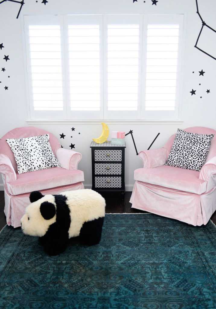
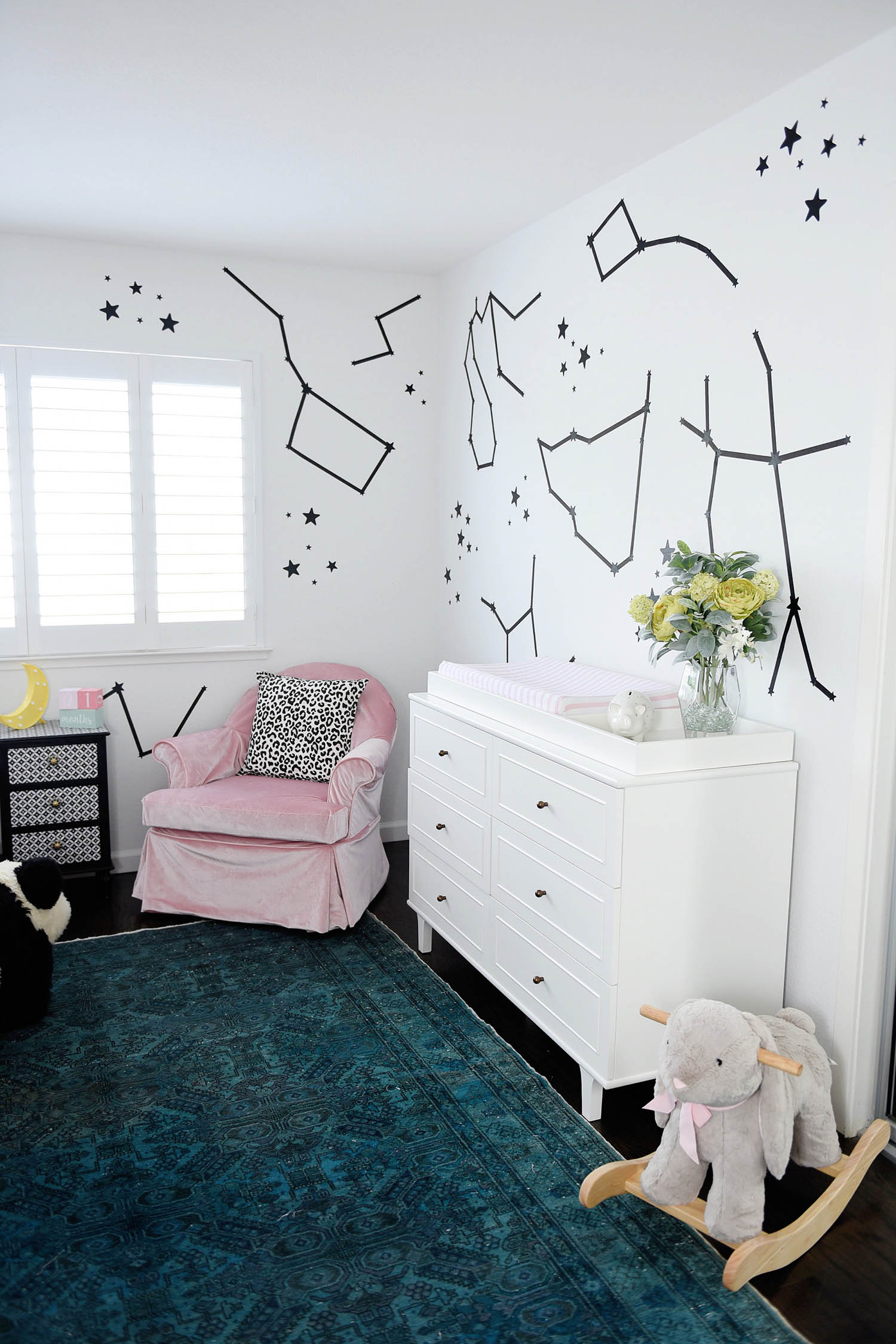
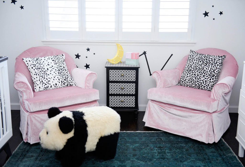
Strangely enough, the entire design actually revolved around 2 swivel/rocking chairs that I was inheriting from my parents house. We have had these two navy blue chairs in my parents home for as long as I can imagine, and they are extremely comfortable, perfect for rocking and swiveling, and… the price was right. The only problem is that the dingy navy blue velvet was stained and ripped in a few places, so I needed to get them reupholstered in pink velvet. After wayyyy too many outrageous quotes for reupholstery (the average was $700 a chair!) we decided on slipcovers. While we still ended up paying $350 a chair which is not inexpensive, this was still much more affordable than buying a new upholstered rocking chair, and we liked the idea of up-cycling something in my childhood home.
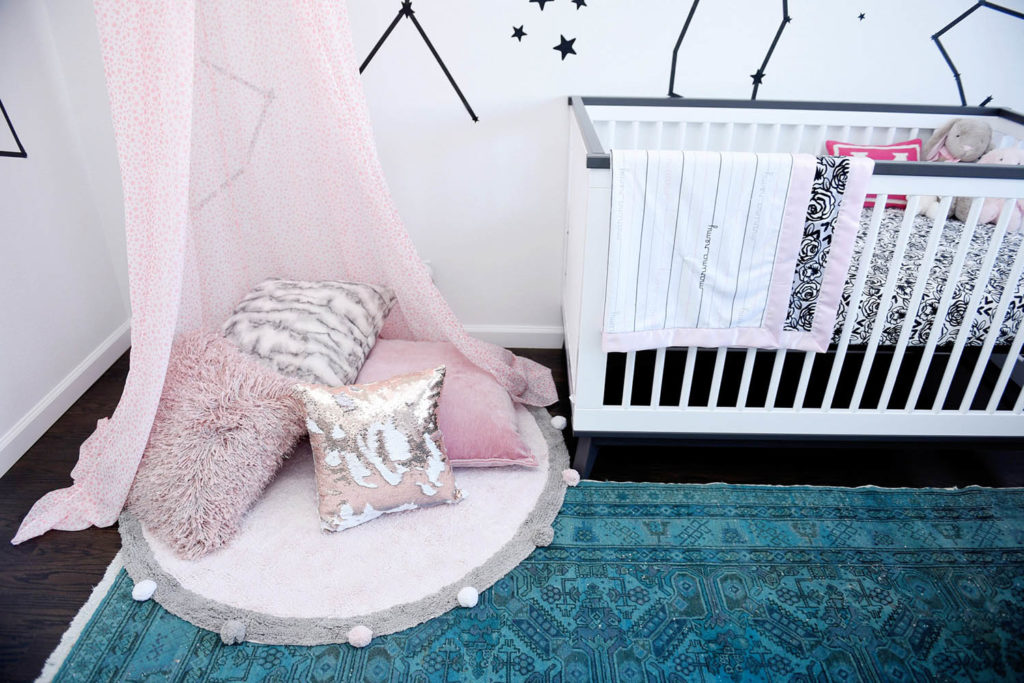
Since we had 2 chairs, I wanted to use both to frame the back window, and create additional comfortable seating for when we have visitors and we are also using Marina’s room as a playroom. From there, the layout came together, which sort of forced the canopy/reading nook behind the door. Although that layout isn’t optimal, we are still easily able to get in and out of the room, and it adds a nice focal point when you are sitting in the chairs to look back at.
The Crib and Changing Table
Cribs can get crazy expensive, and while we looked at ones at all price points, we settled on the Scoot from Babyletto. I love that I can trust Babyletto products for eco-friendly and safety standards, and the price point is on the affordable range. From a design standpoint I loved the dark grey accents on the top and bottom of the crib, which still feels traditional but just a little bit different than most cribs I have seen. We will be able to use it as a toddler bed when Marina grows out of it, or easily use it for any future babies as well.
The changing table was an extremely generous gift from a family member, and we are in love with it. Let’s just say Marina has a nicer dresser than Mr. R and I do! We chose a classic style from Pottery Barn kids with a removable changing table, so that down the line we can take off the top easily and use it in her room when she’s older. Plus, I love that it’s wide enough and has enough storage to hold diapers, blankets, bottles and her clothing, so that we don’t need an additional storage cart in the room.
Curtains and Lighting
This was the biggest design struggle for me in this room, and as you can tell, missing. I knew pretty early on that additional window treatments were going to be a nightmare because of the way the window shutters open and close. Blinds, curtains or any sort of shade would interfere. I could have put in curtains just for show… but that’s not really my thing! The shutters we have are great, and although they don’t add anything from a design perspective, they are functional and FREE! So there.
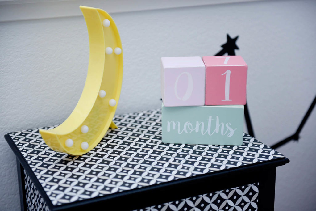
Lighting was/is still a huge problem because there is no overhead light in the space and the light switch is attached to a plug behind the door, which never would have been very functional regardless of layout. We put an adorable Jonathan Adler nightlight into that switch so that in the middle of the night it’s easy to turn on. I also added a silly plastic moon marquee light on the side table which can be used as additional lighting when feeding, or moved to the changing table if needed when I change her. For the majority of the daylight hours this room gets enough light where I wouldn’t turn on a lamp, but around 7-10pm is when we could potentially need more light to put her to sleep or read a book. Since Marina isn’t sleeping in her nursery yet, I have a bit more time to figure out if I need additional lighting, or if we want to have an electrician revamp the entire wiring in the room.
Additional Wall Art and Decor
When designing this space, I had a couple silly rules in my head:
- You hate random art, do not feel pressured to put up random art in this room just to fill space
- Hold off on toys as long as possible. Marina doesn’t need them and they will drive you nuts
- Books, only books
Let’s see how those turned out!
- The day before we shot this I was in HomeGoods searching for random art and crap to put on the walls because it felt so bare. With no curtains or overhead lighting, I was worried that the room wouldn’t look balanced in pictures. But then I came to my senses, stranded my cart before I made a poor decision, and trusted my instincts. I hate random art. Marina doesn’t need it and it will drive me nuts (see second rule).
- I bought and registered for zero toys for Marina. I knew people would buy them anyway, and eventually for birthdays and things we would accumulate enough to fill our garage. I have one trunk underneath the book shelves that currently holds my husbands clothing but could eventually be used for toys… and that’s enough. We were gifted the beautiful rocking rabbit and I’m in love with it, so Marina can definitely keep that. I wanted to have lots of spaces to read in this room (which I succeeded in) so the less room for toys the better!
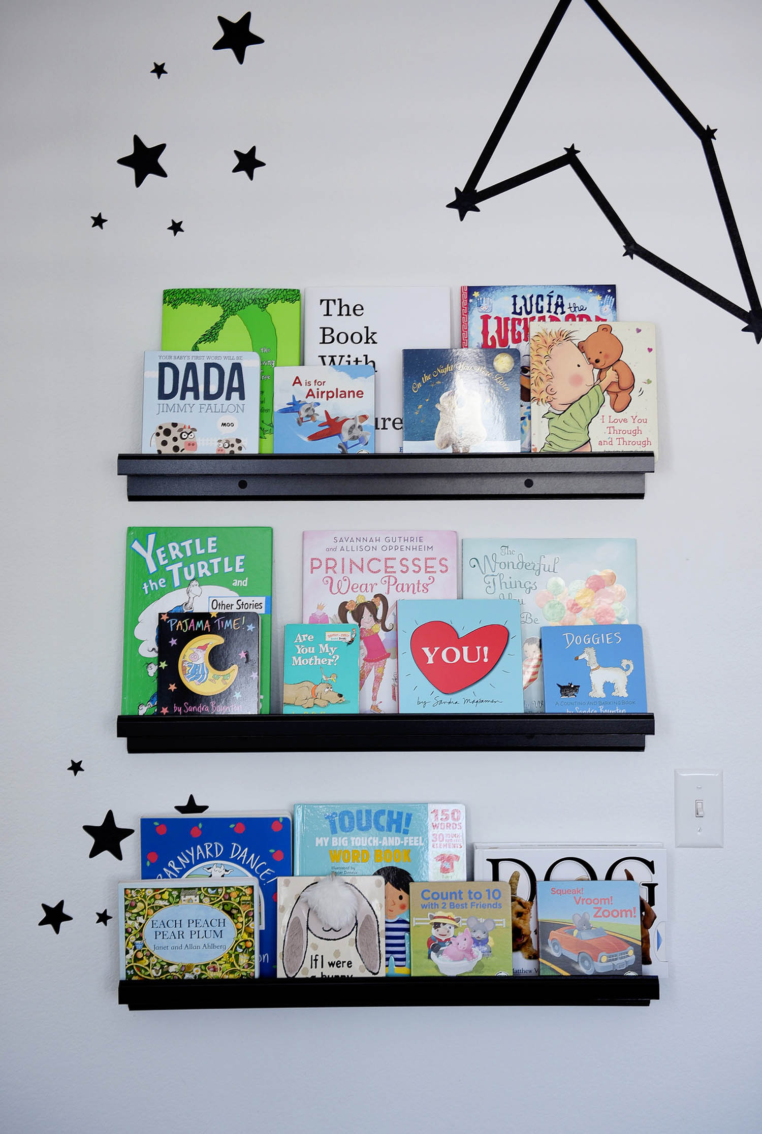
- Like I said, only books. I loved the idea of outward facing shelves to see Marina’s book collection and display them as art, but I realize this is only going to work for so long. as the books are already taking over the closet and will become too thick for the ledges. But I don’t care, because each ledge was $10 from IKEA and if I need to put deeper ones in eventually, then I will be happy because that means Marina is reading a ton!
Special Details
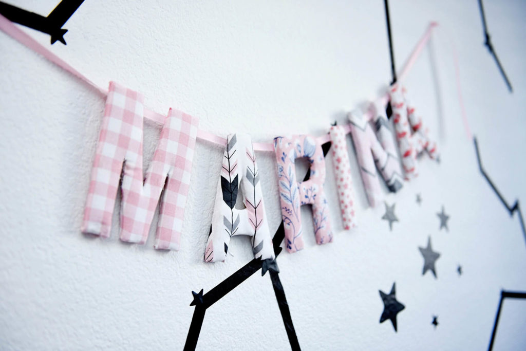
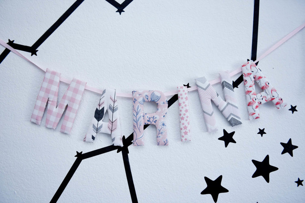
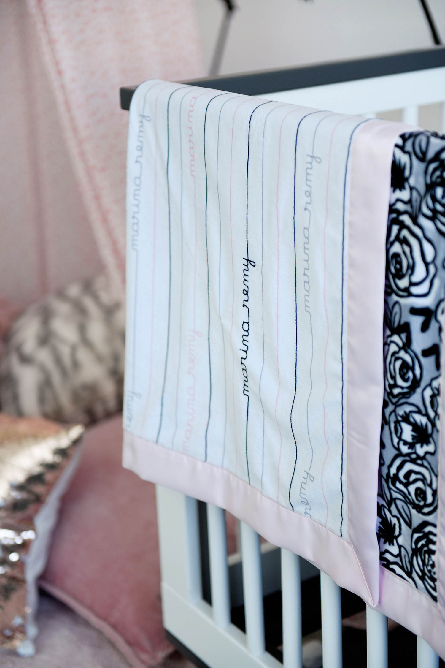
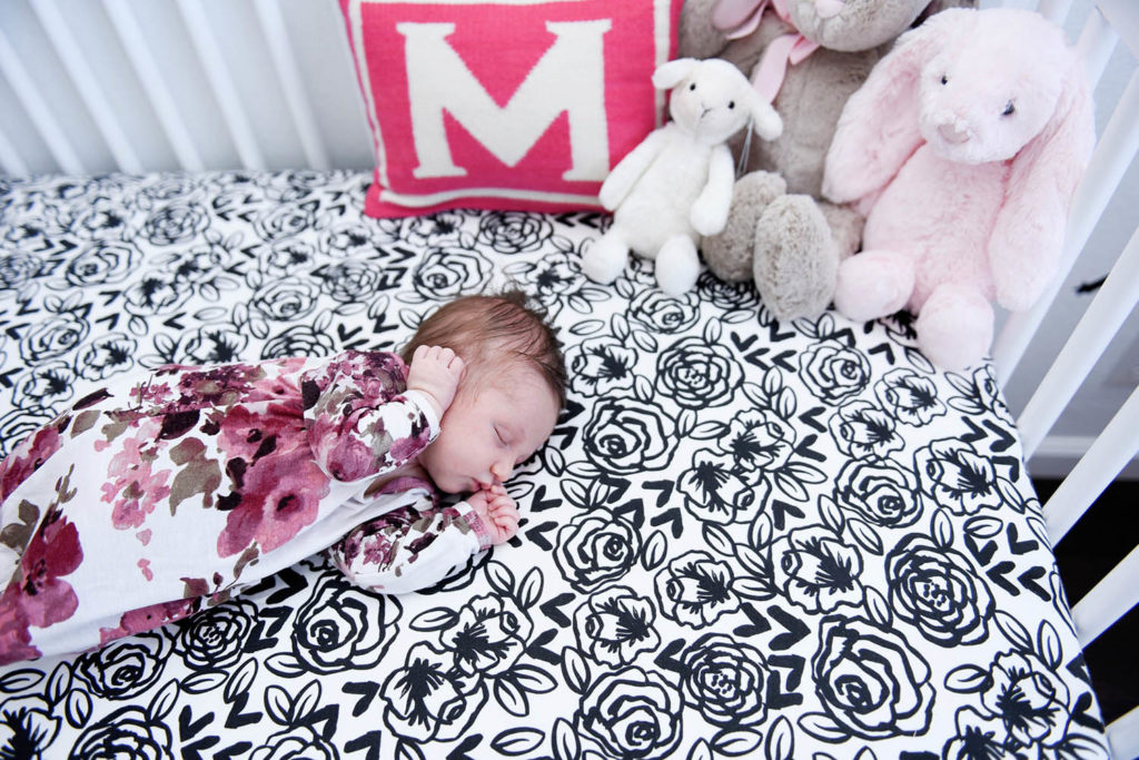
I wanted to make a few custom projects for Marina, hence the collaboration with Spoonflower on the canopy, side table and name garland. But I also made Marina a custom blanket with her name on it, as well as a coordinating crib sheet. Making a few custom linens provides the perfect background for photos of her as she grows, and I can always reorder the fabric prints later on if I decide I want matching pillows or other accessories for her room.
I also love the round rug underneath the canopy from Lorena Canals. All of her rugs and cushions are machine washable, and they come in the cutest designs and styles. Since Marina tends to spit up on everything during tummy time, I know I will be utilizing the easy washing feature all the time!
Shop the Room
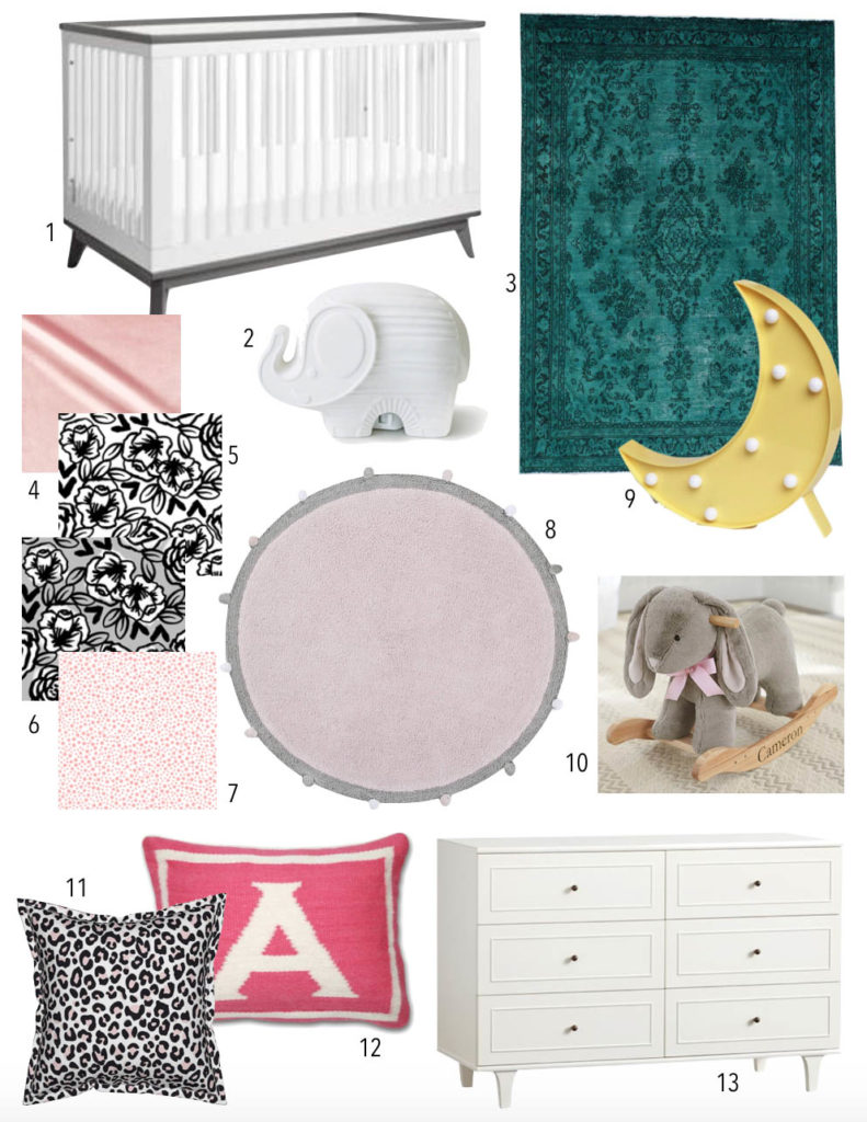
- Babyletto Scoot Crib // 2. Jonathan Adler Nightlight // 3. Teal Overdye Persian Rug // 4. Pink Velvet Fabric // 5. Black and White Floral Fabric // 6. Grey Floral fabric // 7. Pink Star Fabric // 8. Lorena Canals Rug // 9. Moon lamp // 10. Rabbit Rocker // 11. Cheetah Pillow // 12. Jonathan Adler Monogram Pillow // 13. Changing Table Dresser
So what do you think of the room? Anything you would add/remove/change? I always love to hear!
