Hello hello my trusty readers! Before I have a chance to photograph my finished living room (I swear that’s coming soon!) I am already full- on in the next project; our master bathroom. While we need to renovate all 3 bathrooms in this home (a guest bathroom and a powder room as well), we are getting started on the master first since this is where will need to spend the most money. And of course, if we have no money left at the end, that at least we put it in the right place, right? Let’s hope so.
Here is a current view of our master bathroom, from the Zillow listing, along with some of my iPhone photos.
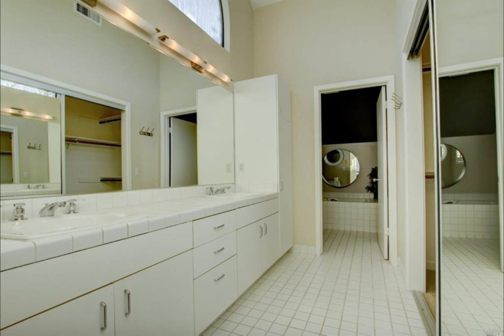
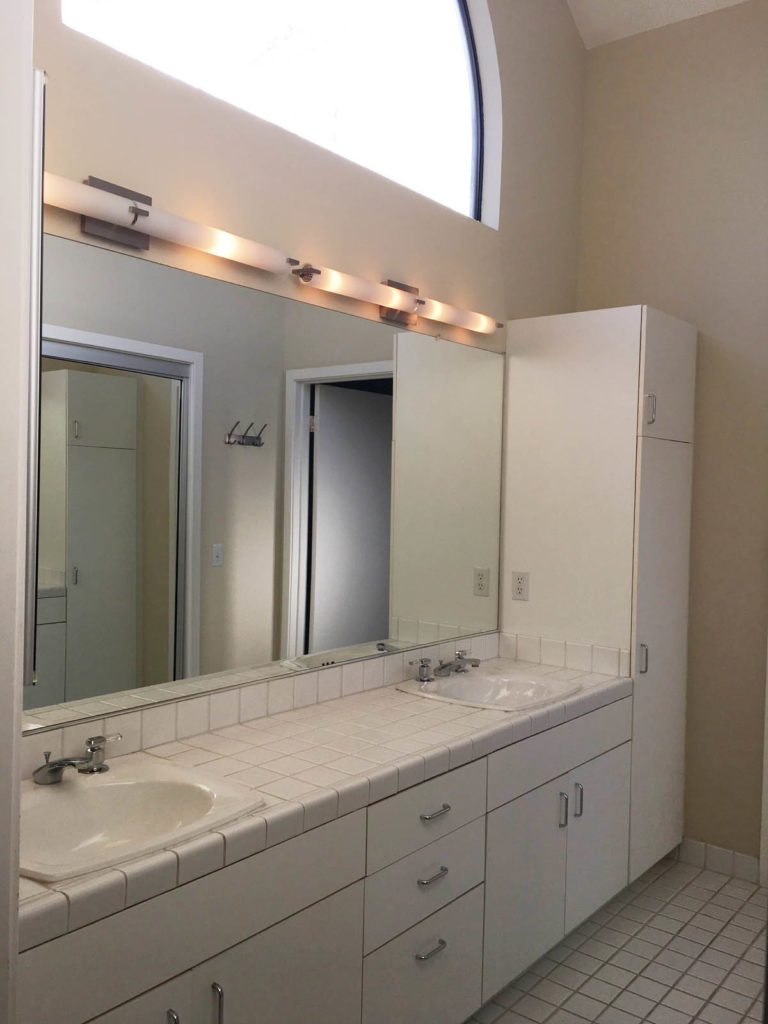
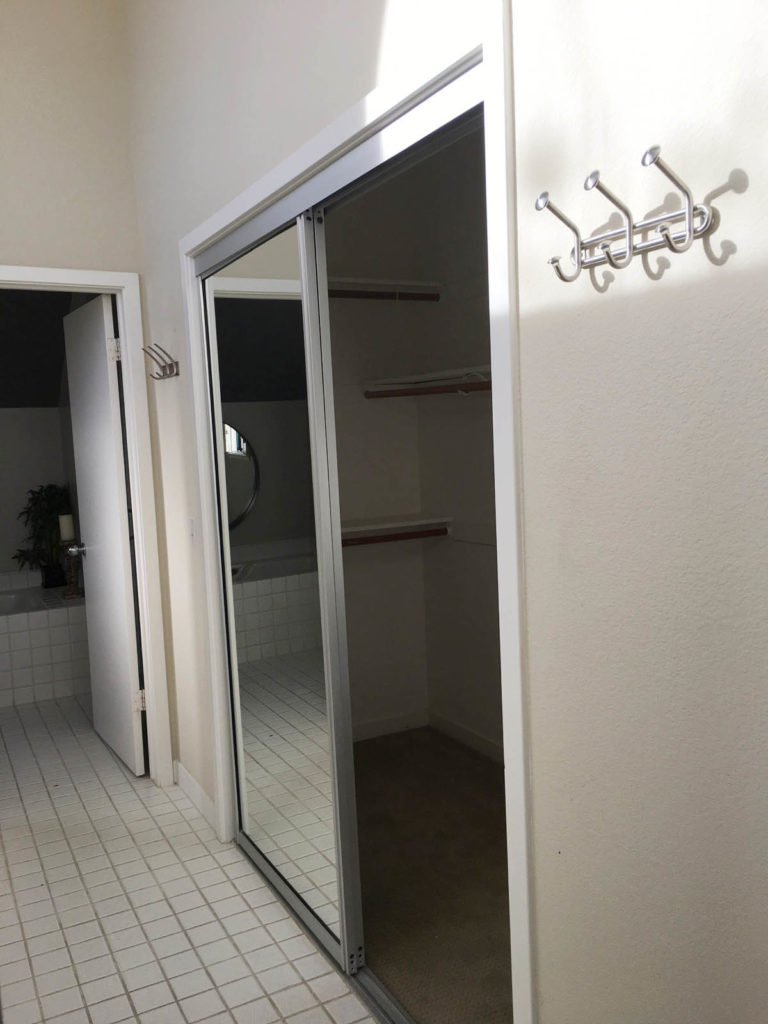
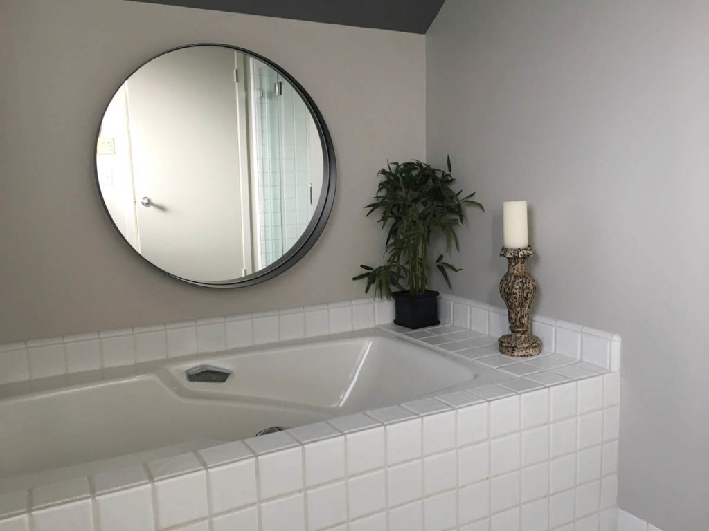
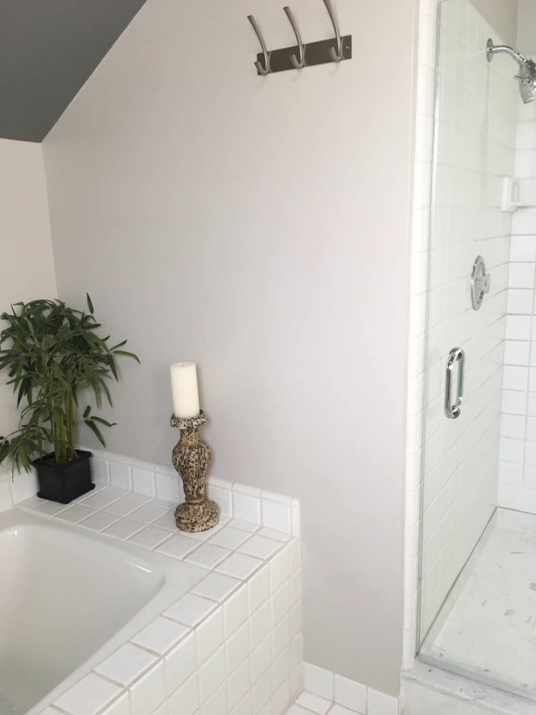
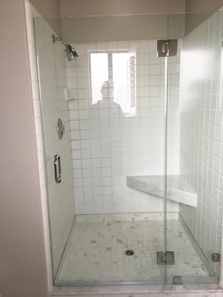
It’s all original from 1985, and it looks it. It’s not particularly hideous by any means (at least it’s white), but just dated and ready for a reboot. We want to essentially gut the whole thing although the layout will stay the same, as we are in a condo complex and therefore can’t change the plumbing and walls.
As you know about my style, I like high contrast and bold colors. Mr. R on the other hand, wants the feel of luxury and high resale value (translation; marble and white). So I have been looking for inspiration that satisfies our differing tastes, and somehow still falls into our ever shrinking budget.
Here are a few images that I’ve rounded up to use as our main inspiration for the spaces. Each one has an element that I love, although none of them hit the nail on the head:
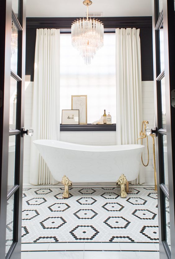
This first picture might epitomize the best combination of both our tastes. While it might not quite be modern enough, we both love the vintage feel of the hexagonal contrast tile pattern, the clawfoot tub, the black and white contrast trims and gold fixtures. Unfortunately our bathroom space looks nothing like this, so we will have to extrude elements to fit better in our footprint.
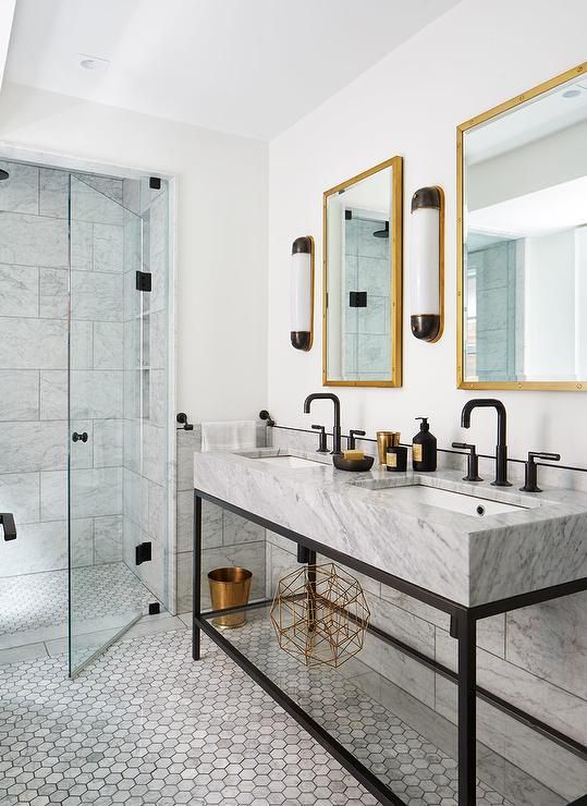
This picture has the more modern, clean lines that fit our home. I particularly like the mix of sizes and shapes of marble tile, which might be the best way for us to incorporate pattern and marble in many ways in our own bathtub/shower room.
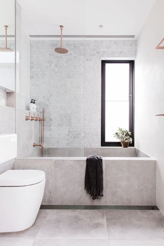
Since we have an apron front tub, I don’t want to break it up into too many pieces if possible (with small tiles). I like that this one uses only 3 large tiles to give a clean look, but the sharp corners and cold feel are not our style at all.
{source}
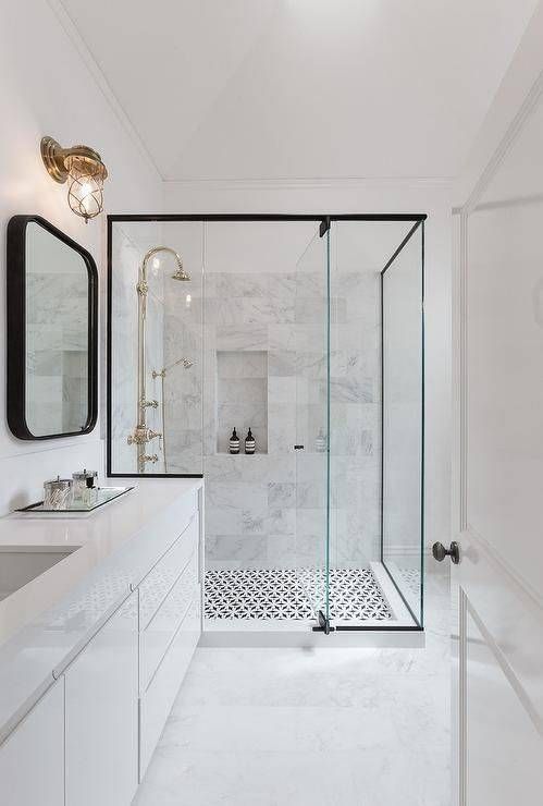
In this picture I love the contrast tile highlighting the shower, as the only source of pattern. I’m also into the black metal frame of the shower doors, which I think I will try to incorporate into our shower.
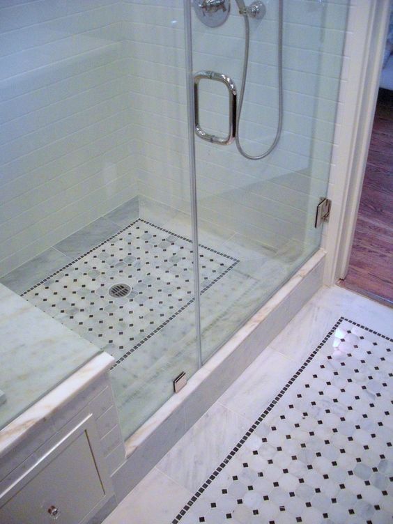
Again, here is a contrast shower floor, which matches a bordered section on the bathroom floor as well. I definitely want to incorporate this idea into our bathroom, but the installation cost can be challenging. I am debating whether the bordered section should just be in the sink/vanity room, or border around the entire area, which could be more complicated. What do you think?
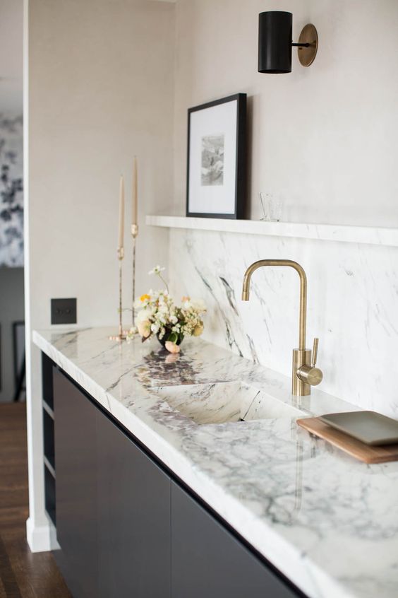
This wet bar is fantastic. I love the black vanity with the beautiful marble top, punctuated by the brass faucet. This is exactly the color scheme we are going to try to emulate.
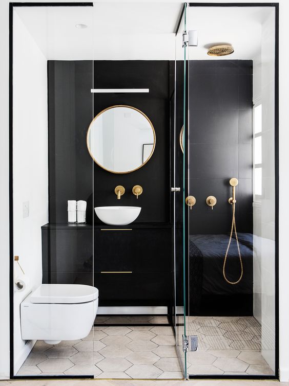
Another beautifully framed shower, this time with a contrast black accent wall. I love how it makes the back wall recede, which I think could be a great detail for the wall above the bathtub.
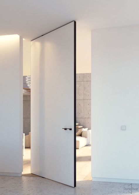
Lastly, we are playing with the idea of pivot doors for our master closet. This way, we can have one side with mirrors and one side for built-in storage. However, this could end up being an expensive project… that which we’re not sure we would get the value back for. What do you think?
I would love to hear your thoughts on our original design inspiration and what you have learned from your own bathroom renovations. Anything you absolutely love or wish you hadn’t done? Any recommendations or learnings? Please share!
