I wanted my blog posts to be timely, and there is nothing that is looming over my life right now more than creating and sending out invitations for my wedding. So here we go- deep into the black hole that is wedding stationery.
I somewhat foolishly decided that I was going to design and make my invitations myself, and once I make up my mind, sadly I don’t change it (I wish I was a bit less stubborn in this regard). The problem with designing your own invitations is that you think somehow, magically, you can come up with a way to incorporate everything you love about other invitation and typography styles, into one cohesive package. Unfortunately I am learning that is just. not. so. So below I have shown some of my favorite invite styles that pertain to my wedding (formal, old world meets modern, striking) with the hope that you, the readers can help me narrow down a theme! So quick, tell me which invitation theme you like the best- I only have a few weeks to get these out!
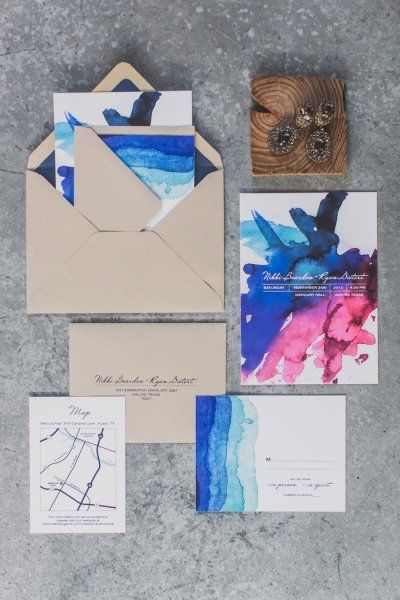
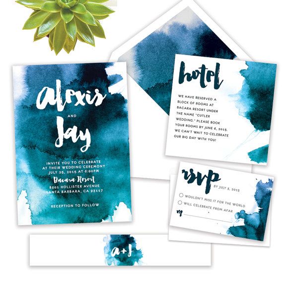
Watercolor is so of the moment- you can get such beautiful saturated color and balance it with organic brush script. I love that the style seems romantic but punchy with the statement color.
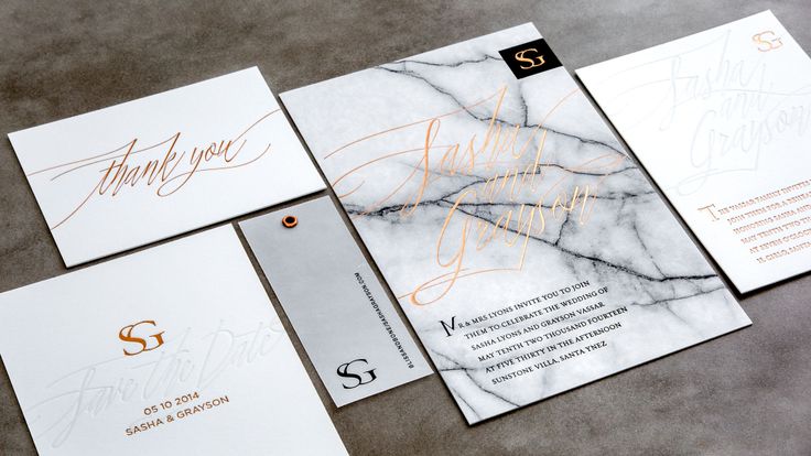
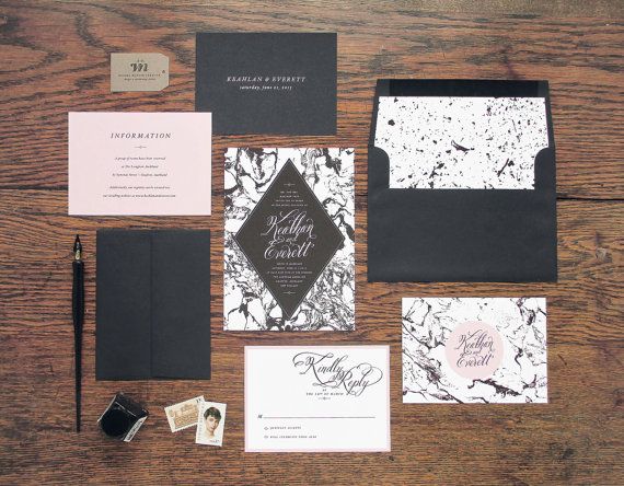
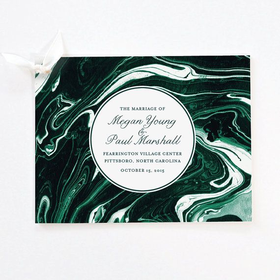
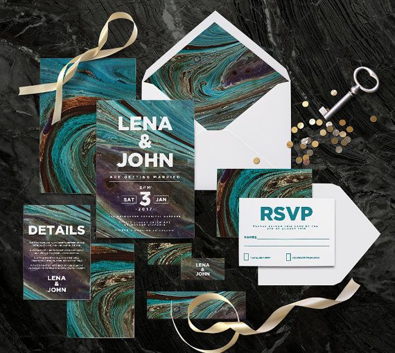
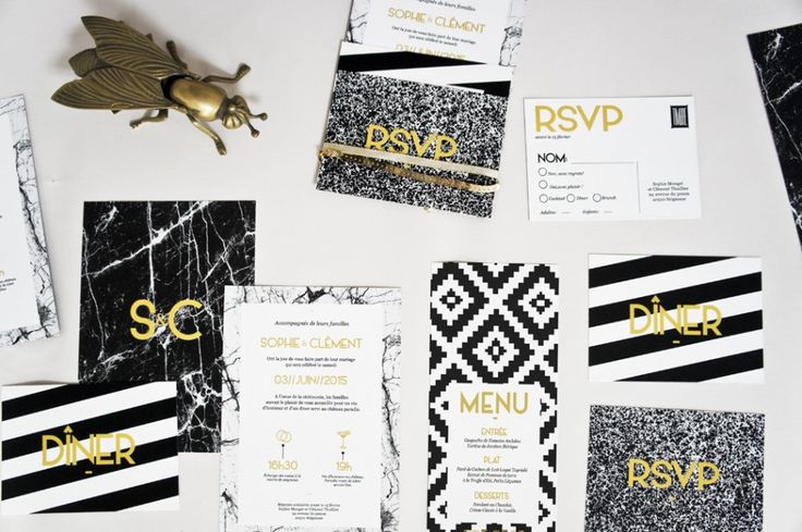
Marble is also verryyyy current, but natural stone textures and mixing of monochromatic patterns together gives it a modern edge. The first of this series is a more classic carrera marble pattern, but as the images go on you can see how you can scale up to more bold color patterns such as malachite and agate textures.
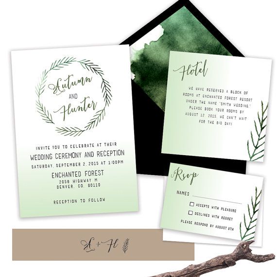
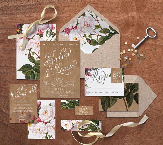
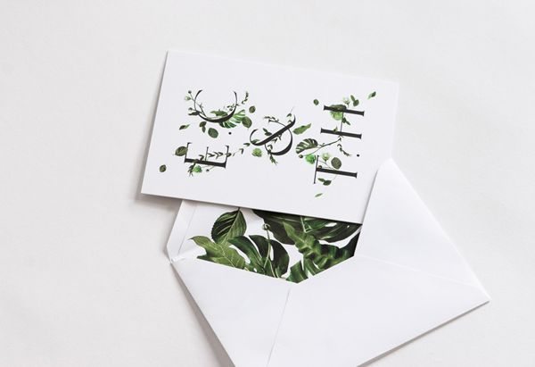
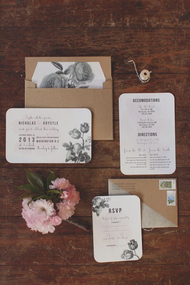
Botanical Prints on textured paper seem fresh and inviting- and with the right font can be surprisingly modern. My favorite of this group is the second one – the green leaves just pop off of the white background. I think that if I were to do something in this group I would stay away from the natural toned envelopes as they are a bit too rustic for my event, and instead use a clean white or black envelope to make the flowers POP.
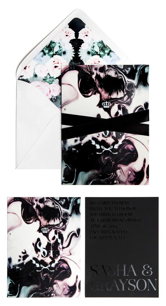
The last few are not really in groups, just other whimsical or beautiful invites that I love. How about the colors on this Rorschach inspired invite? It’s a stunning mix of the marble and watercolor themes.
And what about the mix of lively mix of monochromatic prints and textures in this modern suite? Love the round font btw…
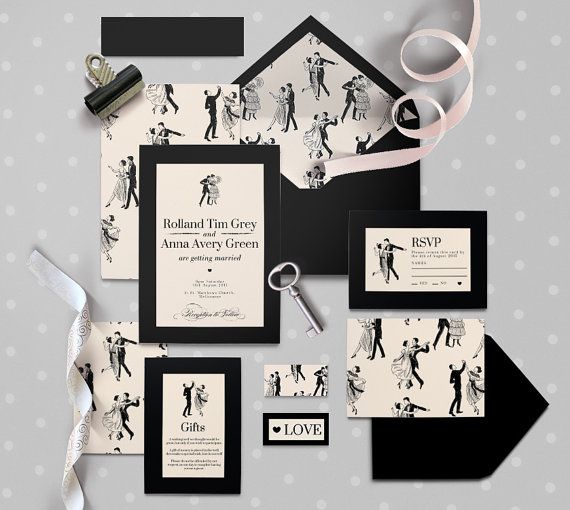
Lastly, I cannot get over the whimsical dancing couples on this invite! It totally makes you smile, but you get that it’s a formal affair. How fun and clever!
OK, now I’m desperate – WHAT IS YOUR FAVORITE???
See the rest of my invitation loves on my Pinterest Board
