Somewhat unexpectedly, my brand has become synonymous with bold colors and prints. When I look back at my favorite outfits, they are almost always where I took a risk with color or print, which is strange to me because there was a time when I stayed as far away from prints as possible.
In design school, I never ever ever designed with a patterned fabric, and although I experimented with color, I always grounded a bold color like red back to standard naturals like black or brown. My use of color and lack of pattern is representative of my skill set at the time, very rudimentary. I remember actually thinking to myself into my twenties that, “I am not a print designer or wearer,” mostly because patterns to me were always very bohemian, and of course bohemian, I’m not.
But in the last few years I have become very comfortable with print and pattern, even to the point where I can say I would rather invest (i.e. spend money) on an over-the-top patterned or embellished item for my wardrobe instead of a basic solid color item. So I have to be reallllly comfortable with how that print is going to work into my wardrobe for the next 5-10 years. In the past, mixing prints was a J.Crew thing, always grounded with stripes – leopard and stripes, florals and stripes, paisley and stripes. These old rules obviously still work for pattern-mixing, but I’m here to present you with a fresh take on mixing prints, that help you to elevate your look to a more unique perspective!
The New Rules of Pattern Mixing
There are 2 new rules, and they are surrounded by the exact same principle, same on same.
Same Print on Same Print
They don’t have to be the exact same print, but mixing a visually similar print, like plaid on plaid, or leopard on leopard, is a more advanced (and actually, easier!) way to mix prints! Our eyes can actually recognize them as the same print in one quick view, as opposed to bouncing around recognizing all the different prints. This tends to make an outfit look more layered and color blocked, instead of discontinuous. The resulting look is intentional and sophisticated, almost as if the pieces were designed for each other.
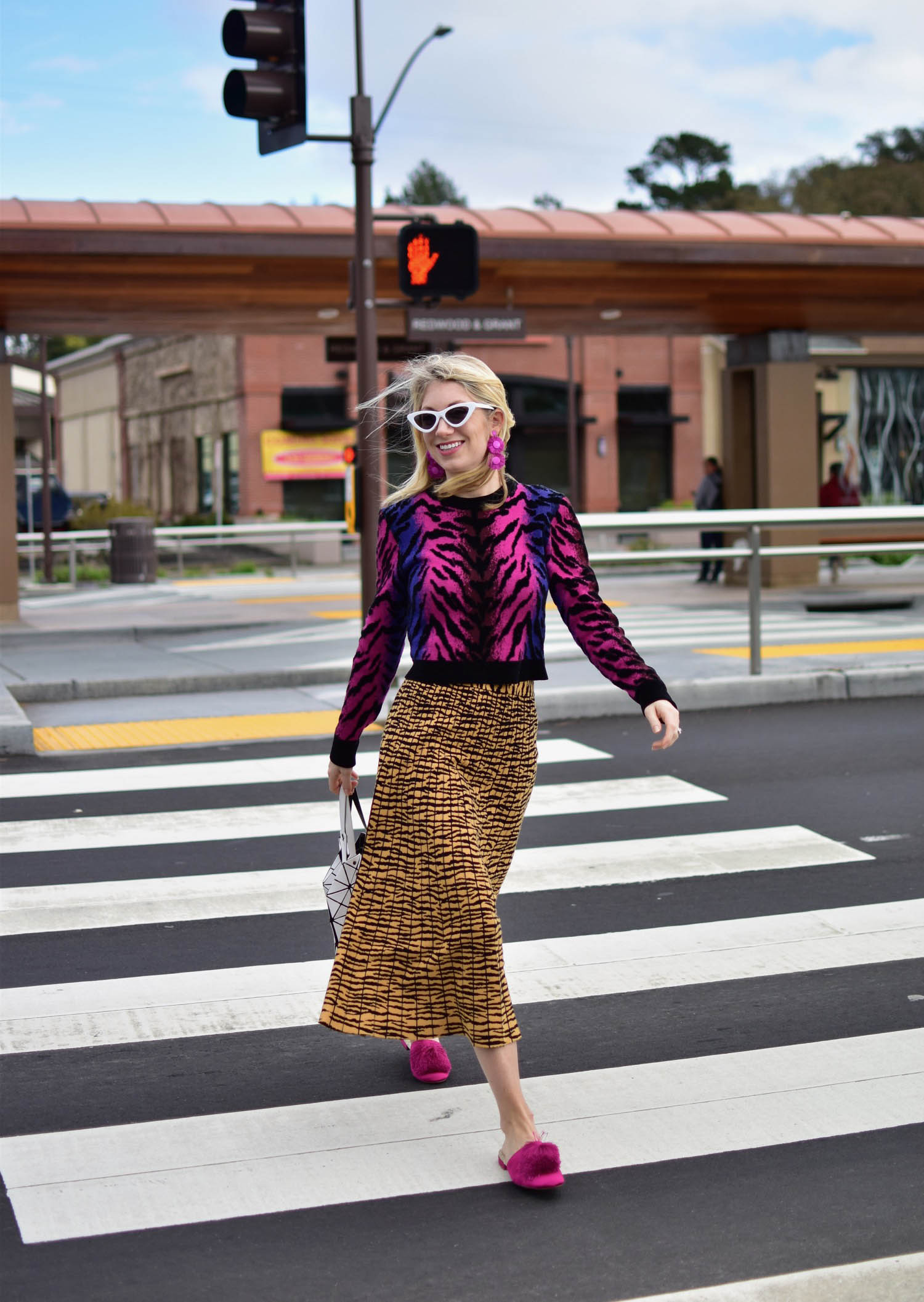
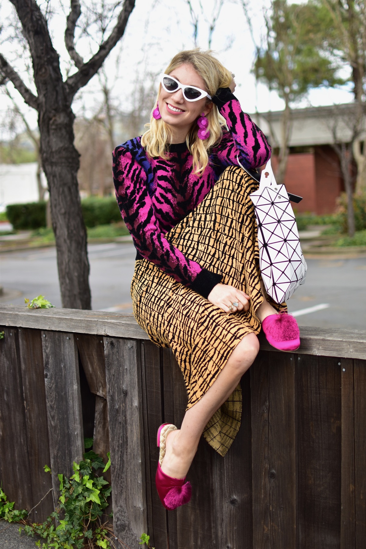
When mixing similar prints, feel free to play with color and scale. For instance, this fuchsia tiger sweater and this tiger knit skirt are similar prints, but wildly (pun intended) different colors.
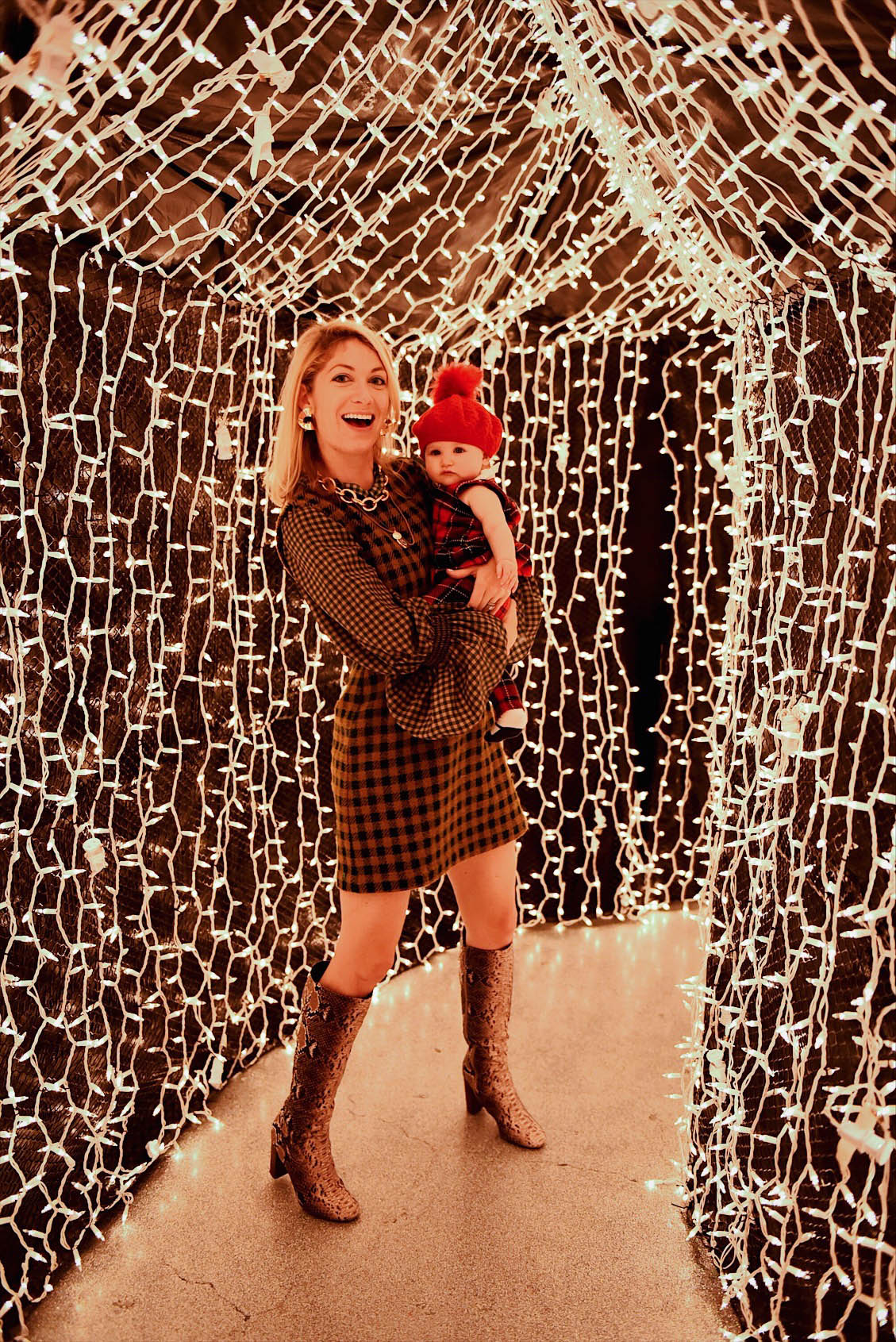
Another example is this Sea New York dress that is actually one piece, but so many people thought that I layered the two items separately. The varying scale of checks works perfectly together!
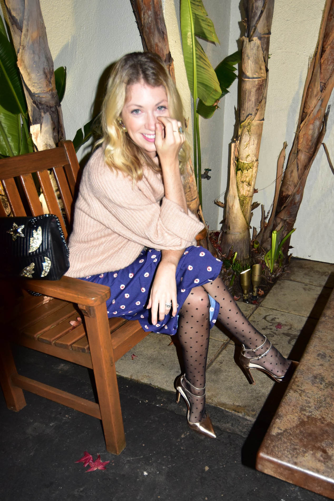
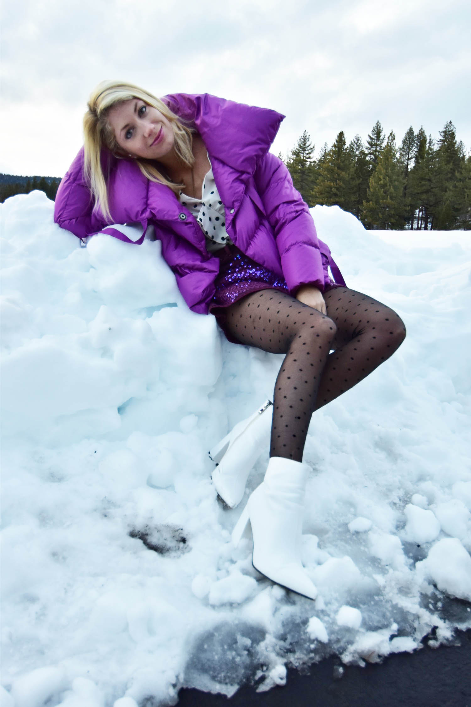
Don’t forget about your accessories! I mixed dots in these two looks by combining my dot print tights with the dots on my skirt and top. If you wear a lot of stripes or leopard, a striped or leopard handbag actually could be a fantastic outfit completer, instead of being something that ‘doesn’t go with anything’.
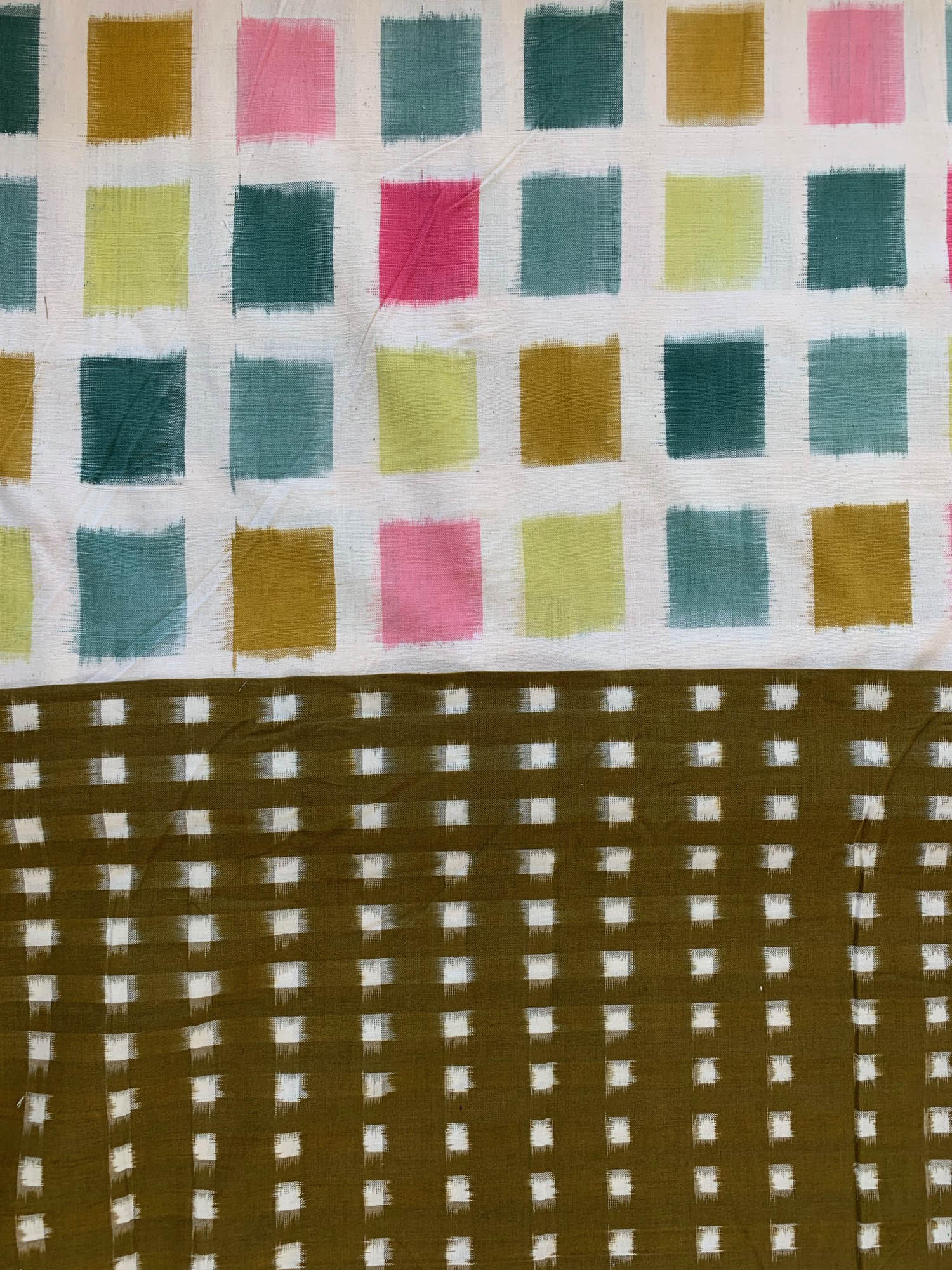
I am actually working on a new dress right now (some of you have been following along on instagram!) and bought these two prints to go together. They are both ikat checks, but in different scales and color ways, but using them against each other feels like a natural fit!
Same Color Palette on Same Color Palette
This one may seem a little more obvious, but I challenge you to take it to the next level when picking your color palette. Instead of just sticking to black, grey and navy blue with your prints, this should allow you to feel more comfortable shopping for prints in the same color palette. For example, if you absolutely love emerald green or leopard but feel like it’s too bold of a choice to invest in, after you accumulate a few pieces in the same theme, they become easier to combine and mix and match. And don’t forget about Rent the Runway Unlimited, which is where I rent a lot of my fun pieces and experiment with the crazier printed pieces, as a resource to complete the look without having to keep in your closet forever.
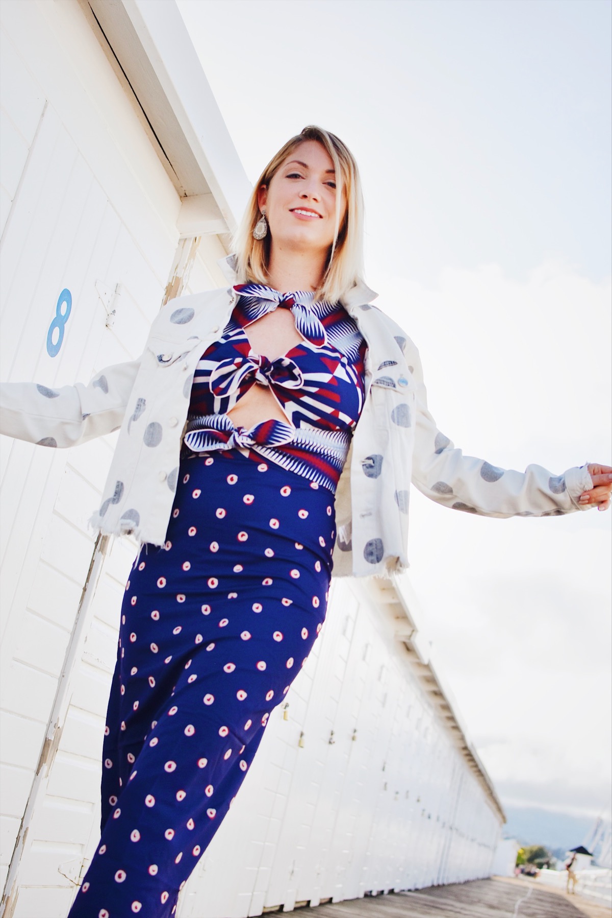
I designed this top and skirt set (a reader favorite) last year and designed all the prints myself. Each print is totally different, but because they are in the same color palette, they work perfectly together!
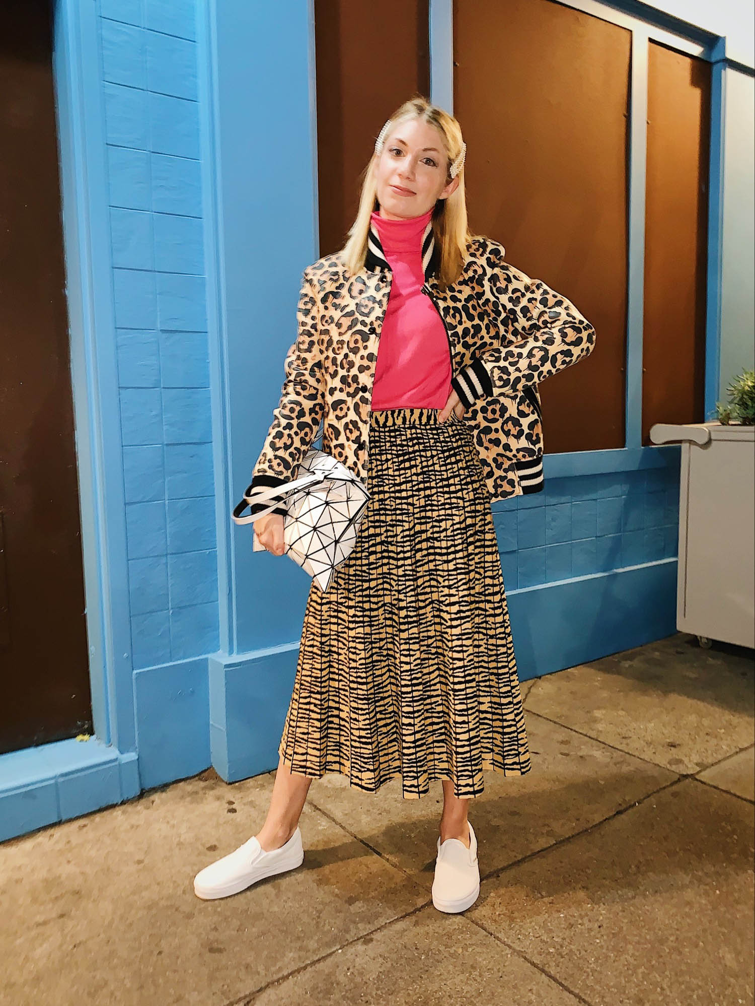
That same tiger skirt from above is totally cool mixed with a cheetah jacket in the same color palette, and somehow, doesn’t seem tooooooo crazy, right?
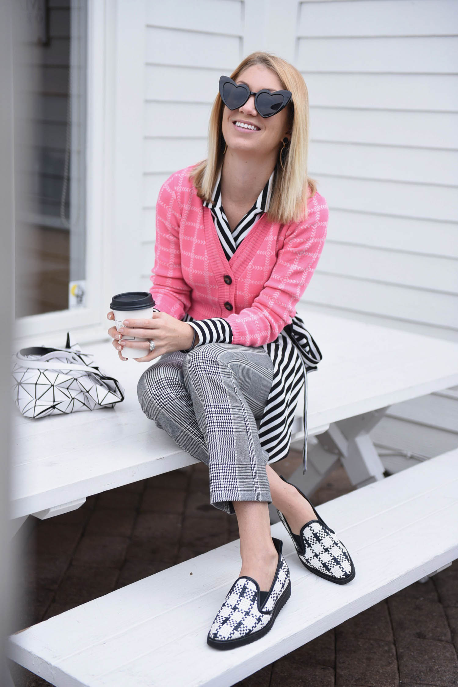
If you are sticking to black and white, mixing a few classic geometric prints at a time is fun, like I did with my plaid pants, striped top, triangle bag and leather woven shoes. Of course knowing me I had to layer in the checked pink sweater as well, but the look would have worked without the pink as well!
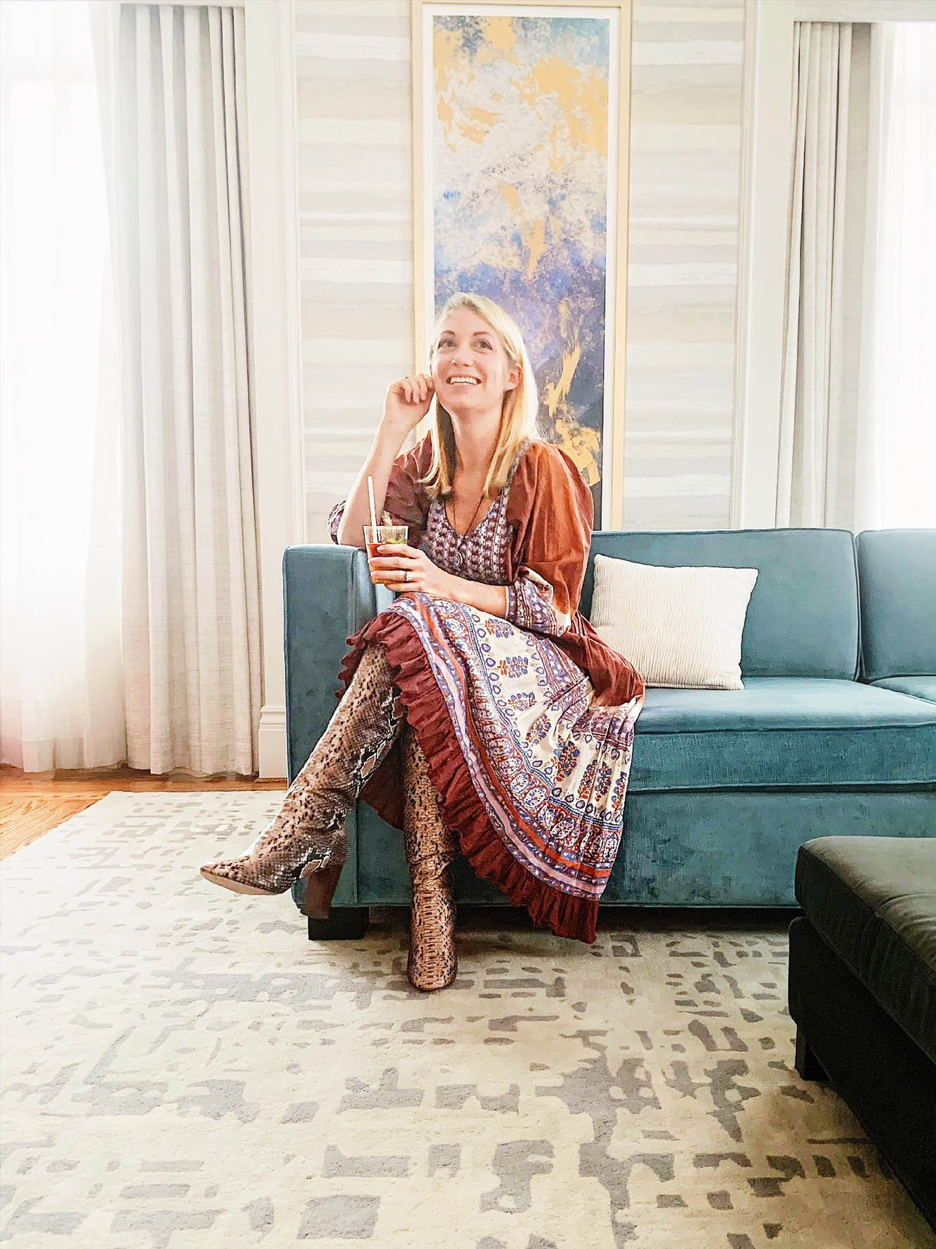
Another way to do a subdued palette is again to think about your accessories. These bold snake print boots have been in my closet for almost 8 years and always look cool with tan/cream/brown/mauve prints, like with this dress.
Mixing prints can actually be really gratifying, once you have a few secrets up your sleeve. When you find that perfect printed item in the store that plays off something you have in your wardrobe already, it’s like placing the last puzzle piece. Plus, it allows you to express your individuality and complexity, without looking cookie cutter!
