My midcentury floral dining room is officially done (for now)! As it took 2 months to decide on wallpaper, light fixtures and the dining table, I barely remember how the room looked before. Good thing I have pictures!
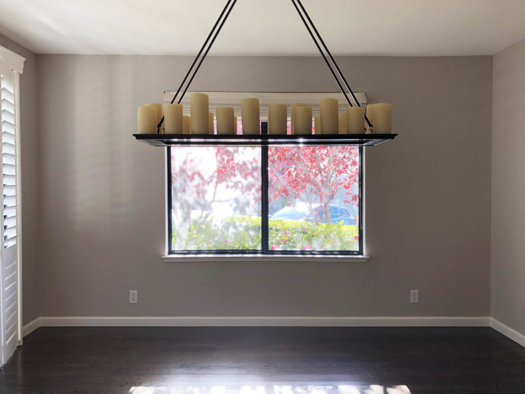
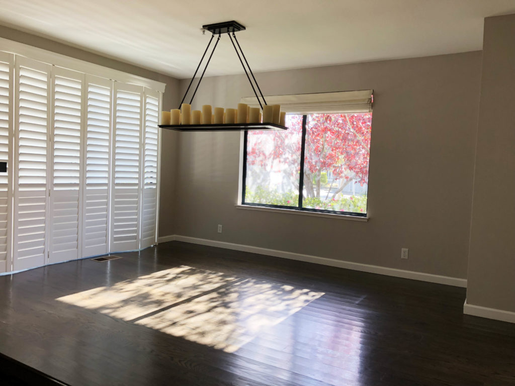
The first thing that had to go was the wall color. Although there is a giant window and a sliding glass doors along one wall, it’s still a fairly dark space. I chose to paint the walls Decorator White by Benjamin Moore, and accent with trim painted in Benjamin Moore Onyx. We added a simple trim around the window to make it pop more, so the black would stand out. Although I would have preferred to make all the trims match, the built out trims and blinds around the sliding glass door were put there by the previous owner and were very expensive (and practical!) so there was no point ripping them out. While most designers would say that highlighting these inconsistent trims in black is a no-no, I don’t have an issue with it! It gives dimension to what would otherwise be a very basic white wall.
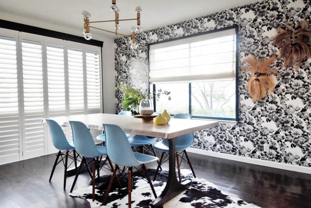
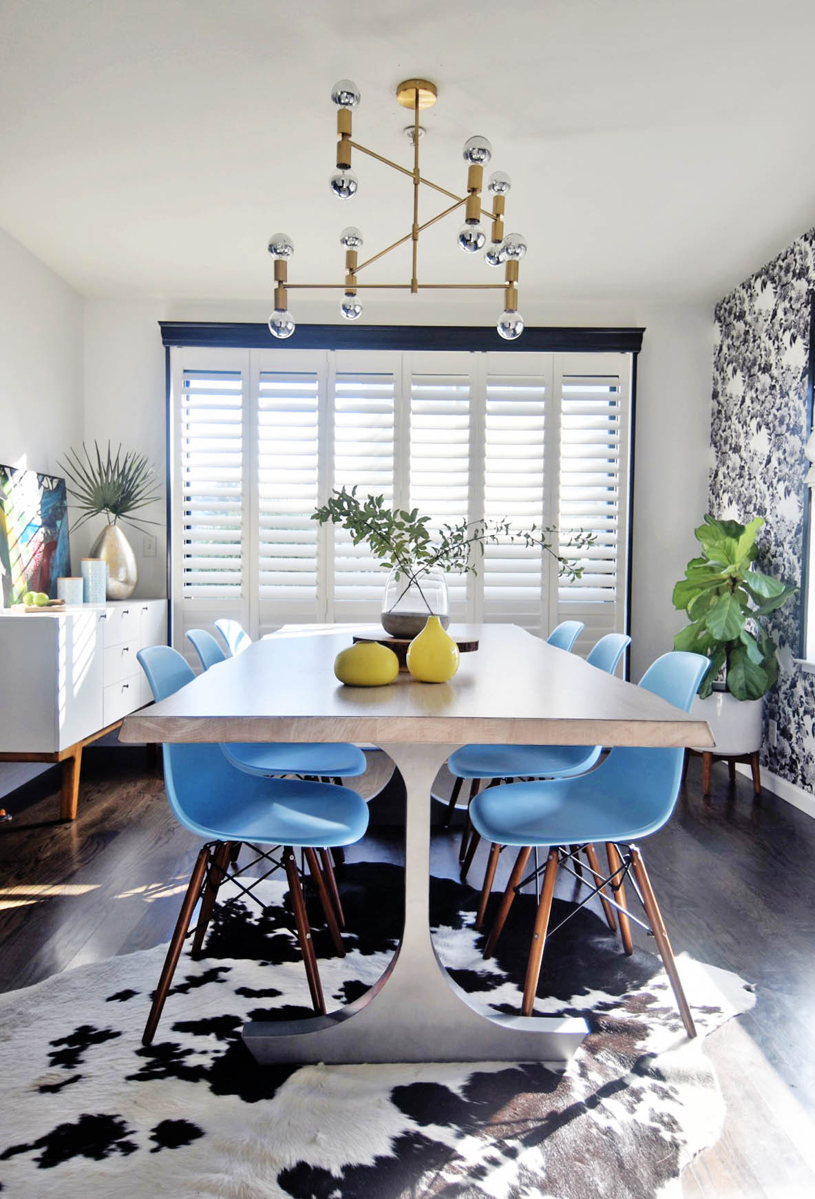
Let’s talk about the light fixture, shall we? I received a lot of great recommendations from readers as to where to find Lindsey Adelman bubble chandelier replicas, as well as some other great alternatives. Although we almost pulled the trigger on a light fixture that was $800, we ended up deciding on this much more affordable one from Attomic Lighting on Etsy. It provides the right amount of light for this dark space but doesn’t weigh down the room like the prior fixture did, and I love the combination of the brass hardware and chrome dipped bulbs.
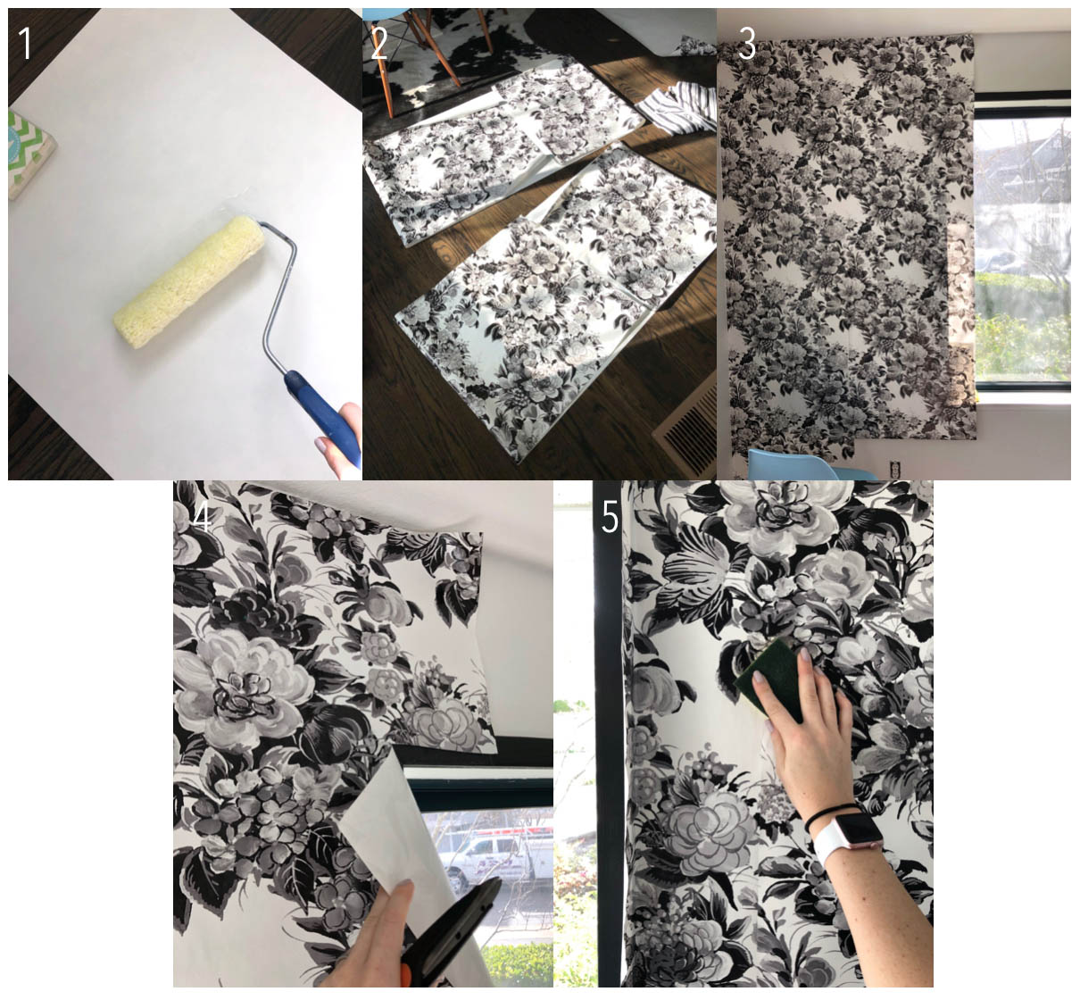
The next step was installing the wallpaper from Spoonflower. I have been in love with this black and white floral design by Peacoquette on Spoonflower for a while, so I was thrilled to work with them to install a wallpaper feature wall in my dining room. Their wallpaper is removable and repositionable, so it’s extremely easy to install and then remove in a few months or years if you change your mind! This is the second time I have installed their wallpaper in one of my homes and I’m telling you, it get’s easier every time! Although I suggest grabbing a friend or a partner to work with you to install it, I managed to do it by myself quite easily, in under 2 hours!
How to Install Spoonflower Wallpaper
- Lay out your roll of wallpaper face down. Using a wet roller (keep a water bucket or tray nearby) roll water on to the back side of the paper to activate the adhesive.
- Fold the top and bottom portions of the wallpaper roll in on itself as you let the water continue to activate for 3-5 minutes. I took this time to prep my next roll, so that I was constantly working one roll ahead.
- Unroll the top portion of the wallpaper design and line up to your ceiling. Use a wet sponge and your hand to smooth out any air bubbles.
- If working around a window or door, have scissors nearby to roughly cut around the edges of the wallpaper about 2″ away from the openings.
- Grab that sponge and really take your time smoothing everything out. This is your chance to make sure the patterns align and the wallpaper is pressed into each corner and nook. Let dry a few hours.
- Once completely dry, use a box cutter or exact-o knife to cut around the loose edges of wallpaper (not pictured).
- Stand back and admire your work!
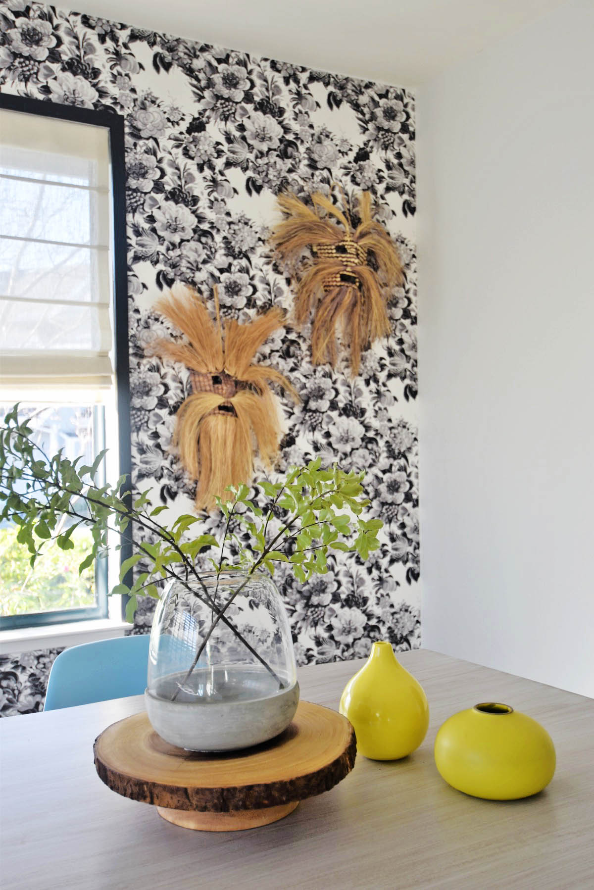
This wallpaper came out better than I could have possibly hoped for! I am in LOVE with the bold pattern, and feel like it adds so much design impact to this space. I can’t believe how easy it was for such a big impact… now I’ve got the wallpaper bug and am strongly thinking about how I can incorporate more in my bathroom renovations later this year!
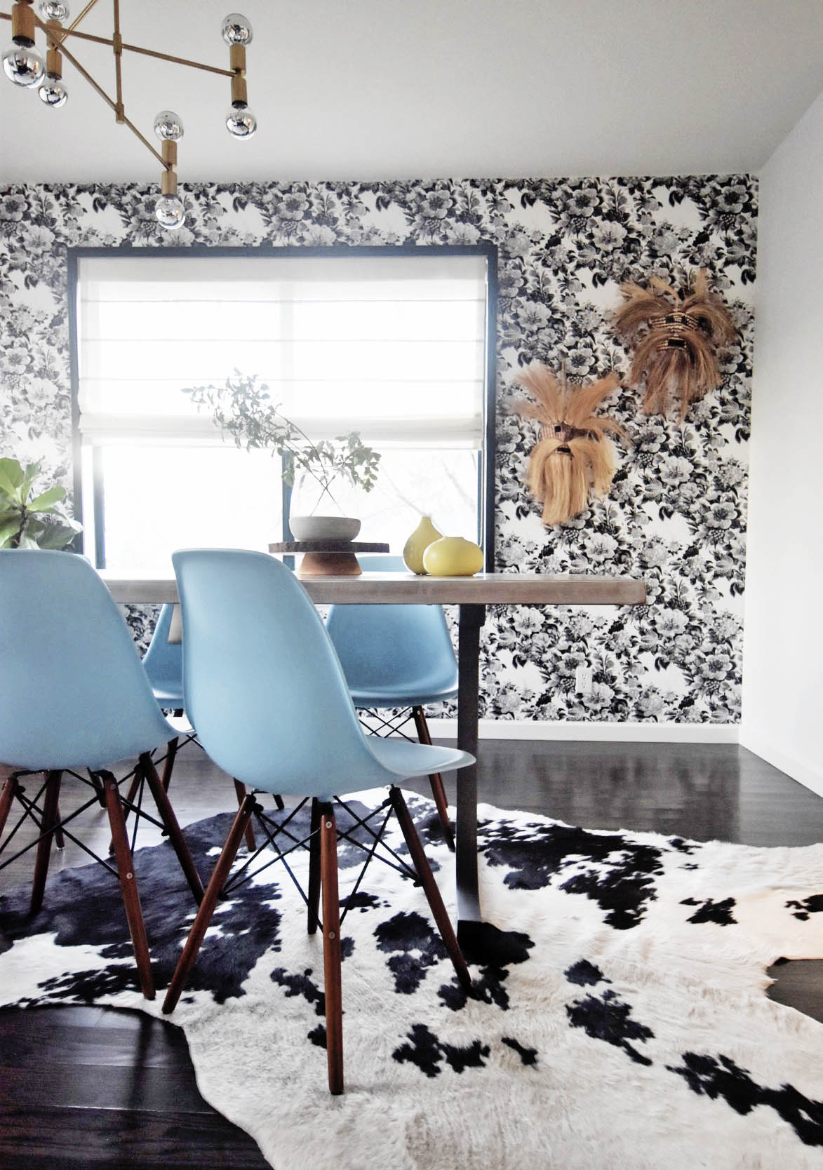
So many of you weighed in on the table discussion, and the votes were pretty evenly split between a natural wood table or a white washed one. I actually think both would have been beautiful, but I love a good, clean white table as a backdrop to work on, so that won out just slightly.
The light blue Eames inspired chairs are the perfect accent color for the space, plus being plastic… they are perfect for messy future kiddos! And truthfully they are surprisingly comfortable for the price!
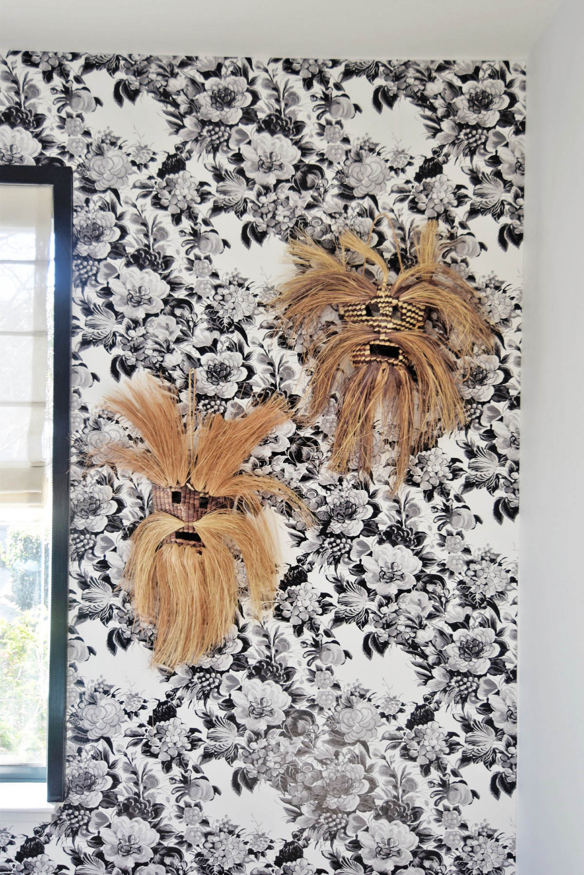
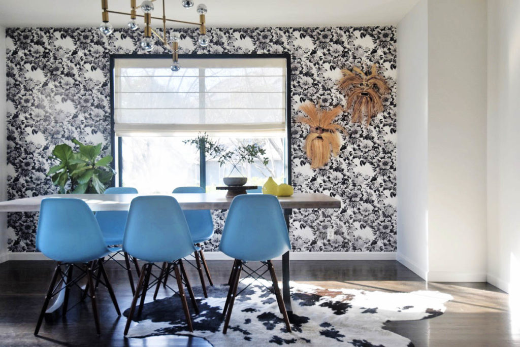
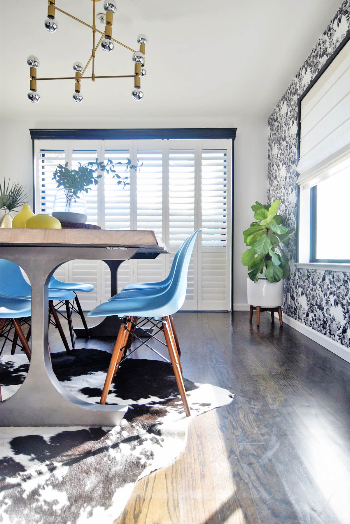
Lots of greenery and chartreuse accents add the punch of color this room needs to make it look lived in. I added my crazy Mexican Straw masks that I picked up on my trip to San Miguel de Allende for a little more of a traveled, boho vibe.
While this room may seem a little difficult to reinvent year after year, I already have so many ideas as to how I can redecorate with vases, plants and accents to make it look new season after season, year after year.
Get the look of my midcentury floral dining room below!
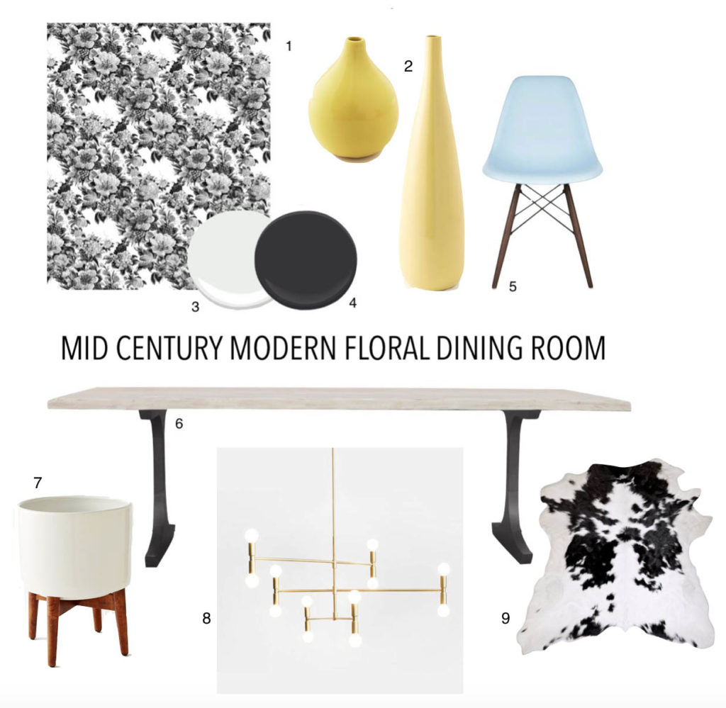
1 Floral Removeable Wallpaper // 2 Chartreuse Vases // 3 Benjamin Moore Decorator White // 4 Benjamin Moore Onyx // 5 Light Blue Mod Chairs // 6 Bleached Wood Dining Table // 7 White Planter // 8 Modern Chandelier // 9 Black and White Cowhide Rug
What do you think of the finished dining room?
