For those of you who followed along with my home renovations, I apologize that this one seemed to take FOREVER to get photographed! We were ‘almost done’ for probably 3 months, but finding the time to finish those last few parts (and really, we still aren’t completely done) with a new baby seriously took forever. But now, everything is basically complete, so I thought I would formally reveal the transformation!
Let’s start with the original images of the house from when we moved in.
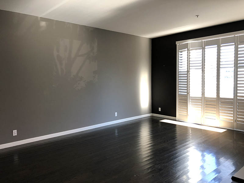
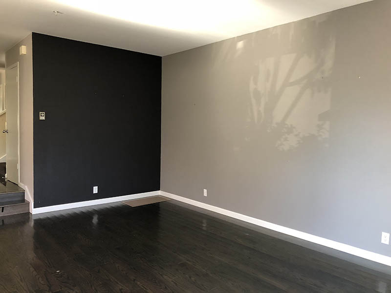
As you can see when we moved in the walls were a mix of grey and charcoal, which really darkened the dining room. In contrast to the upstairs of this home which has a lot of natural light, the downstairs is much cooler and darker. My first thought was that it needed to be lightened up, so we painted the entire downstairs Decorator’s White by Benjamin Moore. Truthfully, I couldn’t decide which white to go with and time was short between moves, so I picked a white that was not too cool and not too warm, just to act as a clean slate for however I decided to decorate it later on.
The key risk I took was in painting the border of the window shutters Onyx, by Benjamin Moore. I knew I wanted to add high contrast in the room, but my original idea was to add crown moulding and paint them and the floorboards black instead. I think I scared Mr. R off slightly, as he was a little worried the next owners would be pissed that I had basically jeopardized all of the moldings in the house. So we settled on the just the borders of the windows and shutters, which can be replaced or painted over easily. I was a little worried that it would look wonky since the window frame borders were all different sizes, but in the end, I think it works! Almost the entire back wall of the room are these shutters, so if it were all white, it would have just looked like a white abyss- this way there is some design detail to provide a frame to the space.
From there, I created my initial design mockups, which you can read about more in this post.
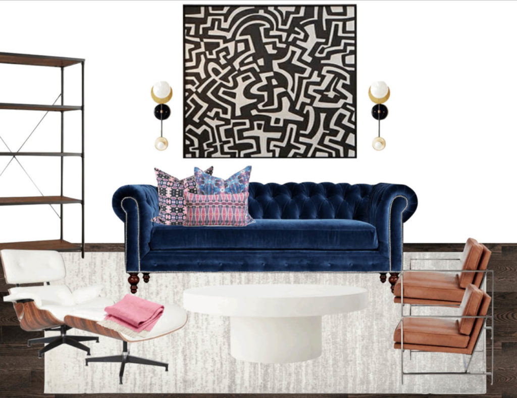
From this original design, a few things went awry, mainly the coffee table, the art, and the lighting, which I’ll share about here.
Coffee Table
My initial mockup included the Shroom table from CB2, and I’m actually still obsessed with this piece. Unfortunately, the two size options were either too big or too small for my space (the smaller one is 2″ shorter!), so I needed to go in another direction. If you saw this post around light white coffee tables, you would have thought that I had a ton of options, but all of sudden I hated all of my original options. So the hunt started again and as much as I wanted to avoid iconic, obvious pieces (where all I can afford is a replica) I kept coming back to the Saarinen tulip table. The bright white, the curved edges, the airiness… all what I was trying to achieve. So I bought the sucker and never looked back.
Art
As you can see in my original mockup, I was planning on a large scale black and white piece, ideally something that I created myself. But time just kept ticking on by, and I felt overwhelmed by the idea of buying and painting a gigantic canvas and not messing it up. All of a sudden I had an abrupt change of ideas – to play off of the colors in my gorgeous bunglo pillows that I am obsessed with, and create a large scale pop art gallery instead. I AM OBSESSED WITH HOW IT CAME OUT and I think everyone needs construction paper in their home to make this happen. Read the DIY here.
Lighting
My final issue is lighting, as I really really wanted sconces for this room but I called in an electrician and he said that it would cost upwards of $1k just to rewire that back wall… so I had to change plans. I ordered these awesome midcentury sconces that I am obsessed with, in a plugin version, and I went with a black cord because I figured why try to hide it? An intentional cord can be cool if secured nicely. Well… I didn’t realize that the on/off switch would be so visible on the cord, which seriously ruined the vibe of the whole room. I fiddled with what to do for a week before I decided to order cord covers for the bottom half of the cord, so it doesn’t look quite as imposing. I’m not sure it’s the best long term solution, but if I fiddle with it forever then we will never get this posted! Life is a work in progress, my living room can be one as well.
So what does this room look like, anyway?
Ok, ok…. here is the finished space!
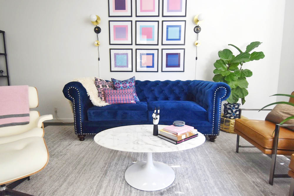
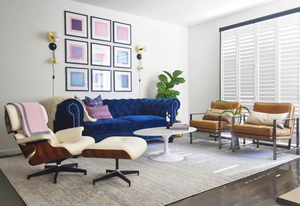
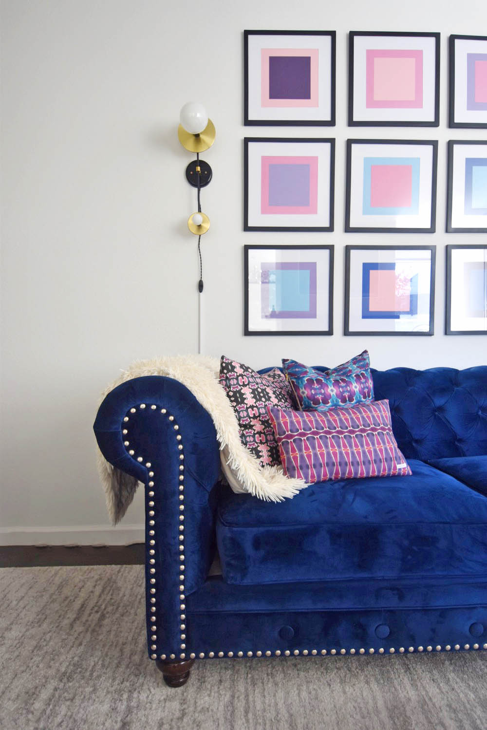
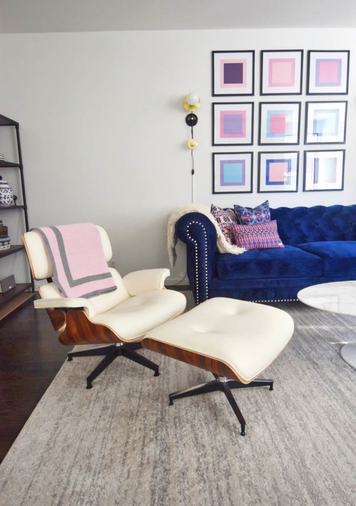
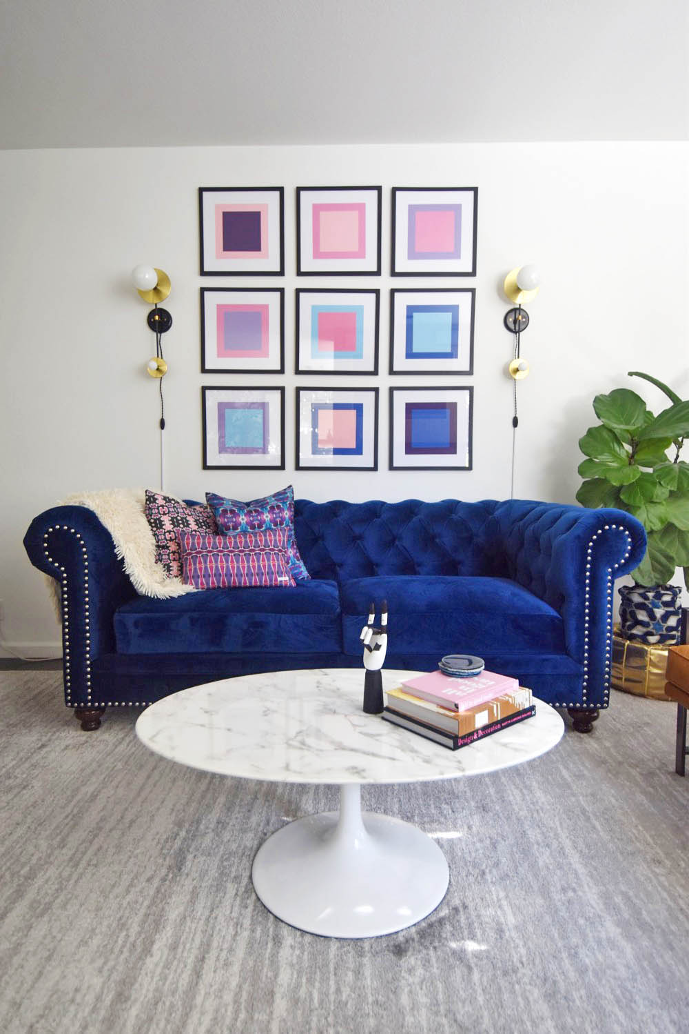
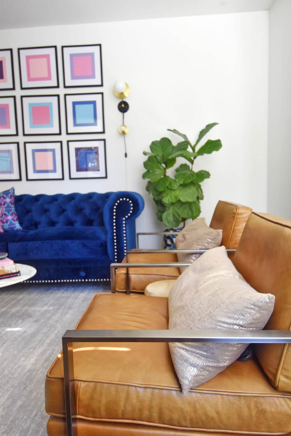
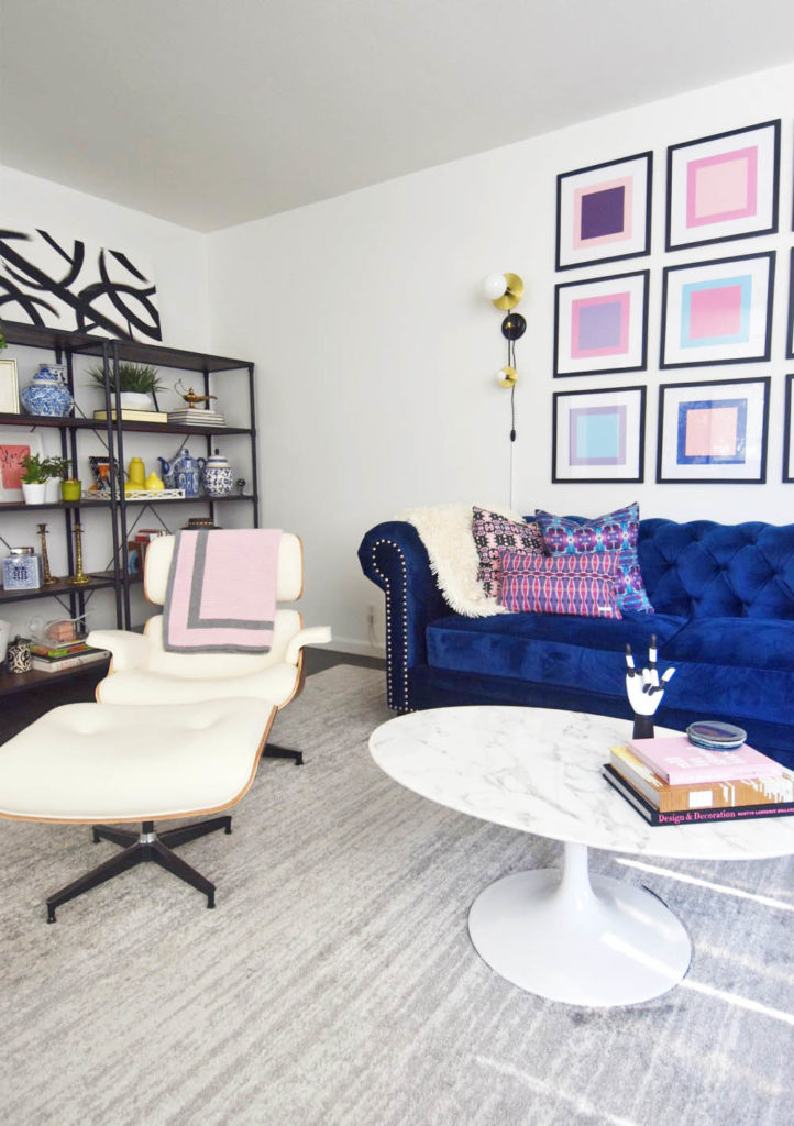
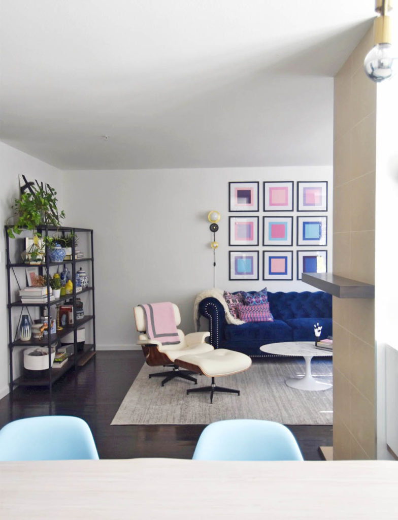
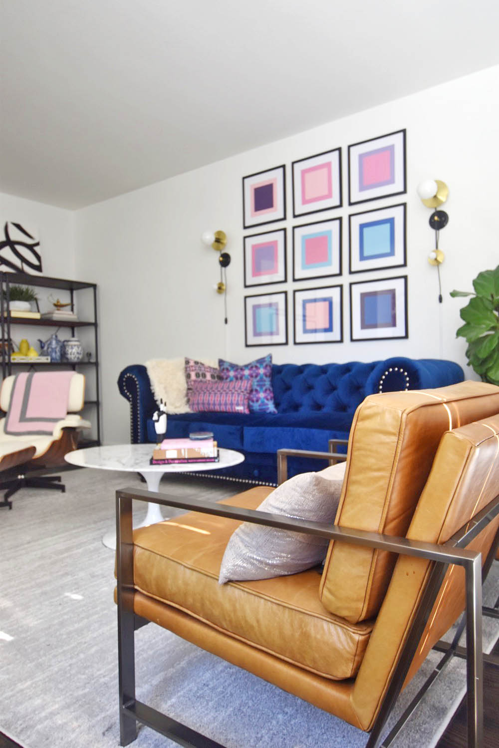
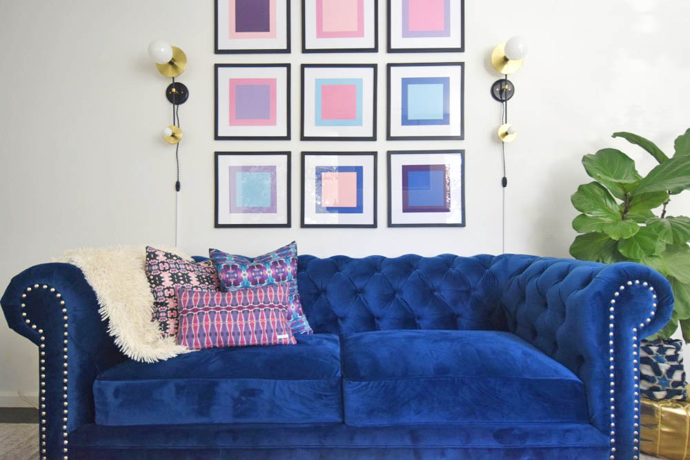
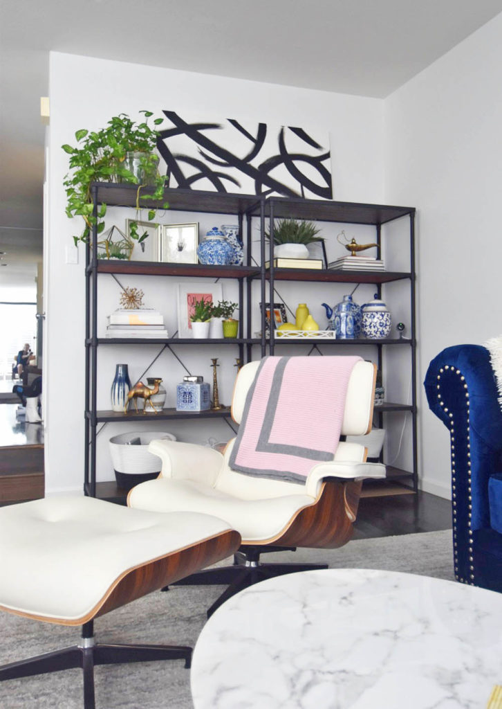
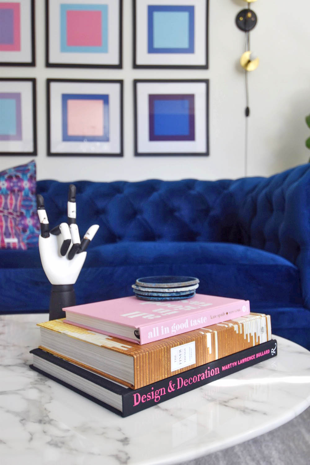
What do you think? Get the look below!
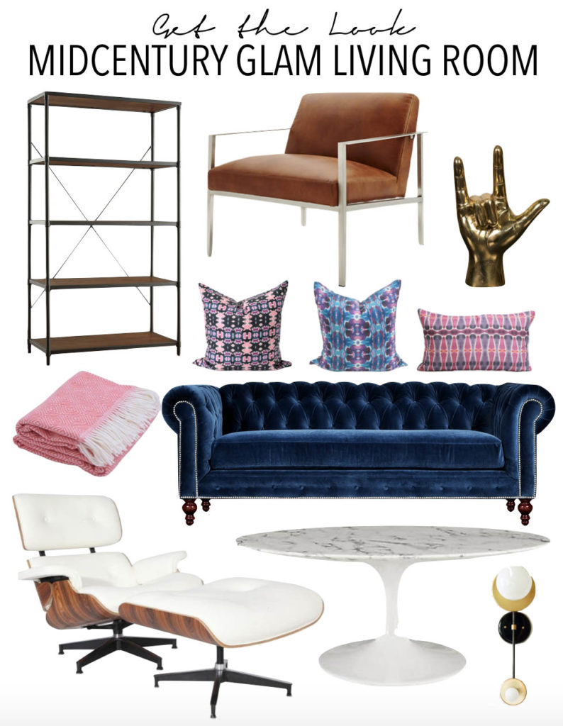
Metal bookshelves // Leather armchairs // Gold hand sculpture // Bunglo pillows 1, 2, 3 // Navy Chesterfield // Pink throw blanket // Eames lounge chair replica // Saarinen tulip table replica // Double sconces


