It’s been a looooooong time coming, but I finally set up our entryway to my liking and wanted to share it with you here. The reason this project took so long is because the wall used to be covered in a floor-to-ceiling mirror, which was expensive and dangerous to rip out. When we finally had out painter come to paint the upstairs of our home, I had him work on this wall as well to be more efficient with his time and my money. Then, we had delays and delays in the delivery of the table, had a mirror to get fixed, and I was sent the wrong rug twice before I gave up and ordered a different one.
Even though we had a few issues, I am thrilled with the result! It is exactly what I wanted; sophisticated, highly textured, and luxe, which is the exact opposite of the 80s hall of mirrors effect we had before.
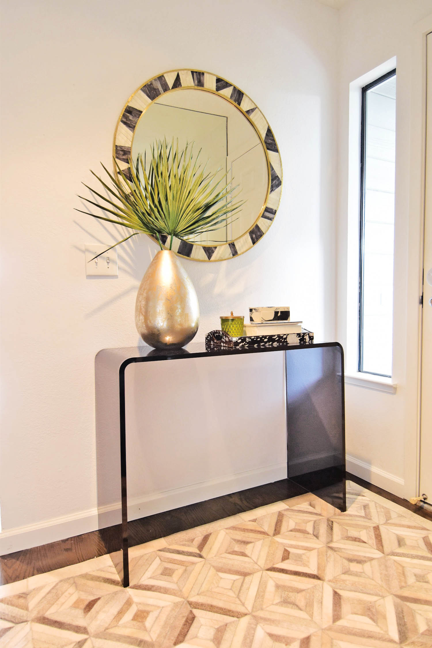
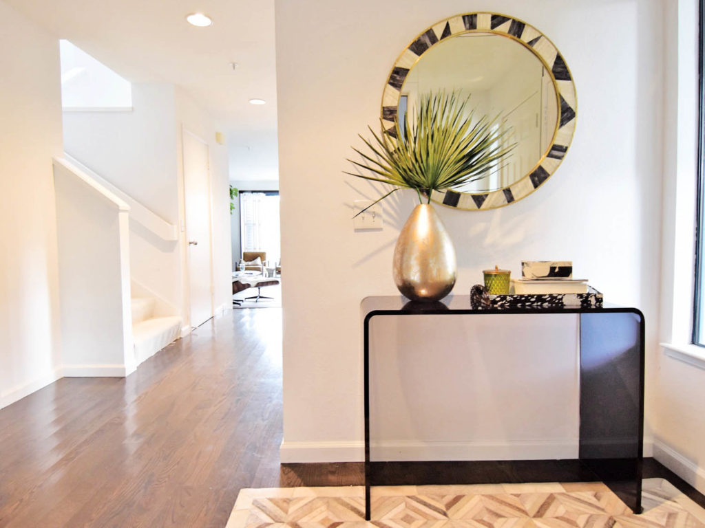
The entryway started with the mirror, which was actually one I chose for my parent’s bathroom. The first one they received was shattered, and CB2 generously said to keep it and they would send another one free of charge. Since I absolutely love the bone-inlay and brass texture of this mirror, I knew I had to get it repaired and use it in my own space. The mirror replacement cost $85, which is not nothing, but for 32″ round is cheaper than buying a new one!
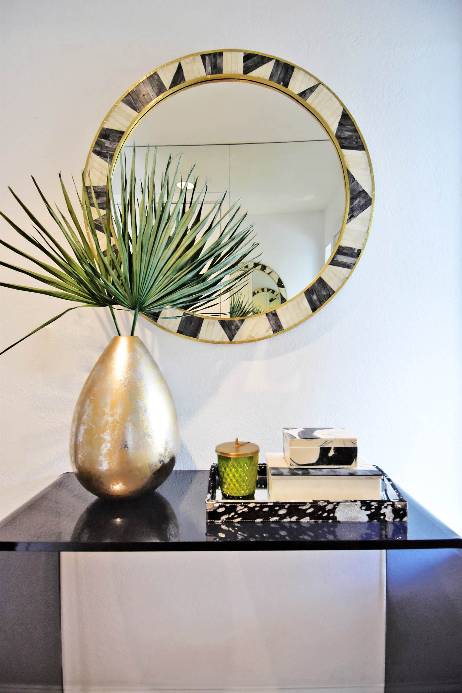
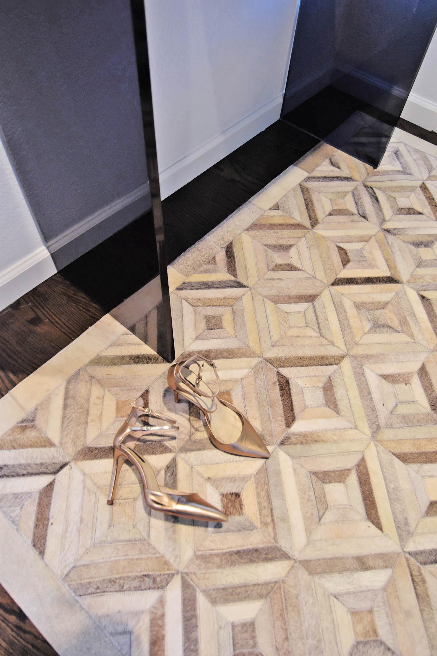
I have basically fallen in love with CB2 products lately, so I thought pairing the heavy inlay texture with this smoke acrylic waterfall console table also from CB2 would be the perfect way to keeps things light. For a rug, I needed something durable but thin (so that the multiple doors that open over it wouldn’t get stuck, and light to contrast with the floor and the console. I know that light rugs can be questionable for an entryway, but there is really nothing easier to clean and more durable than pieced hide rugs, and the fact that they give the ultimate look and feel of luxury was not lost on me. The cost of these can get up there quick the larger size you need, but in a smaller rug the cost is affordable, and gives a lot of look relative to the price tag. I also really love the border on this rug, which frames the space perfectly.
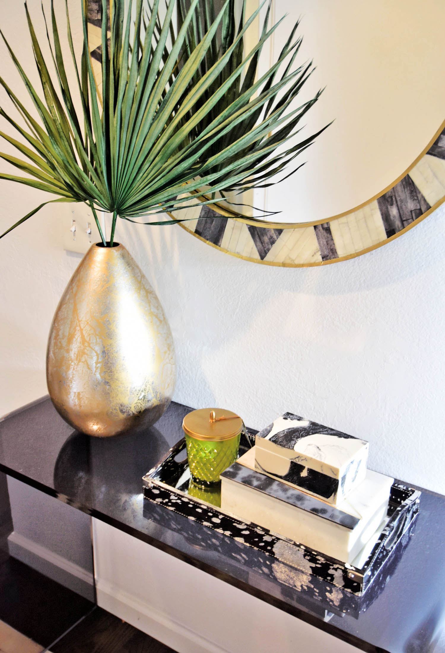
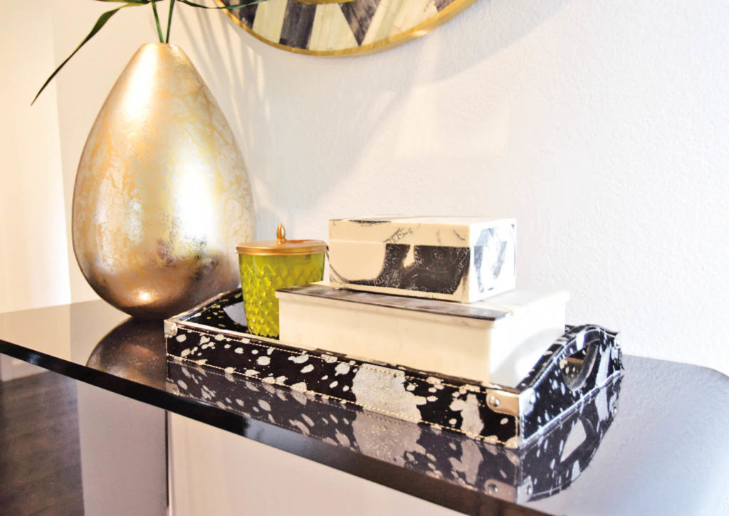
Filling in the rest of the details was quite easy. With a trip to Homegoods for a marble box and a hide tray and rummaging through my garage for an old vase to fill with dried palm fronds, the styling came together quickly. My few rules were to keep the accessories black, white, and metallic, and then layer texture on texture on texture. As long as I kept the palette neutral, mixing all of the materials and patterns together looks rich and layered, instead of cluttered.
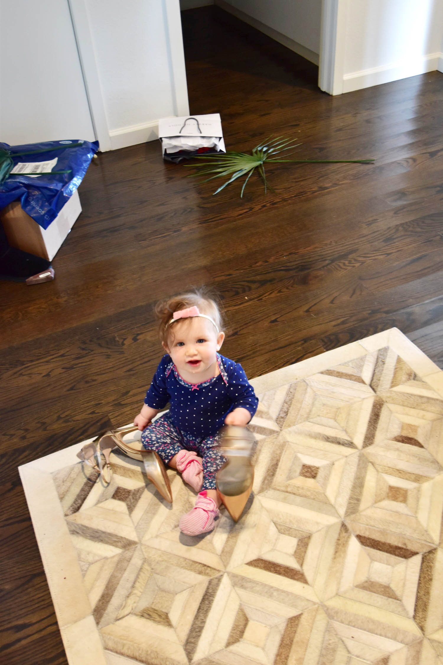
Thought I would throw in a little behind the scenes of trying to get the shot with a 10 month old running around… stealing my shoes, eating the palm fronds and climbing up on the piles of boxes and mail that actually clog this entryway most of the time! What do you think?
