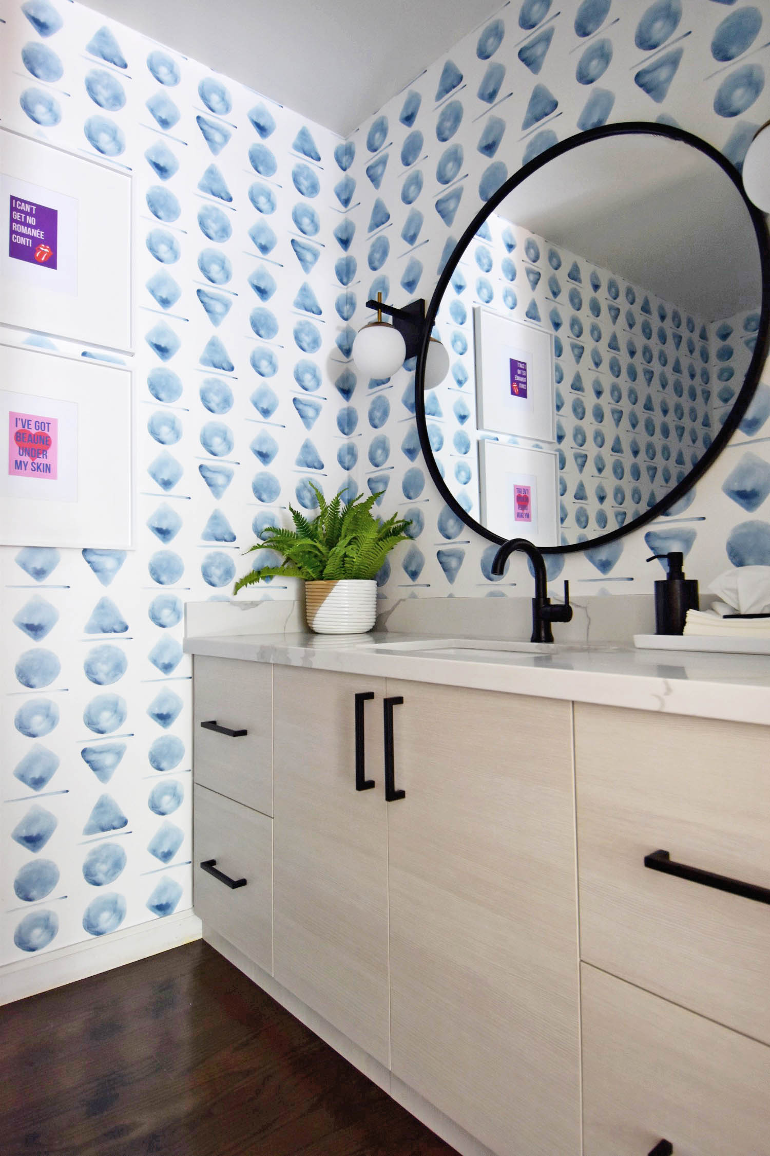
Whew! This post has been a long time coming, but BOY, IS THE REVEAL WORTH IT. Our powder room has been a project that Mr. R and I wanted to complete since the second we saw this home, but it just kept falling to the wayside with a baby and other more pressing projects to complete. All that waiting was worth it though because this modern watercolor powder room is what my dreams are made of and literally my FAVORITE room in the entire house!
I could not have put together this bathroom without the help of Spoonflower, so huge thank you to them for partnering with me on this bathroom redecoration!
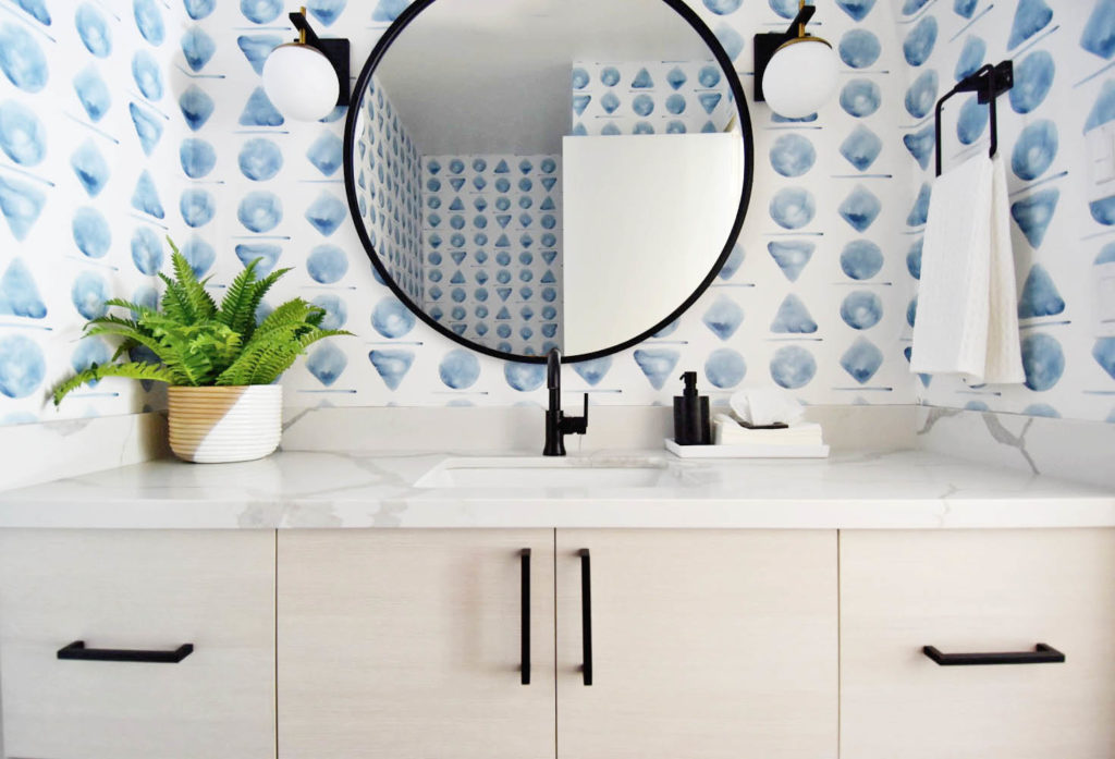
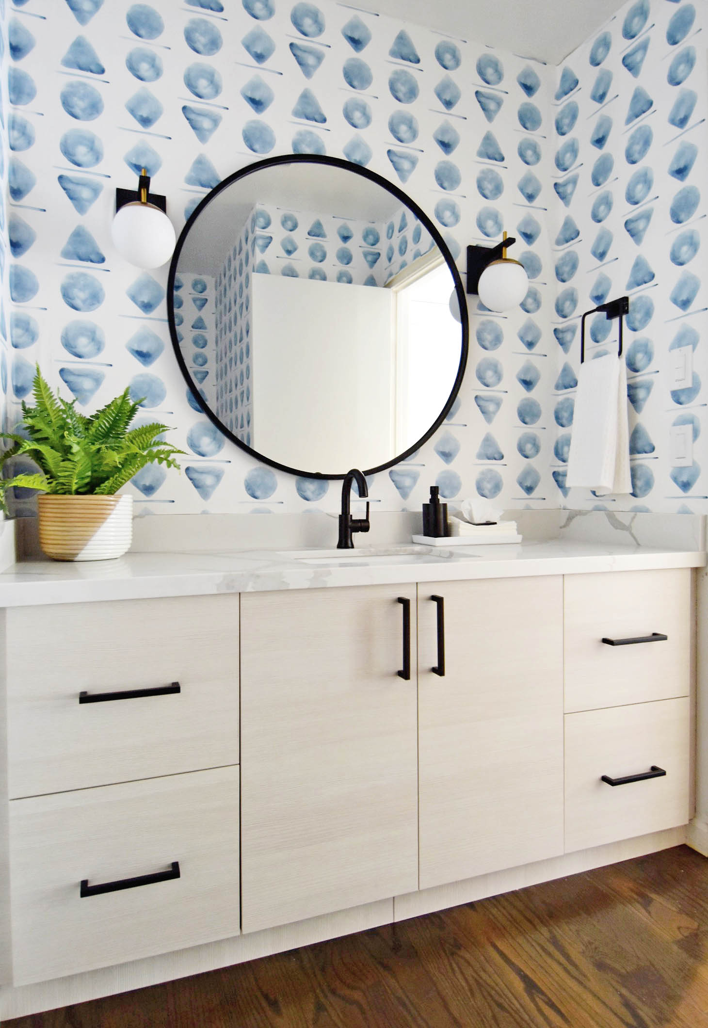
In case you need a refresher on what this room looked like before (all 80s everywhere) here is a post highlighting the before of the bathroom as well as the inspiration for the finished project. I could never have mocked it up as well as it turned out, so I’m thrilled that the final result is even better than my original project idea!
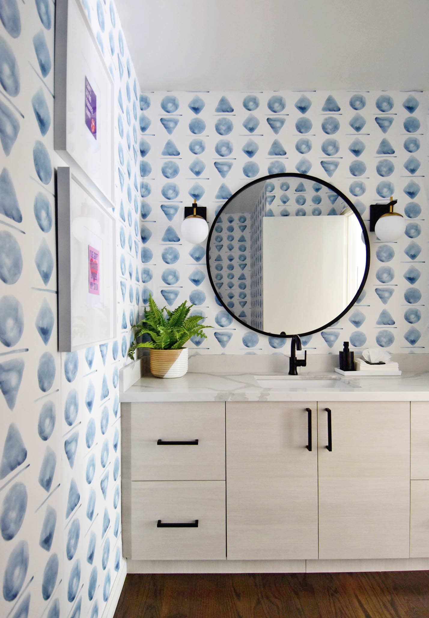
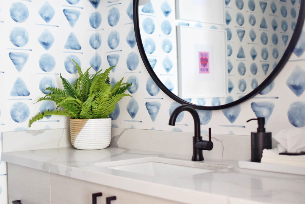
I absolutely love the large scale watercolor wallpaper, and taking that risk is what absolutely makes this room. Looking at the wallpaper alone without all of the modern and textural elements, I think it’s easy to write it off as too crazy and too bold. But remember this is a powder room, and the first room my guests see when entering my home. I wanted it to be clean, modern and FUN, and this large scale print tells that story completely. The best part is that with Spoonflower’s wallpaper options, you can install them yourself or with a friend/partner saving precious money on install. Plus, if you’re a commitment phobe- Spoonflower’s wallpaper options are easily removable and relatively mess free, meaning you don’t have to worry if you change your mind in a year or so!
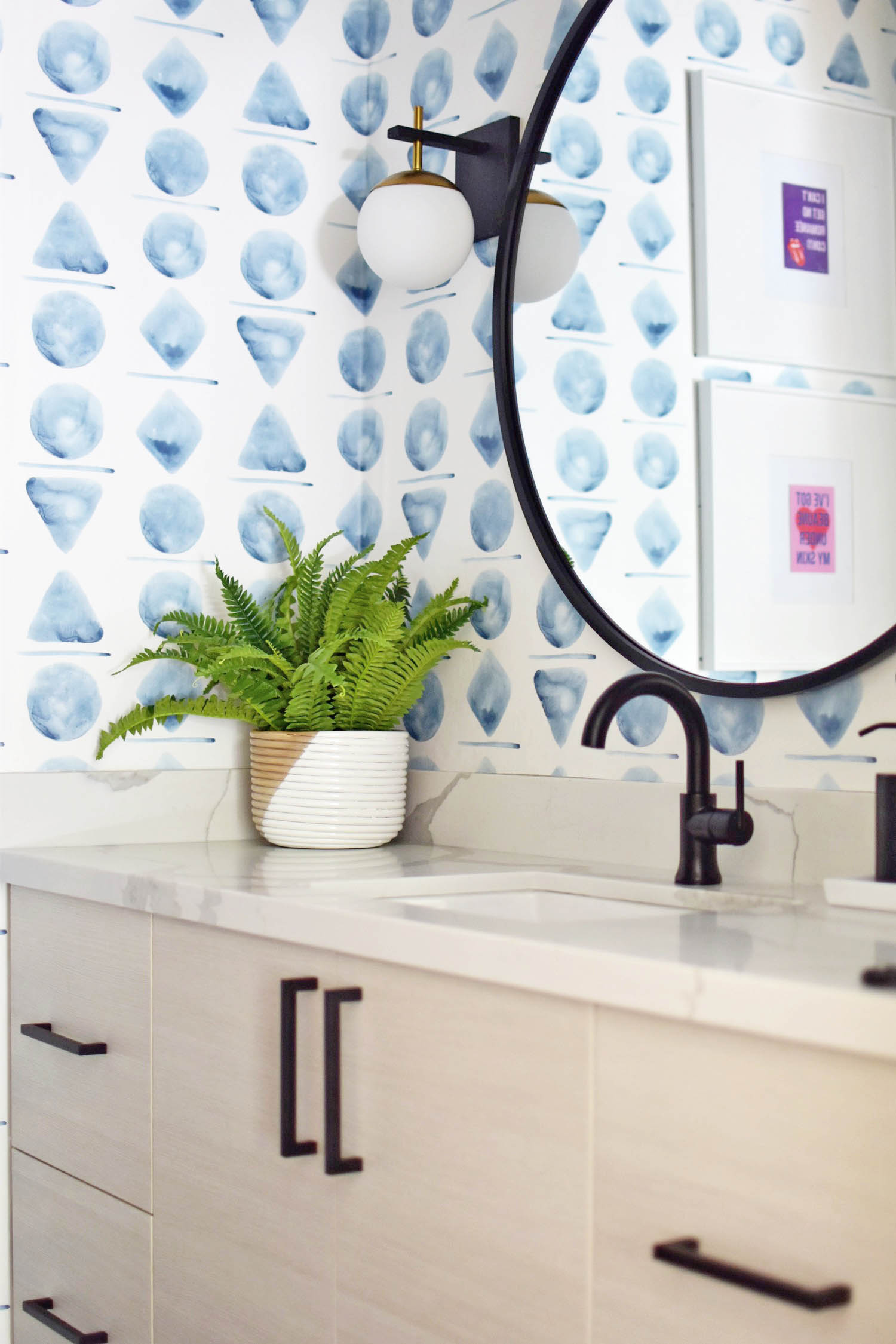
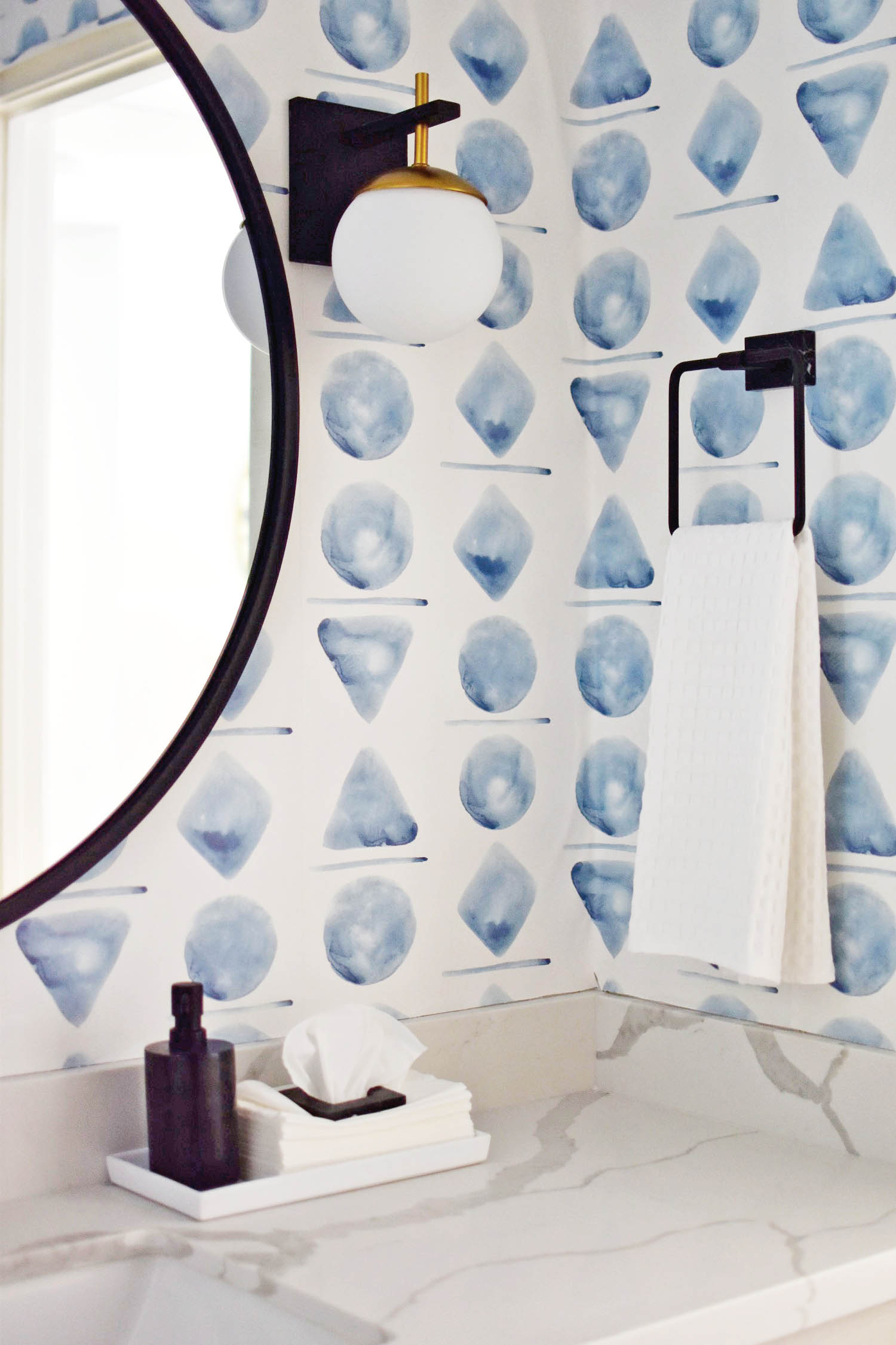
Designing a Modern Watercolor Powder Room
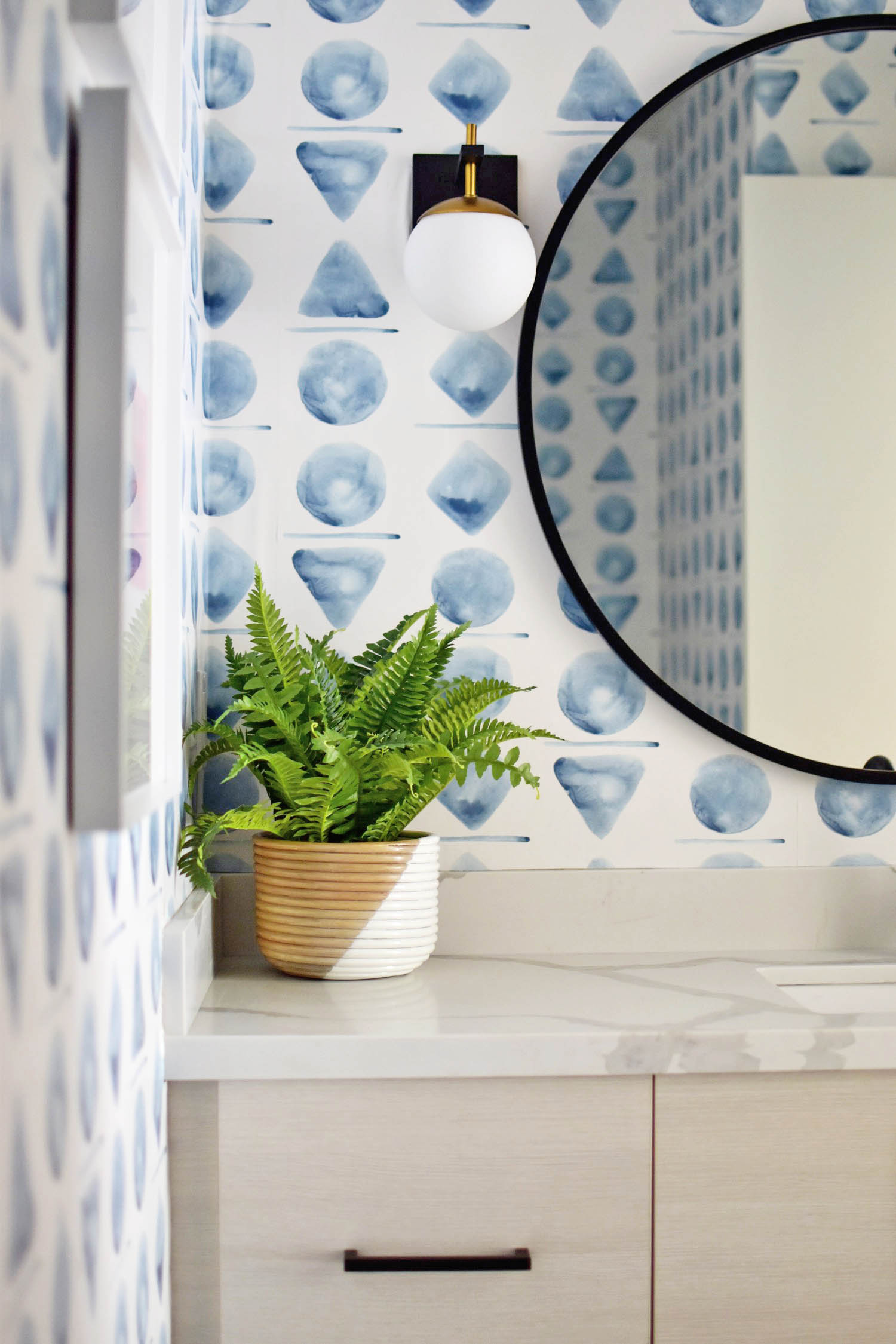
For the rest of the design of this space, I kept it modern and clean, with a luxe 3 centimeter quartz counter and undercount sink. I absolutely love the high contrast of black hardware, so the oversize round mirror and inexpensive drawer pulls were key to pulling off the look. One of the most important parts of the design is the ‘natural’ element, which comes from the bleached wood grain cabinets from Barker Modern, as well as the styling details in the bamboo CB2 basket planter.
I love how the globe sconces pair nicely with the oversize shapes of the wallpaper, but because they are white, they blend in seamlessly. Originally I was worried about too many ’round’ shapes next to each other, but I think with the black hardware sharp contrasts, the redundancy is nice on the eyes. Mr. R loves black marble, so I surprised him with a few more decor items from CB2 in black marble, including the soap pump, tissue square and towel bar, which counteracts the playfulness of the wallpaper and really gives a luxe experience for our guests!
People ask me all the time how to create their own wallpaper, so I figured I would also make this video showing you how to design your own Spoonflower wallpaper, including how to paint watercolor shapes like mine and turn them into a repeat pattern. It’s so easy to change the scale and colors, so you can really customize your wallpaper to your tastes without being an artist (trust me, I’m not).
How to Design Your Own Spoonflower Wallpaper
If you prefer a step-by-step tutorial, see the full instructions here on the Spoonflower blog where you can also shop my wallpaper design!
