So, many of you know I do interior design as well as this blog, but historically I’ve kept that world separate from my blog here because of client privacy and not having the pictures/images necessary to support a blog post. However, I have decided that where possible I would like to integrate my two worlds, so you can see how my thought process and how one skill set (sewing, fashion) influences another (interior design).
I will start incorporating more clients into this blog as allow me, so I figured why not start with one particularly close to home? That’s right, my parents. Although they will not officially ‘hire’ me… I am designing their new home anyway, letting them know what I would do with their home, whether they ask my opinion or not. What are daughters for anyway? My mom has long had her own point of view on design, and although we definitely do not have the same taste, I do expect her to take maybe a few of my ideas.
Client Story
Let’s give a little backstory. My parents are downsizing into a 2400 sq ft 3 BR/ 2.5 BA condo from a 4500 sq ft 5 BR/3.5 BA single family home. They bought this condo during the recession years ago with the plan of moving into it someday, but have been renting it out ever since. Moving to a condo from a home is going to be a big transition for my parents. Not only is it much less indoor space, but they will be losing all of their outdoor space and storage (gardens, pool, 3 car garage). My mom is a retired flight attendant and has traveled the world extensively, which means A LOT OF knickknacks, souvenirs and general things that occupy every surface and cranny in their current home, many of which will need to find a space in their new home. We want to find a way to make this home feel artfully curated, not cluttered, and make it feel as grand of a space that they currently live in. Thus, we are calling this project B+B’s Retirement Palace.
Client Taste
Although they might disagree, my parents prefer the traditional/transitional style, which leads to more of a neutral, comfortable, Pottery Barn aesthetic. Although my mom loves a good accent wall, she tends to be low contrast and low risk in her taste. Due to the amount of artifacts, books, ginger jars, and metal elephants she owns (yes… she has a little menagerie she has collected over the years) this is not a bad design aesthetic. It allows the collections and accents do the storytelling in her home, as opposed to the home itself.
That said, this is a new space, and my goal is to inspire her to take some bigger, more high-contrast risks in decorating. This new home has fantastic windows that look out over the San Francisco Bay and at the city itself, so I would like the focal point of the home to be the outdoors, not exactly all of the ‘things’ indoors. Also, as sad as this sounds, they will not be in this home as long as the last, so I think they should go for it and make it everything they want, instead of playing it safe for long term appreciation.
Design Criteria
Every designer knows they have to understand the ‘must-haves’ of a client in order to design a space that suits them. Here are my mom’s:
- Grey Walls – I painted my last home Purbeck Stone by Farrow and Ball and my mom was always a fan, so I think something similar, perhaps a little lighter, would be nice to highlight the white moldings in this space.
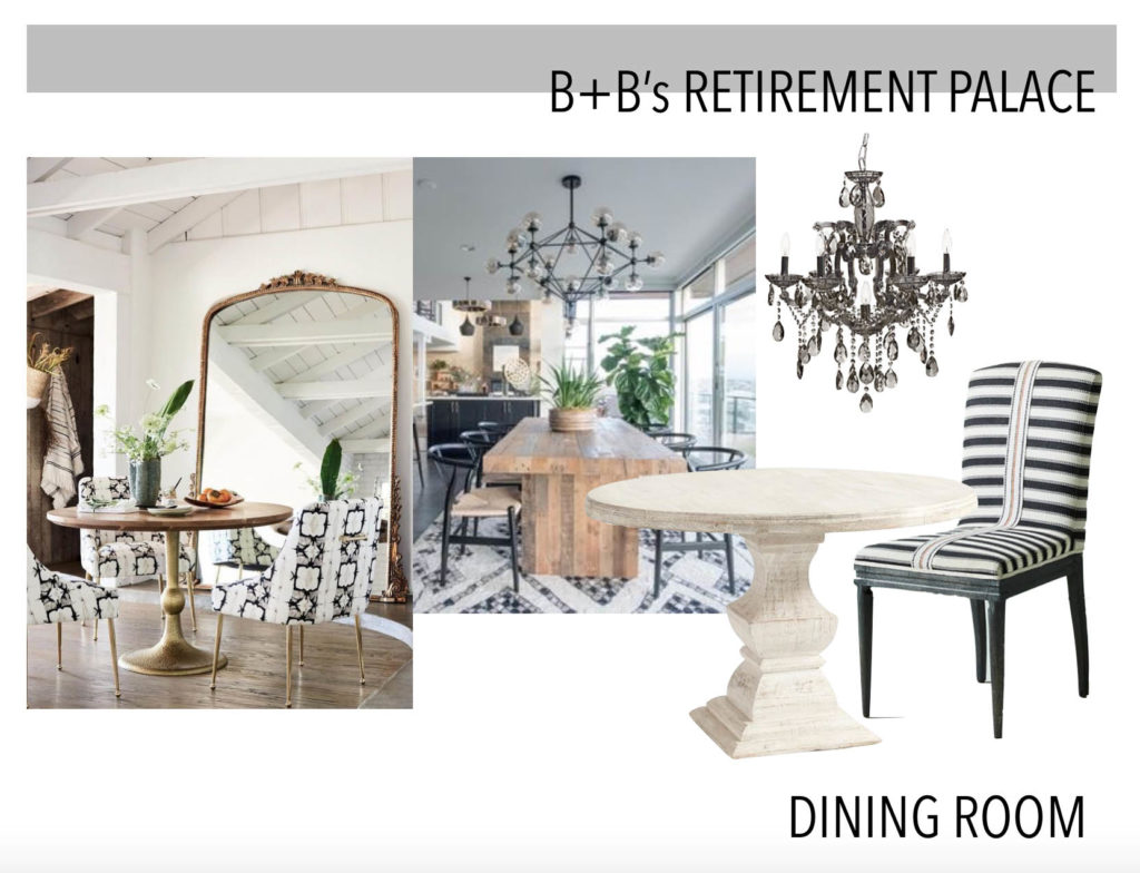
- Bleached Wood Dining Table – My mom has requested my old 48″ round dining table to use in her new square dining space (her previous table is long) and I’m happy to oblige as that beautiful table needs a good home!
- Wood Hutch – My mom has a large 80″ hutch that she stores linens and plates in which is currently in her old dining room. This needs to find a home in the new space. Although she is open to painting it, I really feel that we should first try to find a way to incorporate the warm wood in first, to protect the integrity of the piece.
- Balloon Chairs – This was new to me… but apparently my mom has always envisioned a pair of balloon chairs in her home, to cocoon her for reading or her morning coffee or whatever. We will find a way to make them work.
- Built-ins – The space currently has two set back areas flanking the fireplace/TV that are perfect for built-ins or shelving. Since the spaces are not quite symmetrical, we may have to go custom here so that it doesn’t look unbalanced.
- Piano – My parents have a beautiful baby grand piano that I refuse to let them get rid of (until I have the space to take it!) so this needs to fit in the living room.
- White sectional – We will need to buy/design/customize one with a chaise, but we aren’t sure which side it will be on yet.
- Black and White Chandelier – Another Stefanie inheritance, this piece was in my old condo in San Francisco. 10 years ago when we bought it my mom loved it… so she was happy to snap it up for her dining room once we sold the unit.
My Design Overview
Today we will only be focusing on the main communal spaces in the Retirement Palace, which are the Living Room, Dining Room, and the main stairway leading to these spaces. The bedrooms are all located on the first floor, and the stairwell leads upstairs to the communal spaces, so this is the first main focus that any guests will see, which will set the tone for the rest of the space.
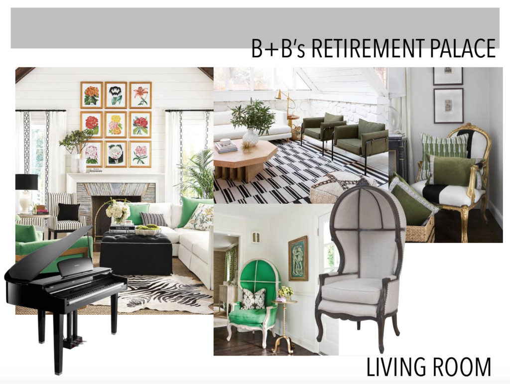
Although I have not found the perfect inspiration image for this space, there are a few that I’ve put together to give the overall color palette and furniture aesthetic that we are going for. My ideal color palette is pale grey, white, black and emerald green, with hints of gold and warm woods, and stripes as a key pattern feature. The furniture will be more on the traditional side, with deep comfortable seats and upholstered arms, most likely a functional ottoman/coffee table combo, and some elements of glass or mirrors to make the space feel larger.
Although my mom hasn’t typically decorated with much black, using it sparingly to punctuate design elements like the stairwell railing, the new roman shades in the main bay windows, and in various furniture elements will provide a bit of contrast to the pale walls.
Let’s discuss the green. Yes, it’s my favorite color so I’m biased! But- with all the greenery and plants that my mom likes to decorate with anyway, I thought it would be the perfect color pop for a lush, luxe feel in this room. My mom has stated that she is interested in putting a pair of balloon chairs to flank the main bay window in the living room, so my thought is reupholstering a pair in a green linen or velvet would feel luxe and be the main standout of the room. We will have to find a great side table to separate the chairs enough, so that they don’t block the fantastic view of the bay and San Francisco. I think this is the design element my mom is most afraid of, since a bold color like emerald green is outside of her comfort zone, so this could take a lot of convincing!
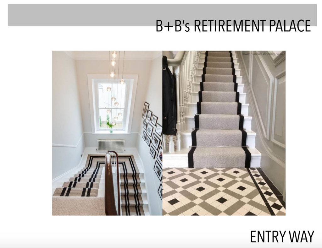
I also love a classic stripe, which I think is the perfect ‘pattern’ to accent in this room. My mom doesn’t tend to use a lot of pattern in her decor, but a black and white stripe acts like a neutral, and will be perfect to carry the eye from one room to another. I would like to use a simple black stripe on a custom stairwell runner to take the eye upwards to the living/dining space. Then, find or upholster striped chairs for the dining room to play off of the black in the chandelier. Since we will already have 2 wood tones in the dining room (the table and the hutch), I think it’s important not to try to ‘match’ or incorporate another wood into this space. Instead, the the vertical stripes will play off of the round table, and draw your eye up to the chandelier.
Typically, I like to design from the ground up, which means the flooring and rugs first, but I’m taking a different approach with this project. The flooring in the space currently is a medium/light oak, and we are working with a contractor to refinish the floors even lighter. I have several ideas for a rug for the main living room, but am waiting to hear what my mom thinks about the design strategy I have in place already, before I go in and suggest individual pieces of furniture.
I will be sharing ‘before’ pictures at a later date once we have more of a concrete design plan, and I will keep you updated with where my parents end up going with the design. Fingers crossed some of my ideas are taken…! So please let me know in the comments what you think about this space- maybe your feedback will help them decide to move in this direction… or not!
