When I was in New York last week I was able to see my best friend’s new apartment in Brooklyn, which she and her husband just moved in to. What’s so nice about moving out of Manhattan into Brooklyn is of course, the added space that comes with either matching or decreasing your rent. They have a great sized living room, an office space, a dining room, and even a large patio! All of this new space is so freeing, but then you have the added cost of buying new furniture to fit all these new nooks and crannies in your home.
While I was visiting we spoke about working together on various design projects, but the first one we started with was her living room. They had already picked out a mid century dining table and chairs (they have great taste!) but they wanted to find ways to incorporate warmth and a touch of color in terms of a bench, rug and storage cabinet. While her husband definitely had some concerns about how much color and ‘fluff’ the space would have (my friend requested shearling throws on each chair), I knew she also wanted a bit of color and texture in the space as it would be a focal point in the room.
Here are my 3 design options with different color schemes, each with their own merits:
Option 1: Midcentury blush
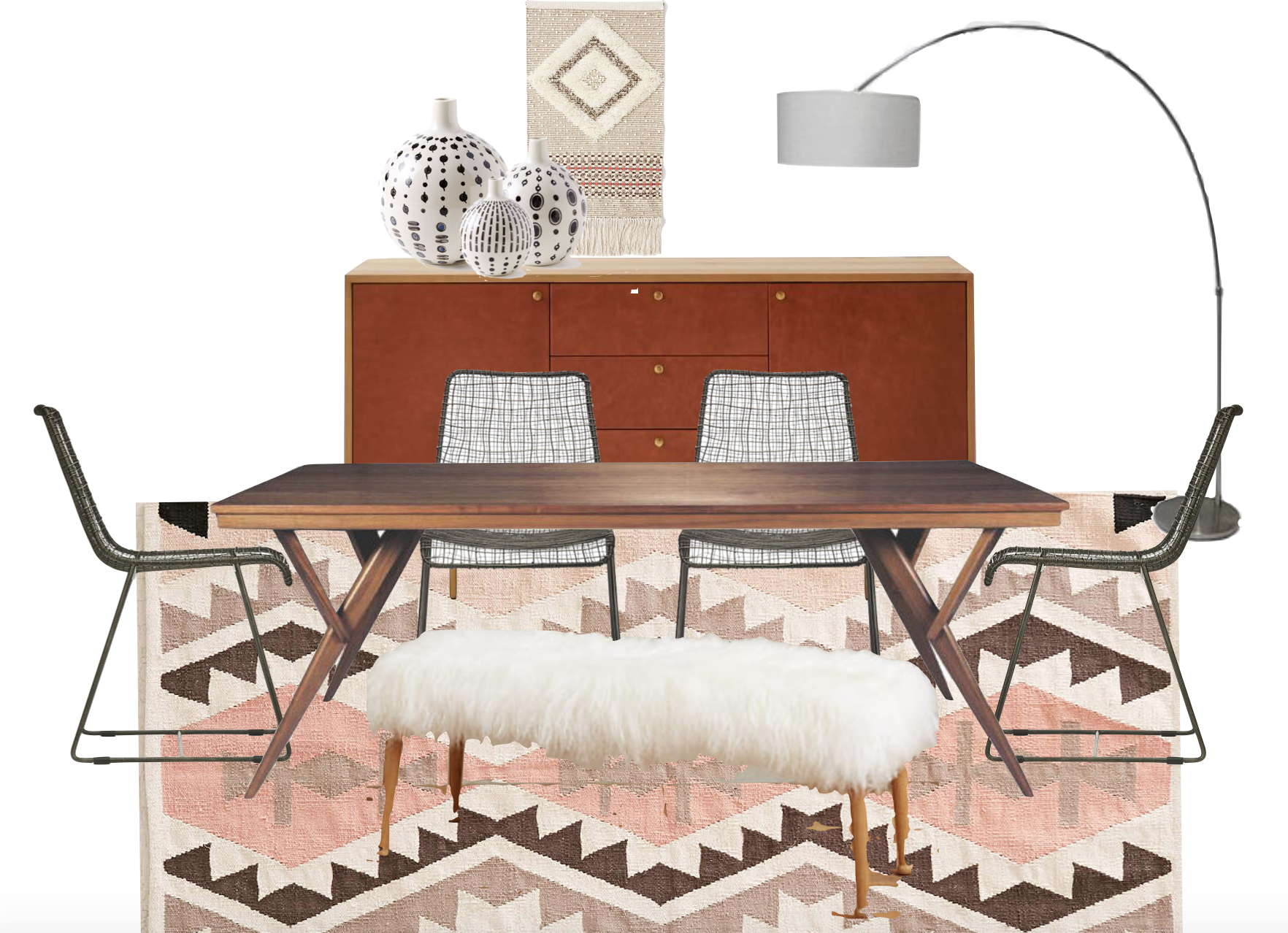
The thought here was to bring in the shearling texture in a bench, which of course could be placed along the back of the dining table if said husband thinks it silly. I absolutely love the color of this rug, and although it is 5×8′ when we need the 6×9′ the price is perfect and the color scheme would add life without being too loud. The back cabinet is MY FAVORITE PIECE in West Elm. The door fronts are covered in cognac leather which is just a fantastic texture and talking point, and if you remember this post, I strongly believe will never go out of style.
Rug // Bench // Chairs // Buffet Cabinet
Option 2: Textured and Blue
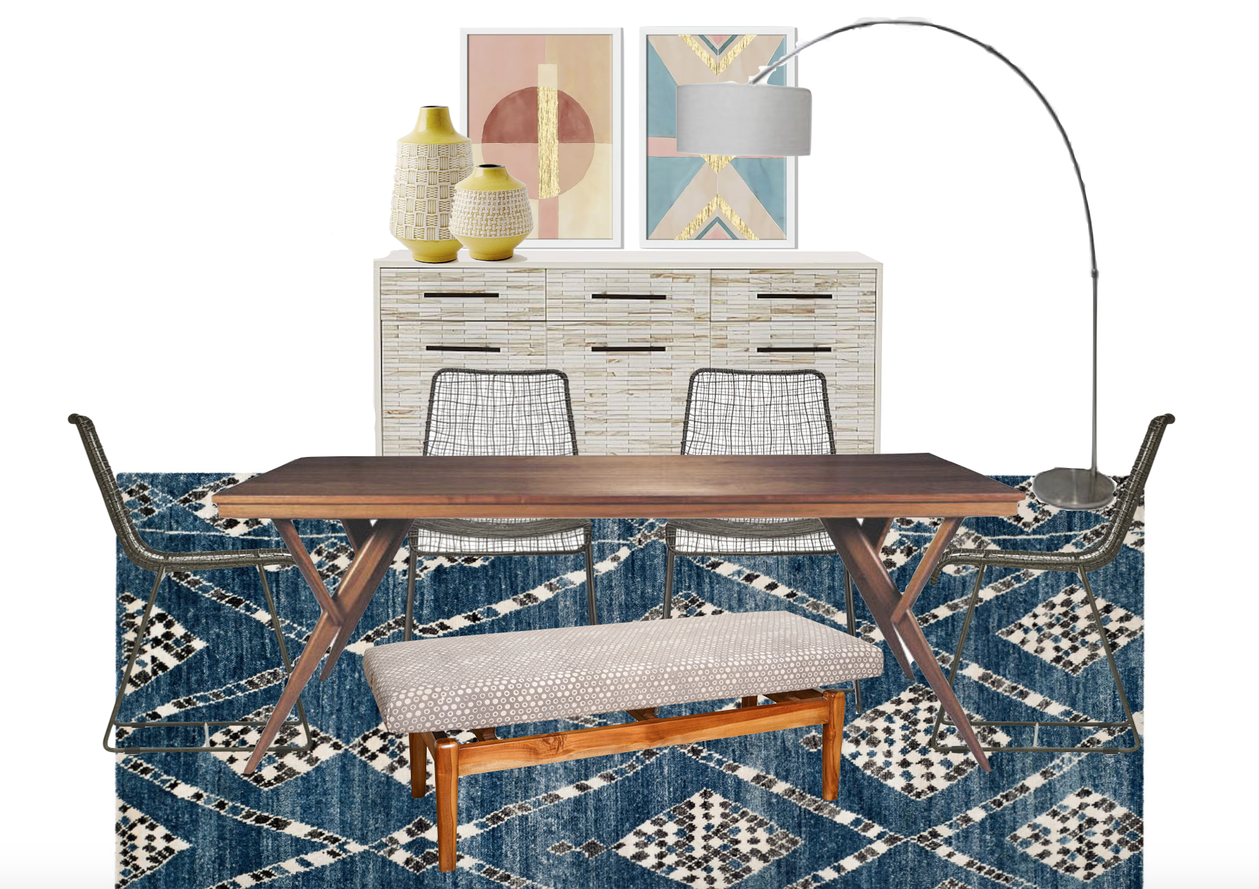
I strongly believe in starting from the floor up when designing a room, and the design for this space came directly from finding this Safavieh beauty. I’m drawn to the black and white check design, and love the fact that it’s a little uneven and wobbly, which makes it look older and have more character. The bench I found is covered in kashish canvas fabric, and the textured gray dot goes well with the carpet without clashing. Finally, back to West Elm for the tile front cabinet. I love the texture that this piece adds to the room, and since it is still white, you can really hang some bright or interesting art above it without fearing for too much craziness.
Option 3: Clean Global
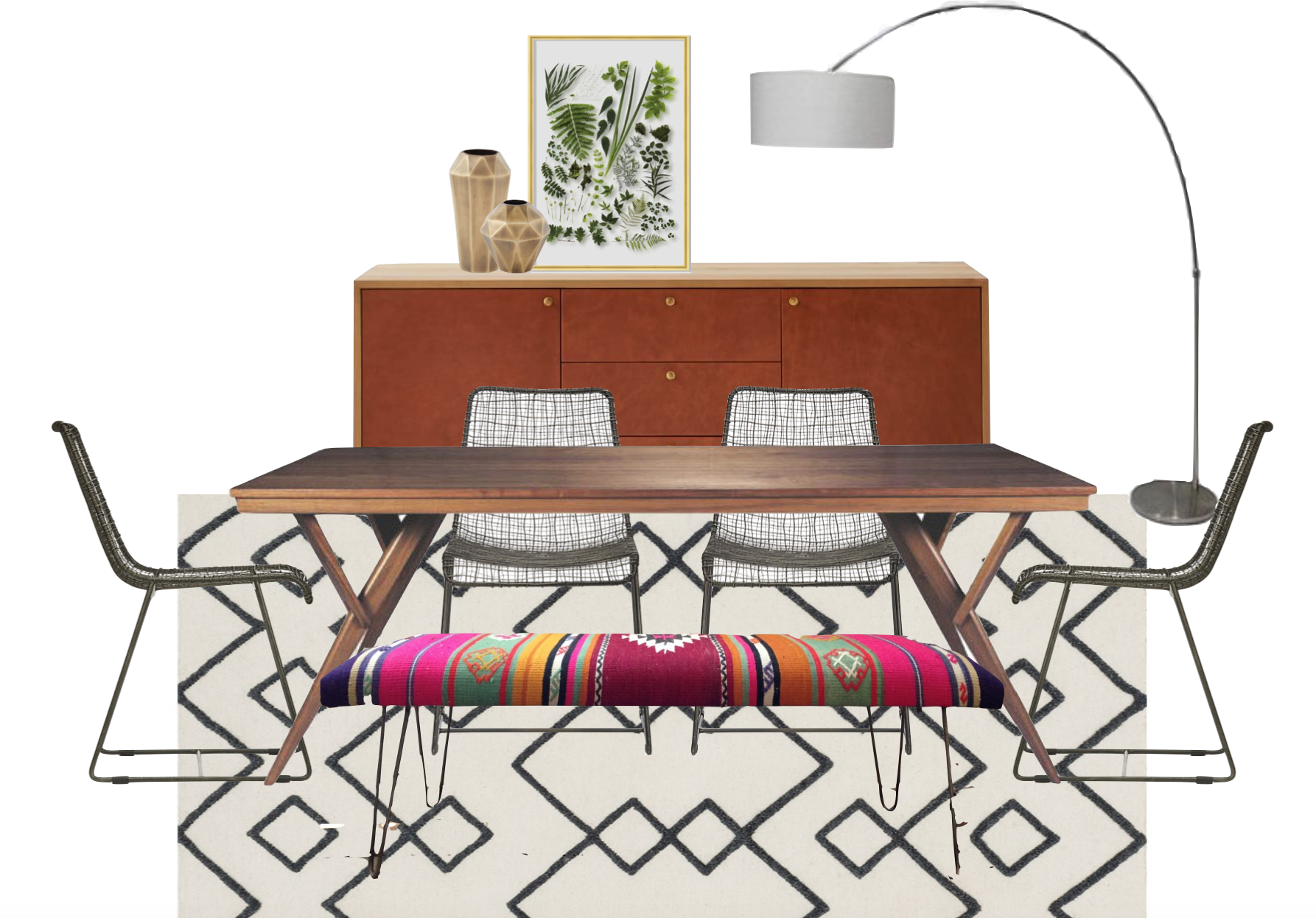
The final combination stemmed from the idea of a Beni Ourain-like rug, such as this black and white geometric one. It’s simple, graphic, and a nice palette to layer on more color. Each of these benches are covered in one of a kind kilims, insuring no 2 benches are the same. I absolutely love the color and know that as their home grows, this would be a fabulous piece at the foot of a bed or in an entryway, insuring it has a long life. I re-used the leather cabinet here because I really wanted to drive the point home that she should buy it…. so yeah I think I made my point.
Rug // Bench // Buffet Cabinet
What do you think? Which dining room combination is your favorite?
