It’s getting down to the wire here with my wedding planning, and finalizing the table settings is one of the last things on my list. I always ask you for your input, but you always feed back that you need to know more about my wedding in order to help me decide. Well, what are surprises for then? I’m not going to give you much information, but spoiler alert: my wedding is not rustic. Although a rustic wedding was something that we originally wanted, instead we are ending up with a much more formal, glamorous wedding, with a bit of unique surprises so that it doesn’t seem too stuffy.
That said, deciding what the place setting will look like has been extremely difficult for me. I know that everyone says no one will notice, but the truth is that I notice at weddings, so I am doing this for me. It doesn’t mean that because I notice the settings need to be over the top, just thought out, and placed with intention. Here are a few of my favorite inspiration images, in order of most simple to most complex. What are your thoughts? Here we go…
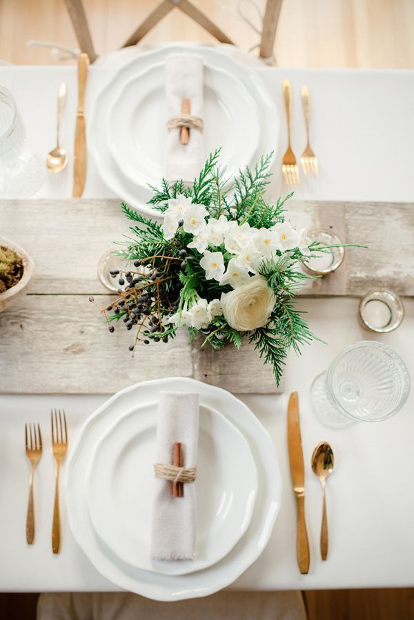
So simple and chic. Although probably a bit too rustic due to the wood table, the pop of glam comes from the gold flatware and etched glass stemware.
 {image Ruffled Blog}
This one is so effortlessly simple, but the use of grey plates instead of white instantly adds a modern update. The bright pop of fuchsia in the leaves and eggs (?) are completely eye-catching.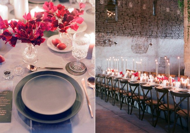 {image Casa de Perrin}
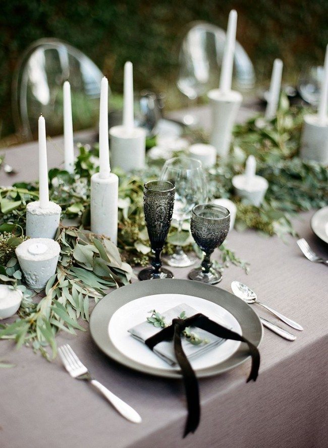
This table setting is made modern by the addition of thick white concrete candlesticks and black etched glass stemware. It harks to older days but the mix of textures is completely new.
 {image Style Me Pretty}
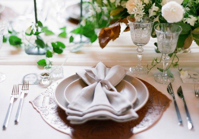
A tooled leather placemat brings the drama to this simple setting, and the folding of the napkin adds a bit of femininity to an otherwise more masculine setting.
 {image Casa de Perrin}
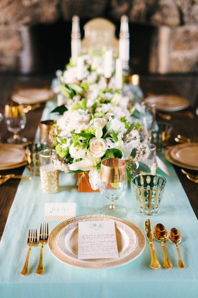
Now we’re jumping up a level to a lot more going on; more boldly patterned stemware and flatware add more visual interest, but all metals are kept gold to streamline.
 {image Style Me Pretty}
This table setting has a vintage flair to it, with the ornate dinnerware and stemware, but I love how the flatware has wood inlay for an added textural element.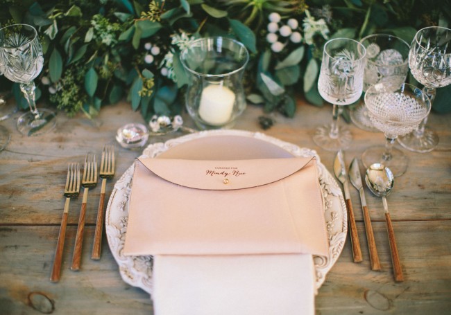 {image Casa de Perrin}
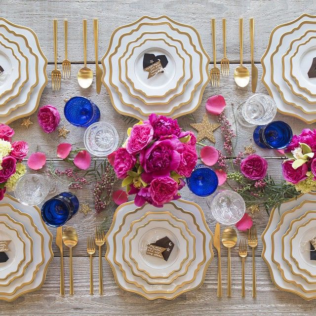
Simply stunning, truly. The Anna Weatherly dinnerware collection and its wavy gold outlines adds so much drama to this simple setting, and bright pops of florals and contrast stemware make it fun and funky.
 {image Casa de Perrin}
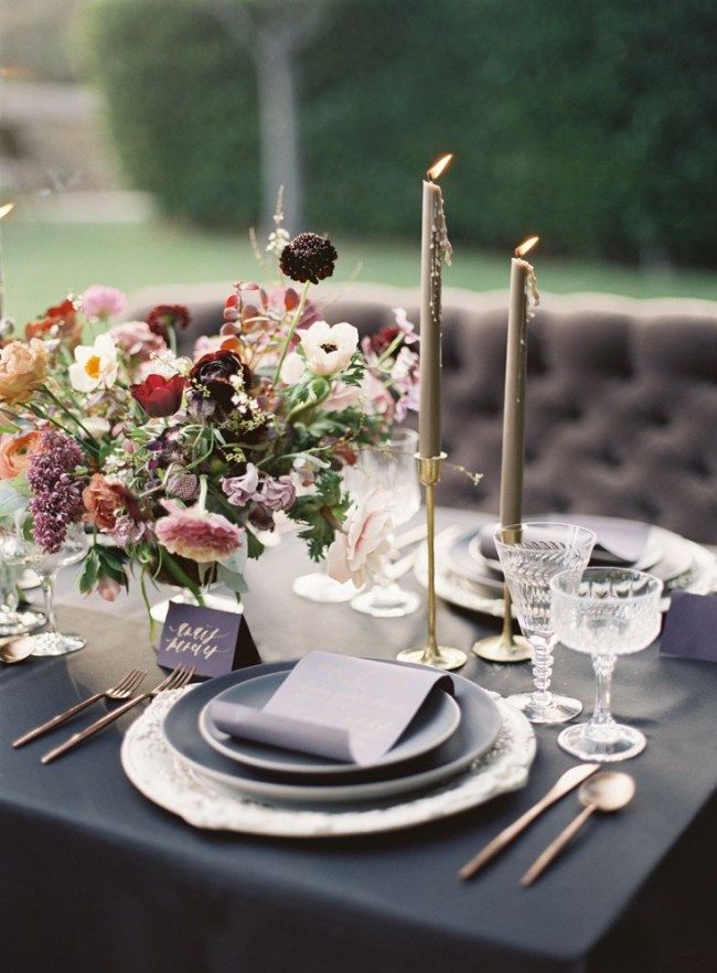
I absolutely love the moody vibe of this setting- the slate tablecloth and salad plates play off perfectly against the gold flatware and candlesticks. And the way they have that menu curled? A genius way to add volume and fluidity.
 {image Tinge Floral}
I mean, how glam can it get? Of course I love the bold color scheme, but I also love the black marble dinner ware and how adding a fern underneath the menu adds a slight softness that is so necessary.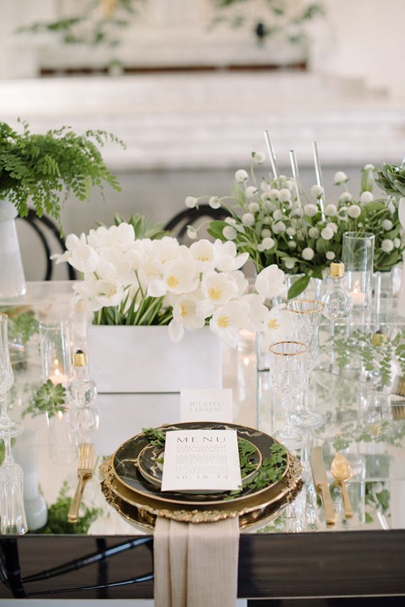 {image 100LayerCake}
What do you think? Which is your favorite setting? What do you think is the most important part of a table setting to land on? I will be working on mine this weekend so I would love your input!
