Welp, it happened.
I wanted things to be fair between my first child and my second child, to make sure I have no bias or special treatment. But sadly before Liam has turned one year old, I have realized he has already fallen into the ‘forgotten second child’ trap. As with happens in many families, the first born typically has their nursery set up before they are born. Liam will be lucky to have a finished nursery by the time he is one!
I mean, it’s not like he hasn’t had a bomb-ass crib from Nestig that converted from mini size (you can see his nursery nook in our old home here) to full size, or even that he doesn’t have his own room. He’s for sure one lucky kid already. But mostly, I had ambitions of completing this room months ago, but ran into design hurdles and indecision and procrastination that just made it feel like it was never going to come together.
As for the design, I always knew I wanted it to be a modern surf and skate nursery theme. I wanted a little bit of Hawaii, a little bit Vans, a little bit retro Venice beach. I love blues and greens, and thought with the right mix of wood tones and natural elements, the room could be really bright and fun.
This blog post was almost written several times, but after each sample of wallpaper, fabric, and rugs came in wrong (or just never came) I changed the design upwards of 25 times. That’s not even an exaggeration, maybe 45, who knows. Mr. R was beyond frustrated with me; it got to the point where I couldn’t even look at my mockups anymore because they were making lose faith in decorating this home at all.
The Before
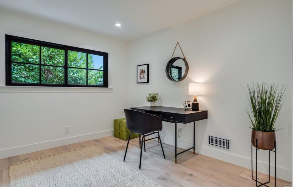
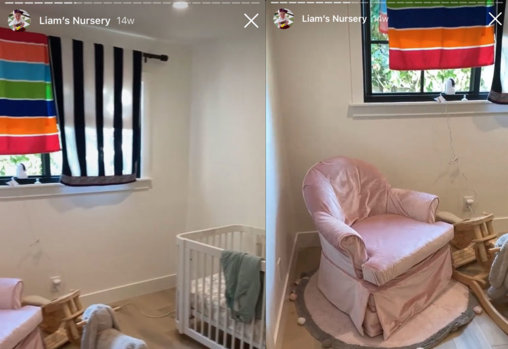
Here is a picture of the room from the real estate listing when we bought the home, note that it’s styled as an office ;) I have also included a sweet photo collage of screenshots I took of the room from my instagram stories. Note the beach towels that I was using for curtains for more months than I care to admit!
The Issues/Design Needs
To keep this post from becoming a laundry list of every hurdle I reached, here is a summarized list of design conundrums I encountered that kept me from having a clear plan in this room:
- The room is roughly 10’x10′, with a small closet, which is tiny for most rooms that are not used as offices. Because one wall has a nice window, the layout of the crib and existing furniture was tricky.
- The existing furniture (other than the crib) are:
- the full 6-drawer dresser with changing table from Pottery Barn. This is too big for the room but it’s the item with our changing table… so we have to keep it in Liam’s room instead of moving it to Marina’s
- A rocker/swivel glider that is from my childhood home that currently has a pink velvet slipcover on it
- The dresser and the crib are both white. The walls are white. The doors are white. We need contrast!
- The window requires drapes, can’t use roller shades or roman’s because of how it opens
- The room is dark! And small! So we need to keep it overall light and bright
- I was adamant about sticking to the modern surf and skate nursery design theme. This is my own pig-headedness but because I had no other ideas, I just wanted to make it work
- The order for rug I initially wanted was cancelled on me 3 times, so I lost it
- I designed 3 wallpapers for this room, all of which I love but didn’t work with the rug I ended up buying on a whim and then of course freaking out about
- I got 2 quotes for recovering the chair and both were like 6x what the chair is worth, so frustrating
- It was a goal of mine (for some unknown reason) to use the same print in two elements of the room. So, either the drapes the same print as the wallpaper, or the drapes the same print as the chair. This is possible with designs from Spoonflower, but I had a difficult time getting swatches of both fabric and wallpaper to actually match (the background whites were often off as they are different materials, understandably)
- I really didn’t want to spend a ton of money. Like, I expected this room all in to be about $1k, but some quotes for wallpaper or recovering chairs were more than that ALONE. Which meant this room needed a heavy dose of ingenuity and DIY.
Liam’s Modern Surf and Skate Nursery Design
Ok, so I debated sharing with you 3-6 of the other mockups that eventually failed me, but I’ve decided to just be positive and look forward at what worked, so that I can just pretend that everything went smoothly from the jump.
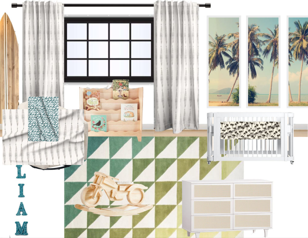
I will quickly take you through the mockup. The first things I knew I needed were wood elements in the room, since the furniture was mostly white. I found a super cute Montessori inspired bookshelf (I went with a different one than the above) from Etsy that has a wave design that I love. I also got super lucky at Crate & Barrel, scoring this wood rocker from the Leanne Ford collection, that gave a little bit of the whimsy that this more traditional room needed.
The rug was always my #2 pick, but I found working with it’s colors initially, so tricky. Anytime I tried to play off the colors for the drapes, the whole room wen’t a little left. But, it worked out in the end because I found this vintage inspired palm tree mural from Etsy, which was $65, and the colors match perfectly. The plan is to break out the panels and individually frame them in molding, so that they look more like an art installation as opposed to an accent wall. I really dislike accent walls. Sorry, not sorry.
The fabric for the drapes and the slipcover is a design on Spoonflower that I have ‘favorited’ for months. I initially was planning to use it as a wallpaper, but when that didn’t work I threw in the towel. Months later I came back to it, still thinking it was soft and versatile, and would add some sophistication to the room. I am going to make the slipcover myself by using the existing one as a template… no other thoughts here yet because I am most scared about this task!
Other DIY projects include adding peel & stick caning wallpaper from Spoonflower to the front panels of the dresser to give it more dimension, and making a new crib sheet for his mattress. I was pretty close to making the drapes myself too but realized Spoonflower had the option to buy them pre-made, and I gave in because Liam would be sleeping with towels forever if I didn’t relinquish control of my wallet.
I can write this blog post now that half of the elements have been received in my house (although not all up/constructed) and I can tell that the colors, patterns, and vibe will work well together. There will no doubt be changes from the above mockup, but for my sanity’s sake, I hope only one or two…!
Please weigh in the comments on your thoughts on this modern surf and skate nursery! I am finally getting excited to have it completed and I can’t wait to hear what ya’ll think!
