Most of the downstairs of our home has been decorated, with the exception of our Powder Room, which is in the entryway of the home and the first thing that guests see upon entering. I have been wanting to remodel this space since the moment we bought the house, but of course, life got in the way. The current bathroom counter is covered in straight-from-the-80s 4″ white tile, with wide grout that gets dirty and dingy. There is a giant wall to wall mirror, and a dated light fixture that gives off the worst light (see below). We wanted to just replace the counter and re-paint the cabinet, but the demo of the counter would most likely result in damage to the cabinet, so it all has to go.
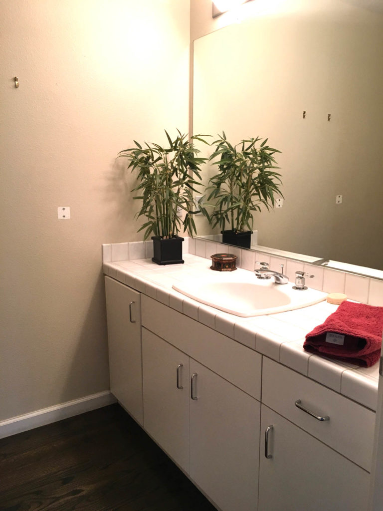
This powder room remodel is a little tricky because of the size and configuration of the space, which makes it a little big to buy ‘ready made’ and do ourselves, and a little small for any contractor to take on the job. So it’s taken us a long time to find the right combination of contractor, stone work, custom cabinet, style and price point that works for us.
The room is an ‘L’ shape, with the toilet in the skinny back part of the room, and a wide vanity of 68″ at the largest part. Because of the size, and the fact that we want to keep the existing flooring and molding, buying a free-standing, finished vanity is off the table. We needed to go custom, but wanted to save money where possible, because, who doesn’t? …and because we have two more, much larger bathrooms that need to be done as well.
The Inspiration
I have tons of bookmarked inspiration for this room, but almost nothing fit in with the existing style of the home. As you have heard me lament before, I struggle with the balance of designing for myself or for future homeowners. I want to make sure this powder room remodel has enough character for me, but will also look good in a sale, since we are perpetual movers.
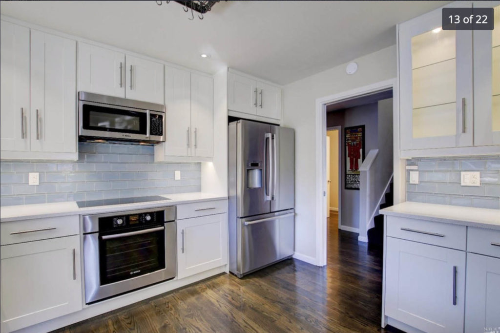
Our kitchen is very close to this powder room (you can see it from the Zillow photo below), and was renovated before we moved in. It has white shaker style cabinets, a white quartz countertop and blue glass subway tile for a backsplash, with nickel hardware throughout. Although it is not exactly my personal taste, we certainly were not going to remodel a brand new kitchen!
I have been using the light blue as a color starting point for the rest of the rooms downstairs, to create a somewhat harmonious feel throughout the home. I used it in our dining room, and our living room (although more of a tertiary color to the navy blue and pink accents). In particular, I like how the large scale geometric artwork works to take up such a large back wall in the living room, and I would love to use that same concept to fill the space in the wall of the bathroom, since it’s the focal point when you walk in our front door, without having to hang a giant piece of art.
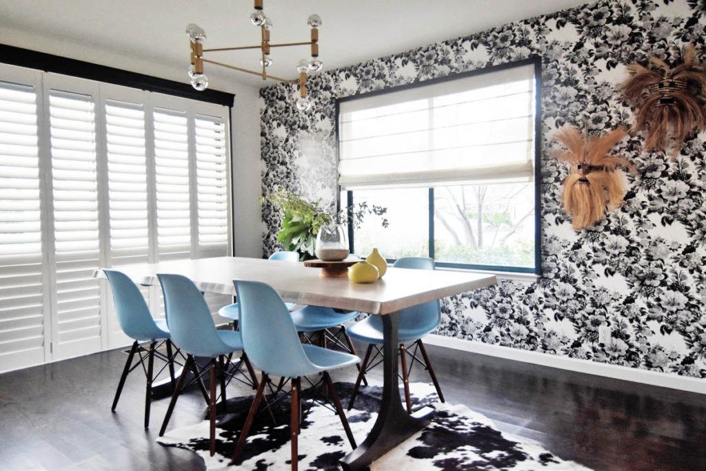
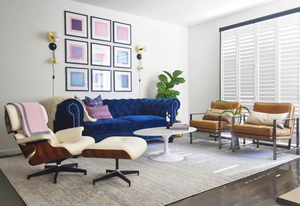
I also have painted the walls bright white, and used black for high contrast, painting the window trims and using black for bookshelves and decorative wallpaper. I wanted to take all of these elements into the powder room remodel, keeping the main elements like counter and cabinets bright white (because people white still sells people!), and have a bit more fun with the hardware and wallpaper.
Powder Room Design and Designing with Large Scale Wallpaper
I LOVE wallpaper, but as mentioned before, it’s not everyone’s cup of tea. So I’m compromising by designing my own custom water color wallpaper that is bright, ties in the right shade of blue, and is easily-removable, should the next owner dislike it. I fell in love with the home designs of Cortney Bishop, and love her no fear approach to color and using large scale geometric patterns in her designs. Paired with white walls and colored moldings, the look is still very modern, which is what sells in Marin these days.
Somewhere on the internet I remember seeing a large scale wallpaper of watercolor shapes used in a bathroom, but I have not been able to find that inspiration image again. At this point the room is probably a figment of my imagination, which is better anyway, so that I’m not tempted to make my powder room remodel look exactly the same. I did a rough watercolor painting of what I wanted the wallpaper to look like, and created a photoshop mockup of it below to see how it will look with some of the other design elements we have landed on.
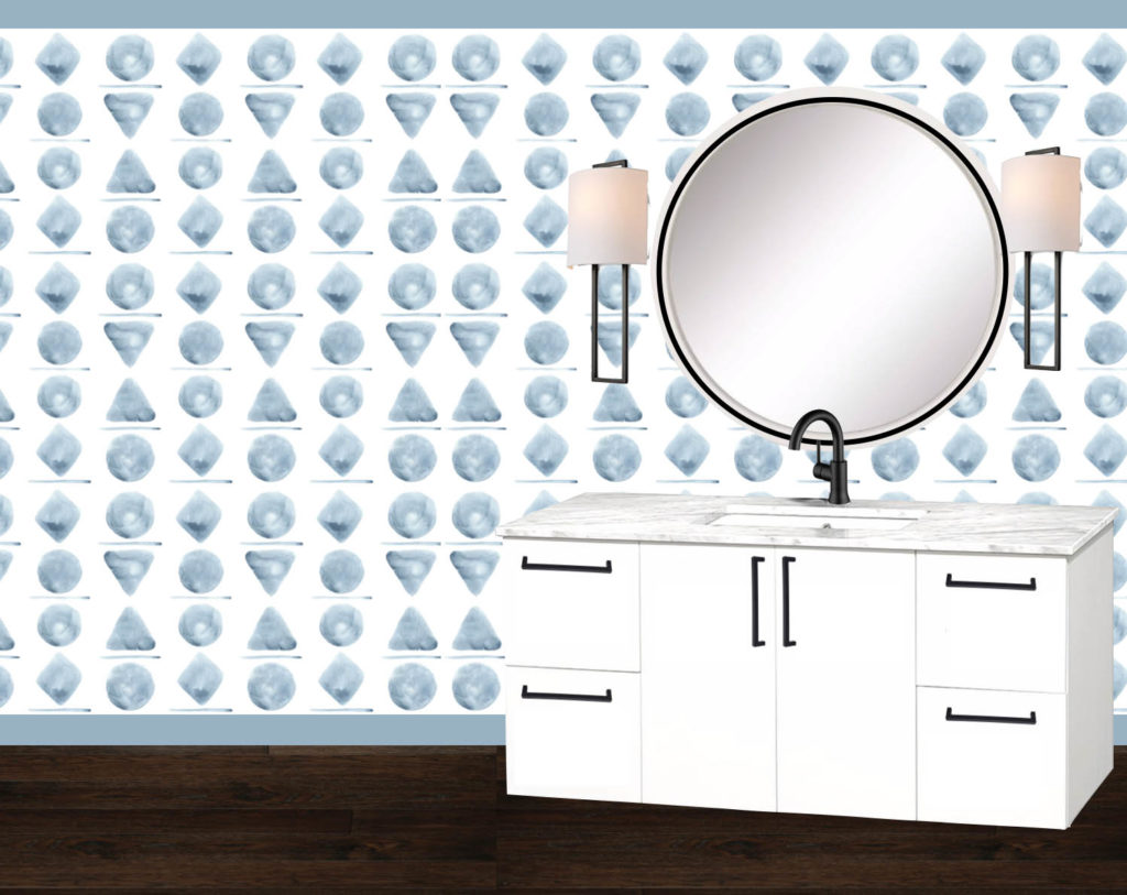
I am pairing the large scale wallpaper with black hardware and fixtures, an oversize round mirror, and maybe painted base boards if I can match the perfect color. I am still playing around with different sconce and handle combinations, as I feel what I have so far is a little cold. I would love to add in some warm accents, or maybe some wood into one of the elements, so I will continue the hunt for those piece. However, I do love the large scale of the wallpaper with the simple, clean lines of the mirror and hardware elements. I feel that the overall look is bright and fun, but not messy or busy at all, which is definitely a look I am trying to avoid for this space.
I am excited to get started and will hopefully be sharing more of this renovation with you in a few weeks! What do you think? Would you buy a home that had this large scale geometric wallpaper in the powder room?
