Originally Mr. R and I thought we would hold off on finishing the living room because, well… it’s already good enough. We aren’t going to buy a new couch or side chairs, and the coffee table we currently have works fine (although I’m over it) so we just thought a new rug and some shelves would get us through this year until next year when we make a bigger investment towards finishing it up.
Then, a few weekends ago we went to the Alameda Antiques Fair and Flea Market and finally found the arm chair of our dreams… which meant buying at asap and re-configuring the room. Once we did that, we realized this space was almost done! We still need to figure out lighting, a new coffee table, art, and some decor touches to add warmth, but all the big items are already complete.
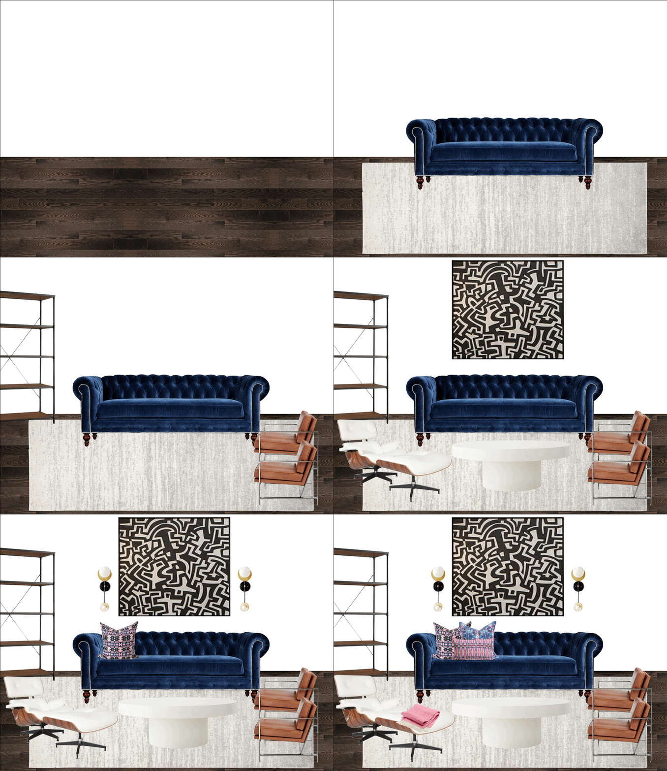
Overall Design Notes
Overall… I think this mid century glam living room is probably the best example of what my design style looks like today. It’s maybe a little more mid century than I would want, as I think if I could start from scratch I would only have one leather chair (we have 3-eek!) and 2 upholstered chairs with a pattern for a more eclectic, boho feel. Or maybe a side table with bone inlay or marquetry details. I love mixing prints and patterns- as you know with my fashion sense- but I will still get that feel with pillows and throws and art pieces. And I also like a touch of glam, whether it be through metallic accents, luxurious fabrics or mirrors, and I think that even though I have a touch in the room, I can definitely try to incorporate a bit more.
Mr. R prefers things a bit cleaner and more sparse than me as well, which is important to note when designing a living space. I also agree that we don’t want our main living space to feel too cluttered. It’s literally so much easier to keep clean, when there is nothing to move around! And as we all know, over time you collect more things, so a simpler starting point is best to build a foundation to accumulate.
One of the biggest changes of this room- once we show the before and after in the final post- is actually the painting of the walls to Benjamin Moore’s Decorator’s White. The room is very dark with poor lighting as it is, and the previous owner had grey and black walls which I thought really brought it to a sad place. Since we painted the room before we even moved in it doesn’t really feel like part of the design plan, but it’s probably the most important part!
What We are Re-Using
The first item is the couch. I have always been very consistent on couches that I like and want to own in my life. One, is a large white sectional. Two, is a navy velvet tufted chesterfield. I have been consistently obsessed with both for as long as I can remember. I had a white sectional for 10 years, brought it across the country with me twice and spilled more red wine on it than I care to quantify. However, it didn’t fit in our last home, so it was time for it to retire. When it was time to buy a new sofa, I told myself that sometime in the future I will own another white sectional, but knowing that kids were in our imminent future, that time was not now. So we decided upon the chesterfield. I bought it 2 years ago even though it wasn’t perfect for the space. I believe that if you love something, you love it no matter what, and boy am I happy I trusted my gut. I love it even more in our new home and feel that it adds glam and luster to the space that it so desperately needs.
We also kept our two cognac leather arm chairs from West Elm. When we bought these 2 years ago we definitely splurged, as leather chairs can cost a pretty penny. But I knew that this color and textile would be timeless, so it was worth it. Honestly, I’m shocked that West Elm discontinued the chairs, as we absolutely love them and receive nothing but raving compliments on them all the time. I love the metal frame on them, as the shine contrasts nicely with the leather, and keeps each chair from looking too clunky. They still sell them in fabric though; click here to shop them.
That’s really it. Everything else we have bought since we moved into the space, except the coffee table… which as mentioned I still need to find. More on that in future posts!
The Questions
I know for the coffee table I want something big but light in feel. Either white wood, acrylic or marble. I want to be able to stack coffee table books on it, or put our feet up, without worrying too much about how it will look long term. I don’t particularly want glass or sharp edges because of the baby. I haven’t found anything I am 100% in love with at our price point, but I will round up some of my faves in a future post to have you guys weigh in.
As I mentioned, lighting is the other issue. There are no ceiling or canned lights in the space, and no switch that even works with a plug to make a lamp turn on. Literally nothing. We currently have a floor lamp in the far corner that you have to manually walk over to every night to turn on and off, and that alone doesn’t provide enough light for the space. I have spoken with an electrician and here are my options:
- Add sconces behind the couch on a dimmer switch (estimated cost $1K plus fixtures)
- Add canned or any lighting to the ceiling (estimated cost $4K plus fixtures)
- Buy two lamps and get a receiver from Amazon for each with a separate remote (estimated cost $50 plus fixtures)
So… you can see my dilemma! What would you do?
DIY Projects Planned
My plan it to DIY a VERY LARGE canvas for behind the couch, similar to the one in the mockup. I am all about one large piece of statement art right now, but have no intention of dropping $1k or more for something that I don’t even know how much I will love long term. So. the solution is being being a bit crafty and doing this myself. It’s certainly a daunting project and will most likely be the last thing done in the space… but I think it will add so much graphic pop to the space that it will come alive! What do you think?
I don’t have any other DIYs planned for this space, but will hopefully incorporate some fun textiles into the mix to give the room some life!
What do you think of my mid century glam living room mockup so far? Get the look by shopping these items below:
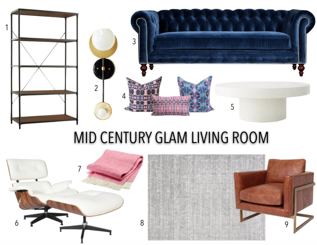
- Hera Bookcase // 2. Assymetrical globe sconce // 3. Navy Velvet Chesterfield // 4. Bunglo Pillows 1, 2, 3 // 5. Shroom Coffee Table // 6. Eames Chair Dupe // 7. Pink Wool Throw // 8. 7×10 Rug // 9. Leather Arm Chair
Check out my other Home Renovation Mockups Below!
Baby Girl Constellation Nursery
Mid Century Dining Room
