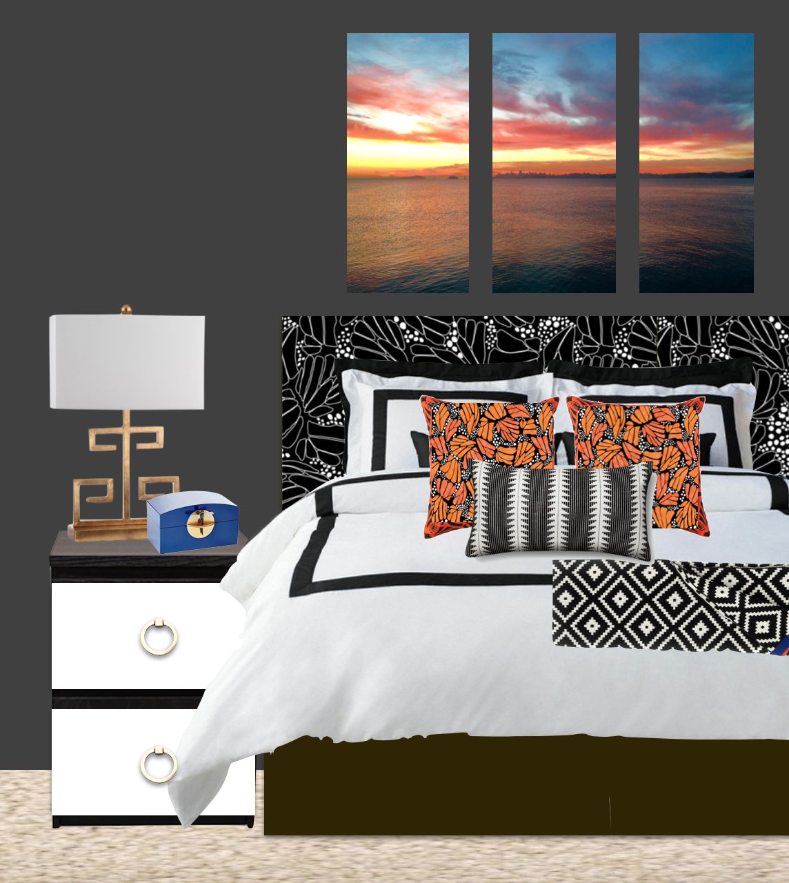
Last week I talked about printed fabric headboards so this week I figured I would share where I was going with that thought. As I mentioned that we want to re-do our bedroom but only with small DIY changes, below is a little sneak peek of how I’m thinking I would like to plan out the room.
I’ve always been obsessed with the Morgan bedding collection from Pottery Barn – mostly because it’s modeled after chic and clean hotel bedding… and who doesn’t love diving into a big, fluffy and tightly made hotel bed? It may look traditional and boring white bread, but sandwiched in between layers of my Monarch Butterfly print, it will look anything like ham and cheese. #Reallygoingforthemetaphorstoday
I love the idea of repeating the butterfly pattern in a color for the pillows, as opposed to just the outline for the headboard. I think it will create a nice continuity to breakthrough what could otherwise be a chaotic print. As for when I’m going to update the headboard- that DIY make take me a few months so this is as close as we are getting to a finished bedroom photo for a while…

Black Outline Monarch Butterly Fabric // Orange Monarch Butterfly Fabric // Pottery Barn Morgan Bedding // Shiraleah throw // Black and White Pillow // Malm Dresser // Gold Greek Key Lamp
The nightstands will be a simple DIY upgrade to the IKEA Malm dressers we already own, with a new coat of paint and some fresh gold midcentury inspired hardware. Other pillows and throws will be a combo of black and white geometric prints- I love mixing them around my house, so the more I have the more I can intersperse them.
As for the art above the bed, I am still debating what my strategy is. I wanted to blow up a photo that I took on one of Mr. R and my travels, but I am not sure I have found the right one. I was also thinking I could do a little Gray Malin inspired DIY project with one of my photos, so let me know if you would be interested in that. In the meantime, I am still debating whether or not I should go with black and white or with bold color, but I do like what strong color does to this room.
So what do you think? What are your favorite/least favorite parts of this space?


